
4.2: Investigation
- Page ID
- 28675

Activity A – Investigating Surface Temperature
Launch Build your own Earth <http://www.buildyourownearth.com/>. When the title screen for the model appears click on “Getting Started”. This should give you a screen that looks like Figure 4.2.1.
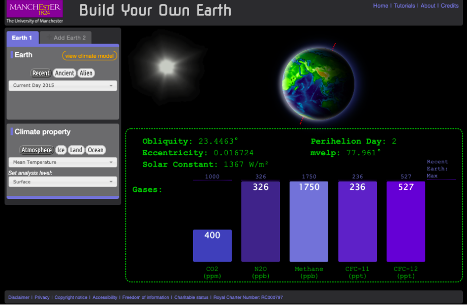
The principle control panels for the model are the two panels on the left side of the screen. The right side shows the energy per square meter received by the sun at the top of the atmosphere (solar constant), factors controlling the solar constant (obliquity, and eccentricity), and principle greenhouse gasses that influence the energy balance of the climate, hence air temperature at the surface..
Begin by making sure that the “Earth 1” tab in the control panels on the right is highlighted blue and that the pull-down menu in the top panel (Earth) is set for “Current Day 2015”. In the lower panel (Climate Property) make sure that the “Atmosphere” button is dark grey and the pull-down menus under the button reads “Mean Temperature” and “Surface”. Then click on “view climate model” in the top panel. The screen that appears should look like Figure 4.2.2.
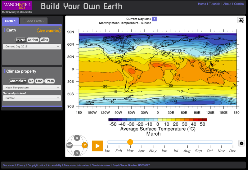
Like the previous screen the principle controls for the model are in the two panels on the left side of the screen. Additional controls include the timeline below the map legend which controls the month the map represents. The globe to left of the timeline changes the map projection.
When the map first shows up it will automatically start scrolling through all the months of the year. Click the pause button on the left end of the timeline and then select January. Using this map answer the following questions…
Questions
- What is the range of temperature shown on the map?
- Where is temperature highest and where is it lowest? What are the values at each place?
- What do you notice about the temperature of the interior of the continents in the northern hemisphere compared to the temperature of the oceans at the same latitude? What part of Figure 4.1.1 explains the observed difference?
Now set the timeline to July to answer the address the next three questions…
Questions
- Where are the temperatures highest and where are they lowest? What are the values at each place?
- How does the distribution of high and low temperatures change from January to July?
- How does the temperature of Northern Africa compare to that of the Atlantic Ocean at the same latitude? How does what you concluded in question 3 explain what you are see here.
Activity B – The Atmospheric Energy Budget and Surface Temperature
Now set the climate property in the left-hand control panel to “Top of the atmosphere”. If you are in the climate model mode, you should have a screen that look like Figure 4.2.3.
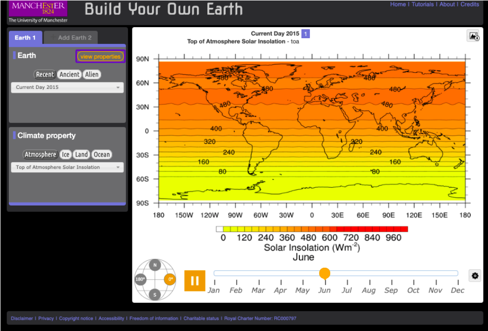
Like the previous screen the principle controls for the model are in the two panels on the left side of the screen. Additional controls include the timeline below the map legend which controls the month the map represents. The globe to left of the timeline changes the map projection.
If the map is scrolling through the months, pause it and set the month for March. Using this map answer the following questions.
Questions
- What is the range of values shown on the map?
- Where is insolation the most intense and where is it the least? What are the values at each place?
- What is controlling the intensity of the insolation at each place? Remember that insolation is presented at energy per unit area (watts per square meter). Another hint is that March 21 is the spring equinox, which means that the sun is directly overhead at the equator at noon.
Now switch the date on the timeline to January.
Questions
- Where are the minimum and maximum insolations? What are the values at each place?
- Switch the date to July. Where are the minimum and maximum insolation now? What are the values at each place?
- How do the maps for January and July look different from that of March?
- What accounts for these differences?
Begin this next part by switching the date back to March and make sure that you have selected “Top of the Atmosphere” in the pull-down menu in the control panel. Create a second map by clicking on the “Add Earth 2” tab in the left-hand control panel. In the new Earth 2 panel select “Mean Temperature” in the control panel. After you have done this you should have a screen that looks like Figure 4.2.4.
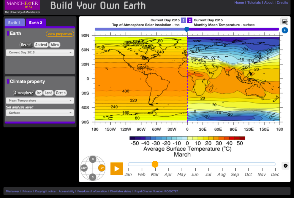
The blue dashed line in the middle of the map can be moved left and right to hide, show, and compare the maps. Click on hold on the pointer on the blue bar over the top of the map to do this.
Using these two maps address the following questions
Questions
- In what ways are the two maps similar?
- In which ways are they different other than the fact they are displaying two entirely different variables?
- How does the insolation map explain what you see in the temperature map?
- What about the temperature map does the insolation map not explain?
What other factors need to be taken into account to explain what the insolation map does not explain? Suggestion go the Earth 1 tab and try some of the other options in the “Climate Property” panel.
With the model still in the dual map mode it’s time to investigate the energy out portion of the atmospheric energy budget. To set it up for this part of the activity set Earth 1 to “Current Day 2015” / “Atmosphere” / “Top of the Atmosphere Insolation” and set Earth 2 to “Current Day 2015” / “Atmosphere” / “Net Longwave Radiation” / “Top of the Atmosphere”. Pause the timeline and set it to March.
Questions
What are the maximum and minimum values on the insolation and the long-wave radiation maps? Where are they?
In ways are the two maps similar? In what ways are they different?
What factors need to be taken into account to explain the differences?
Activity C – The Atmospheric Energy Budget and Changing Global Climate
Beginning with the same dual earth configuration you used at the end of Part B, set Earth 1 to “Current Day 2015” and “Mean Temperature” / “Surface”. Set Earth 2 to “No Greenhouse Gasses” and “Mean Temperature” / “Surface”. Pause the timeline and set it to March.
Questions
How does the temperature map for Earth 1 (2015) compare to Earth 2 (no GHG)?
How much of Earth 2 is habitable?
Now set the climate property of both Earths to “Top of the Atmosphere Solar Insolation”. How do the two Earths compare?
Next set the climate property of both Earths to “Net Long-wave Radiation” / “Top of the Atmosphere”. How do the two Earths compare?
Now set Earth 1 to “CO2” / “Low” and “Earth 2” to “CO2” / “IPCC A1F1 CO2 Scenario, Year 2010”. Then set the climate properties for both Earths to “Mean Temperature” / “Surface”.
What is the CO2 level in ppm (parts per million) for the Low and A1F1 scenarios? To find this out click on the “view properties menu” and toggle back and forth between Earth 1 and 2.
How does the January and June surface temperatures of the Low scenario compare to the A1F1 scenario? To find this out you will need to click on the “view climate model” button unless you have already done so. Also in answering the question talk about what parts of the world show the most significant change and estimate what the temperature increase or decrease is.
Activity D – Synthesis
In the BYOE model what factors control surface temperature?
In some corners of society CO2 is referred to as a pollutant when talking about climate change, in others increased CO2 is promoted as a benefit to society. How do the results of activity C both support and challenge both arguments?