
14.2: Investigation
- Page ID
- 28612

Activity A – Annual global temperature over the past 800 millennia
Access the Global Temperature Record graph by launching the Climate Dashboard <https://www.climatelevels.org/>. Then click on the graph in lower left corner of the set of six graphs that appear. What you see when you do so should look like Figure 14.2.1. Since this graph only goes back a thousand years you will need to click on the clock icon in the upper left corner of the frame. When you do this you should see something that looks like Figure 14.2.2.
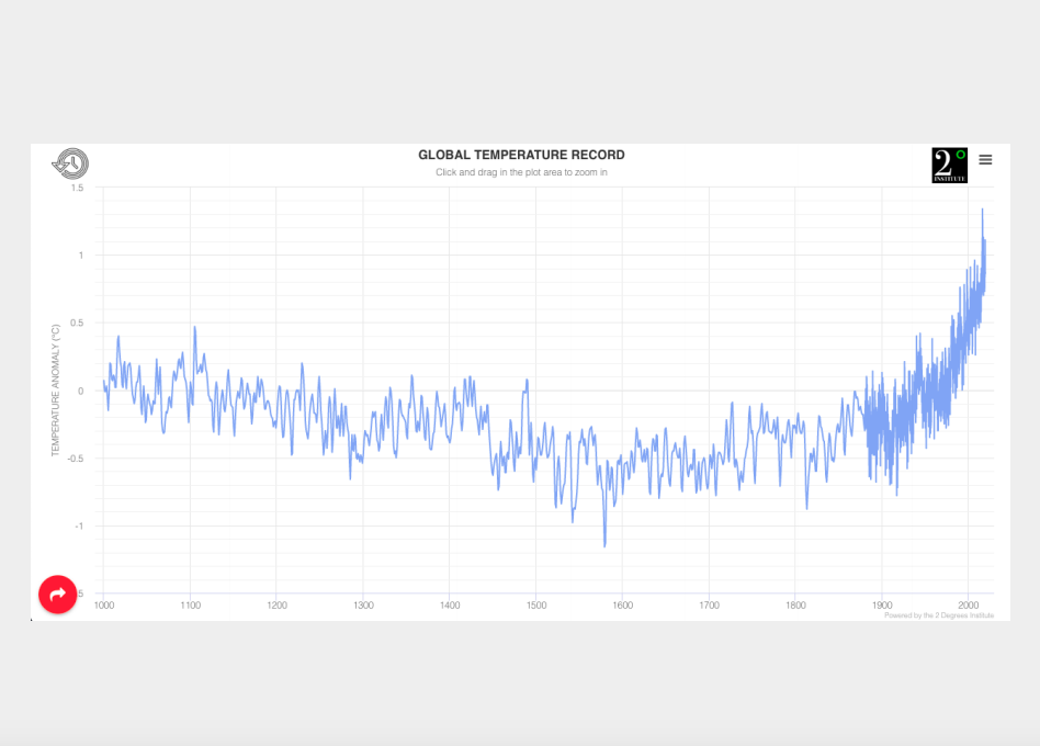
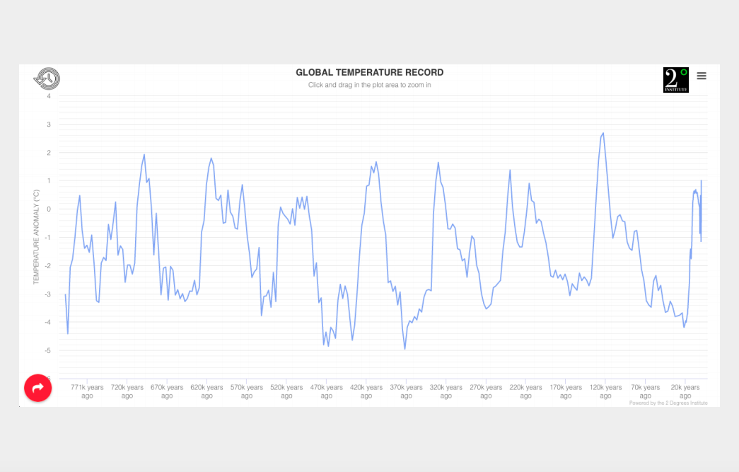
Once you have accessed the temperature graph for the past 800 millennia use it to address the following questions.
Questions to investigate
- What and when were the highest and lowest temperatures during the past 800,000 years?
- How do the highest and lowest temperatures compare to the most recent temperature?
- Between 123,000 and 22,100 years ago what were the highest ad lowest temperatures? How would you describe the temperature variations between these two times?
- What happens to mean global temperature (MGT) after 22,100?
- How is the temperature variation between 330,000 and 270,00 years similar to what happened between 123,000 and 22,100 years ago?
- Find at least three other time periods that show similar trends to the two periods mentioned in the previous question. When were they and what were their maximum high and low temperatures?
- On the graph, troughs correspond with periods of cooling and glacial advance (glacials), while peaks correspond with periods of warming and glacial retreat (interglacials). For each of the periods listed in questions 5 and 6 how many glacials and interglacials did you count in each period?
- Based on what you observed for questions 4 and 5 what kind of temperature variations would you expect to see on the planet during the next 100,000 years?
Activity B – Impact of varying global temperature on sea level
Click on the three bars in the upper right corner of the frame. When you do so you should get a menu of other graphs in the dashboard. Select “Global Levels” from the list. When you do you will get a graph of Global Mean Sea Level for the past millennium. Again, click on the clock icon in the upper left corner of the frame to see sea level over the past 800,000 years. Sea level is shown here in meters above or below present mean sea level.
Questions
- Was there ever a time when mean global sea level was estimated to be greater than present day mean sea level? When was it and how much higher was it than present?
- What was the temperature anomaly for that time? To find this out click on the globe / thermometer icon in the upper left corner of the frame. This will superimpose a global mean temperature graph onto the sea level graph.
- What seems to be the relationship between sea level and temperature?
- How do you explain this relationship?
- How “tight” is this relationship? In other words, are there any mismatches that challenge the conclusion that you reached in question 3?
- How do you explain the mismatches?
Activity C – Drivers of varying global temperature over the past 800,000 years
Click on the upper right corner of the frame to get the menu of other graphs in the dashboard. This time select “Carbon Dioxide Levels”. Since the graph that appears will only show atmospheric \(CO_{2}\) concentration for the past millennium click on the clock icon in the upper left to show \(CO_{2}\) levels for the past 800,000 years. When this appears use the graph to answer the following questions.
Questions
- What are the highest and lowest concentrations shown on the graph? When were they and how much were they?
- How do they compare to present day \(CO_{2}\) levels?
- How do these high and low concentrations compare to mean global temperature? To make this connection click on the globe and thermometer icon in the upper right.
- Are there any instances where peaks in \(CO_{2}\) happen before peaks in temperature? Are there any instances where the peaks in \(CO_{2}\) happen after temperature peaks?
- Are there any instances where lows in \(CO_{2}\) happen before lows in temperature? Are there any instances where the lows in \(CO_{2}\) happen after temperature lows?
- Over the past 800,000 years temperature seemed to go from extreme highs to extreme lows (for instance 126,000 to 22,100 years ago) on a regular basis. Look back at the other cycles like this identified in questions 5 and 6 in Activity A. What is the length of these other cycles? What is the average of all the cycles?
- Referring back to question 7 in part A what seems to be the average time between interglacials in a cycle?
- The earth’s orbit changes from a circle to an ellipse and back to a circle every 100,000 to 413,000 years. The tilt of its axis changes from 22 to 24° every 41,000 years. How do these changes compare to in orbit and tilt compare to the length of the cycles outlined in question 6? How do they compare to the average time between interglacials?
Activity D – Synthesis
In debates about past, present, and future climate change, a couple of challenges that are frequently raised by people skeptical of mainstream climate science are…
- It really isn’t possible to talk about past climate with any degree of certainty since no one was around to make reliable observations.
- There are so many mismatches between past global temperature and atmospheric \(CO_{2}\) concentration that the conclusion that increasing \(CO_{2}\) leads to increasing global temperature is a highly suspect.
In this synthesis you will be using the observations and conclusions you made in the past three activities to reflect on these two challenges. To do so answer the following questions.
Questions
- What is the temperature record for the past 800,000 years based on? To address these questions, scroll down to the informational text below the graph.
- How are some of these same techniques used to establish past \(CO_{2}\) levels?
- Based what you said in question 8 of Part C, how would you explain the “mismatches” you observed in questions 4 and 5 of that same activity? In other words, if \(CO_{2}\) were the only factor controlling temperature controlling global temperature, why is it that some temperature peaks and valleys come after \(CO_{2}\) peaks and valleys rather than before?