
9.2: Investigation
- Page ID
- 28710

Activity A – Browsing the Data
Begin this part of the investigation by accessing the Global Temperature Record graph <https://www.temperaturerecord.org/>. What you should see should look like this Figure 9.1.1.
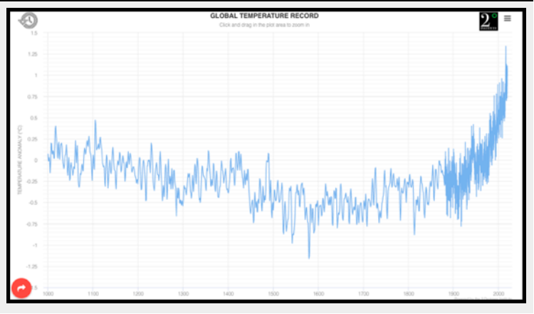
If you move your cursor over the blue plot line you can read the temperature anomaly for any one year. Note – this works a bit differently on the denser right-hand side of the plot. More about that later. The three bars in the upper right corner of graph is a pull-down menu that allows you to change the graph, print it, and so on. The clock symbol in the upper left corner expands the time scale to 800 thousand years.
For this activity use the temperature record for the past 1000+ years to address the following questions…
Questions
- What and when was the highest temperature shown on the graph? What and when was the lowest?
- What are the time differences between adjacent temperature record on the left side of the graph? On the right side of the graph?
- What is the reason for this switch? Hint – if you click on the menu in the upper right and select “Data sources and credits” you can read about how the data for this graph was collected.
Activity B – Establishing trends
In determining whether global temperatures are rising or falling we need to look for long-term trends rather than focusing on short-term variations. In part B you will be looking at trends in the millennial temperature records and strategies for identifying these trends. To do so use the 1000-year graph to answer the following questions…
Questions
- How does temperature seem to vary from year to year?
- Given the year to year variation in temperature you saw, how would you go about determining where temperature was rising or falling for two or more centuries?
- Using the strategy, you outlined in question 5, what is the trend in Global temperature over the entire record (1000 to present)?
- What was the trend in temperature from 1000 to 1500? From 1500 to 1800? From 1800 to the present?
Activity C – Examining the instrumental record
Climate data collected since the beginning of the industrial revolution is often referred to as the instrumental record. This is because the climate data that was collected was measured directly with weather stations and satellites, rather than being estimated or inferred from historical records, tree rings, ice chemistry, or other physical evidence.
To see the instrumental record in greater detail in this graph move the cursor to 1880 and then click and drag the cursor to present day. This will highlight the part of the map you want to magnify. Once you’ve done this, the graph should zoom into the selected period. Having done this, address the following questions…
Questions
- What and when were the highest and lowest temperatures shown on the graph?
- What is the general trend in the temperature?
- During what years was the rate of increase the highest?
- During what years was there an extended period of cooling?
- During what years was there neither cooling or warming?
- How did the temperature change from 1880 to 1950 compare to that from 1950 to the present?