
13.14: Random sampling from a stationary Gaussian process
- Page ID
- 22535

Gaussian distributions are powerful tools for data analysis of randomly generated samples. Gaussian distributions are typically associated with a “Bell curve”, a graphical representation of a probability density function that is characterized by a peak at the data mean and a width determined by the standard deviation of the data set. The distribution of the curve around the mean is symmetric, with certain percentages of the data falling within one standard deviation of the mean. The probability that a data point exists within a certain range of values is equal to the area under the probability density curve between those two values. The total area under the curve is equal to one because all data points can be found to exists somewhere in that data set. For more detailed information on Gaussian distributions, consult the section on Continuous Distributions.
The random number sampler is a powerful tool and is very useful in process modeling. One example of a use for a random number samplers is to generate weather data from a model to simulate changing climate throughout the year, in order to properly maintain the temperature of a storage vessel. Another way it can be used is to create a control chart to monitor how well a process is controlled over time based on some information about normal system operation. The goal of random number generation is to be able to use large amounts of data based on limited experimentation to test a control scheme.
The objective of this article is to explain how random sampling to form a Gaussian data set is useful in process control. First is discussion of how to use a Gaussian distribution to analyze probability and compare the statistical similarities/differences between different data sets. Then is an explanation of how to use the Central Limit Theorem and show how to create a Gaussian distribution from non-Gaussian data using average values. Last are examples of how to use this theory in process controls, including how to generate and use control charts.
Random Number Sampler
The purpose of the random number sampler is to take randomly generated points and turn them into a Gaussian distribution (i.e. a PDF). It is important to use points distributed throughout the range of 0 to 1. This task is accomplished by assuming a random number (\(R\)) is equal to the ‘y’ value of the cumulative distribution function (CDF). The CDF is the cumulative area under the curve of the probability density function (PDF). By taking an integral from −∞ to x in the PDF, this ‘y’ value of the CDF can be found. Since the value of R is already known, we can find the \(x\) values of the CDF and thus, the PDF. With the \(x\) values of the PDF known, we can find \(P(x)\) and construct the Gaussian distribution. The relationship between \(R\) and \(x\) is shown below:
\[\begin{aligned}
R &=\int_{-\infty}^{\frac{x}{2}} \frac{1}{\sqrt{2 \pi(\sigma)^{2}}} e^{\frac{-(X-\mu)^{2}}{2(\sigma)^{2}}} d X \\
R &=\frac{1}{2}\left[\operatorname{Erf}\left(\frac{x-\mu}{\sigma \sqrt{2}}\right)-\operatorname{Erf}\left(\frac{-\infty-\mu}{\sigma \sqrt{2}}\right)\right] \\
R &=\frac{1}{2}\left[\operatorname{Erf}\left(\frac{x-\mu}{\sigma \sqrt{2}}\right)+1\right] \\
x &=\sigma \sqrt{2} \, \text{InverseErf} (2 R-1)+\mu
\end{aligned} \nonumber \]
The process of choosing a random number and implementing it into the PDF can be done using Mathematica. Excel is not recommended because it cannot compute the Erf() of a negative number, so we cannot use it for data points below the mean in a CDF.
The first step for random sampling a stationary Gaussian process is to input the mean (\(µ\)) and the standard deviation (\(σ\)) into the equation below. Then, you can determine the random points either with Random[ ] function in Mathematica or via user input to develop a list of random numbers between 0 and 1. Using a random number input as \(R\), Mathematica can be used to determine the corresponding data point x using the syntax below:
Solve[R == (1/2)*(Erf[(x- µ)/( σ*Sqrt[2])]+1), x]
The syntax can be repeated to determine as many random numbers and their corresponding x values as is necessary for your problem. A CDF plot can be created by plotting all of the random R values versus their corresponding \(x\) values.
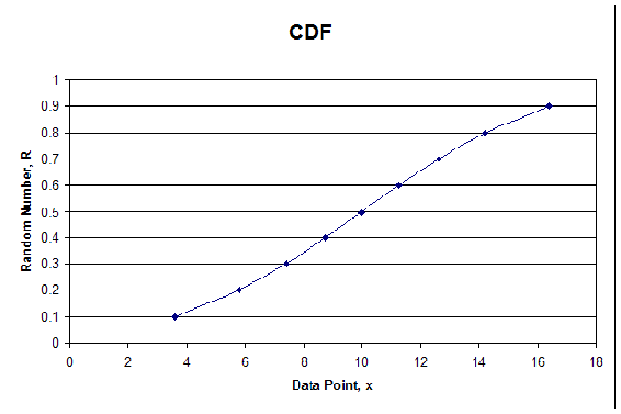
We will demonstrate how the procedure works in the following example. First, we chose 10 random numbers and found corresponding \(x\) values, given in Table 1 with µ = 10 and σ = 5. See Figure 1 for the plot of the CDF.
Table 1: CDF Random Numbers and Corresponding x Values

In order to develop the PDF you would input the mean and standard deviation into the following PDF equation, and find \(P(x)\) for each value of x.
\[P(\mu, \sigma)=\frac{1}{\sqrt{2 \pi \sigma^{2}}} e^{\frac{-(X-\mu)^{2}}{2 \sigma^{2}}} \nonumber \]
The syntax used in Mathematica is:
Solve[P(x) == (1/Sqrt[2*Pi*σ^2])*e^(-(x-µ)^2/(2*σ^2)), P(x)]
The syntax outputs values for \(P(x)\) which are then plotted against the x values calculated from the CDF. The following table shows the random numbers generated in Mathematica, the corresponding x values, and the \(P(x)\) values for the PDF. The plot of the PDF is also shown below.
Table 2: For Each R, x Values and Corresponding \(P(x)\) Values

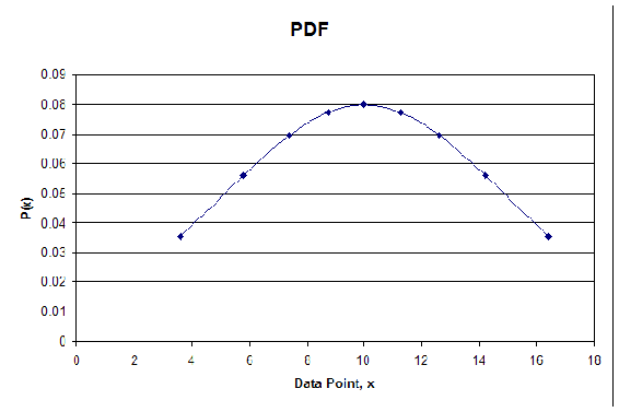
As you can see the plot is in fact Gaussian. The distribution will become more Gaussian as more random numbers are used. The take home message from the random number generator is that a data set with numbers ranging between 0 and 1, obtained through random number generation, can be converted into a Gaussian distribution.
Probability Primers
One major advantage of the random number sampler is the ability to generate different data sets without having to actually gather data. These data sets can be used to help you better understand the workings of many of the different statistical comparisons. For instance, if the sample size increases, does that lead to more or less significance in the difference of two means? Most of these analysis tools are the topics of other wikis, so we will revisit a few only briefly with the intent on asking more in-depth questions in example 1.
Probability
Recall that the area under any Gaussian function is related to the probability. Suppose we use our sampler to generate a random set of 100 data points with a mean of 10 and a standard deviation of 5. The probability of creating an additional data point between ‘a’ and ‘b’ is the integral of the Gaussian distribution function from ‘a’ to ‘b’ as follows:
\[P(a \leq x \leq b)=\int_{a}^{b} \frac{1}{\sqrt{2 \pi \sigma^{2}}} e^{\frac{-(x-\mu)^{2}}{2 \sigma^{2}}} d x \nonumber \]
Further information on probabilities can be found in the section on Continuous Distributions.
Error in the Mean
Assume we have the same data set as described above. Let’s say we wish to add a new data point and compute the probability that the new mean of the data set lies between ‘c’ and ‘d.’ This calculation is very similar to that described above with one difference. The standard deviation, which describes the variance in individual data points, is replaced with the standard error in the mean, which describes the variance in the mean as data sample size changes. The standard error in the mean is calculated as follows:
\[\sigma_{\mu}=\frac{\sigma}{\sqrt{n}} \nonumber \]
Once this value is obtained, we can solve for the probability as follows:
\[P(a \leq \mu \leq b)=\int_{c}^{d} \frac{1}{\sqrt{2 \pi \sigma_{\mu}^{2}}} e^{\frac{-(x-\mu)^{2}}{2 \sigma_{\mu}^{2}}} d x \nonumber \]
Further information on standard error can be found in section on the Comparison of Two Means.
Comparison of Two Data Sets
Now suppose we have two distinct data sets with different means and standard deviations and we wish to determine if one data set is statistically different from the second. To do this, we will compute a p-value. The p-value is computed as follows:
\[\begin{array}{l}
P\left(\mu_{1} \rightarrow \mu_{2}, \mu_{1}<\mu_{2}\right)=\int_{m}^{\infty} \frac{1}{\sqrt{2 \pi \sigma_{\mu 1}^{2}}} e^{\frac{-(x-\mu)^{2}}{2 \sigma_{\mu 1}^{2}}} d x \\
P\left(\mu_{1} \rightarrow \mu_{2}, \mu_{1}>\mu_{2}\right)=\int_{-\infty}^{m} \frac{1}{\sqrt{2 \pi \sigma_{\mu 1}^{2}}} e^{\frac{-(x-\mu)^{2}}{2 \sigma_{\mu 1}^{2}}} d x
\end{array} \nonumber \]
Further information on p-values and mean comparisons can be found in these wiki articles: Comparison of Two Means and P-Values
Central Limit Theorem
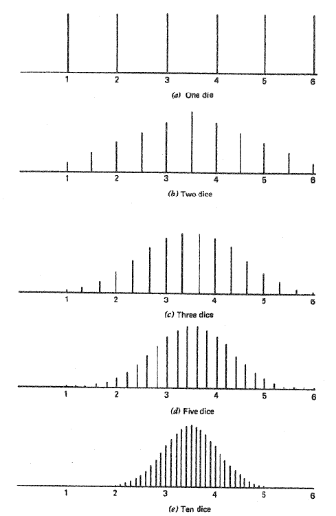
Recall that one property of the random number sampler was that as the set of randomly generated numbers increased, errors became more random and the distribution became more Gaussian. The central limit theorem states that the sampling of a given distribution mean will approach a normal or Gaussian distribution as the sample size increases. This theorem is proven by the following example illustrated in the “Statistics for Experimenters: An Introduction to Design, Data Analysis, and Model Building.”
Rolling of Dice
The probability that a certain face will land upright when rolling a six-sided die is the same for each face. This is shown below in Figure 3 (a). The mean value of a roll can be calculated to be 3.5 by summing up the value of each face and dividing by 6. As the sample size is increased, this mean value will be shown to have the highest density of occurance. When the sample size is increased to two dice you can notice in Figure 3 (b) that the density distribution of the average score begins to take the shape of a curve. The density distribution of the average score for sample size increases to three, five, and ten dice are shown in Figure 3 (c, d, and e respectively). For each increase it can be noted that the density of the extreme values decreases and the overall density distribution appears more like a Gaussian distribution, as predicted by the central limit theorem.
Random Number Generation
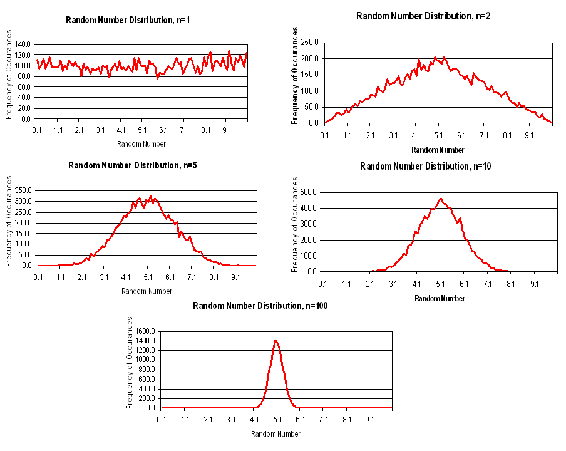
The above dice example is analogous to random number generation. Consider a set of random numbers between 0 and 10. If these numbers were truly chosen randomly, then you would expect an even distribution of numbers between 0 and 10. The average of these numbers would be about 5, with a large standard deviation. However, let’s suppose your data set now consists of an average of two random numbers. In this case, the data will be less evenly distributed, as averaging tends to lessen the contribution of terms further away from 5. The shape of the distribution will begin to appear Gaussian.
As you increase the number of random numbers averaged together (‘n’) to create each data point, the distribution becomes more Gaussian in nature. Please refer to figure 4. When n=1 (one random number is used to compute each data point), the density distribution is relatively even. As ‘n’ increases, the curves become more Gaussian in nature until we have a very smooth Gaussian distribution when n=100 (100 random numbers were averaged to obtain one data point).
In a healthy adult female, studies have shown that the mean fraction of deoxygenated blood leaving the lungs is 0.05 with a standard deviation 0.01. To obtain this data, 100 healthy females had been sampled using our random number sampler.
- Assuming this distribution is Gaussian, 95% of all healthy females will have deoxygenated blood fractions in what range (assume this range is centered over the mean of the data)?
- What is the expected error in the mean to a 95% level of confidence?
- A second study has been conducted on pregnant adult females. It was found that the mean fraction of deoxygenated blood leaving the lungs was 0.06 with a standard deviation of 0.02. Is the deoxygenated blood concentration in this population of women statistically different?
- Now assume that only 10 adult females had been sampled instead of 100. Analyze how the answer to part (c) may change.
Solution
a) To solve this problem, recall the equation of a Gaussian distribution. Substitute in the value of the mean (0.05) and standard deviation (0.01). Next, recall that the area under the curve corresponds to probability, so we can set integrate this function to determine the range at which the probability equals 0.95. The bounds on this integral are 0.05 + k and 0.05 – k, since we are assuming this data range is centered about the mean. This integral can be solved in integral form or in error function form, depending on the commands you choose to use in inputting the function into a computer algebra system solver. Maple, Excel, and Mathematics can be used to solve the expression simply by entering the last line of math text shown in the solution below.
\[\begin{array}{l}
P(\mu, \sigma)=\frac{1}{\sqrt{2 \pi \sigma^{2}}} e^{\frac{-(x-\mu)^{2}}{2 \sigma^{2}}} \\
P(\mu, \sigma)=\frac{1}{\sqrt{2 \pi(0.01)^{2}}} e^{\frac{-(x-0.05)^{2}}{2(0.01)^{2}}} \\
0.95=\int_{005-k}^{005+k} \frac{1}{\sqrt{2 \pi(0.01)^{2}}} e^{\frac{-(x-0.05)^{2}}{2(001)^{2}}} d x \\
0.95=\frac{1}{2}\left[\operatorname{Erf}\left(\frac{0.05+k-0.05}{0.01 \sqrt{2}}\right)-\operatorname{Erf}\left(\frac{0.05-k-0.05}{0.01 \sqrt{2}}\right)\right] \\
k=0.02
\end{array} \nonumber \]
Therefore, 95% of healthy adult females have deoxygenated blood levels between 0.03 and 0.07.
b) This problem is solved much in the same way we solved part (a). However, in this case we are looking for the 95% confidence interval of the mean, and not the entire population. Therefore, the standard deviation must be converted to the standard error in the mean. Then, all the above calculations are repeated.
\[\begin{aligned}
&\sigma_{\mu}=\frac{\sigma}{\sqrt{n}}=\frac{0.01}{\sqrt{100}}=0.001\\
&P\left(\mu, \sigma_{\mu}\right)=\frac{1}{\sqrt{2 \pi(0.001)^{2}}} e^{\frac{-(x-0.05)^{2}}{2(0.001)^{3}}}\\
&0.95=\int_{0.05-k}^{0.05+k} \frac{1}{\sqrt{2 \pi(0.001)^{2}}} e^{\frac{-(x-0.09)^{2}}{2(0.001)^{2}}} d x\\
&0.95=\frac{1}{2}\left[\operatorname{Erf}\left(\frac{0.05+k-0.05}{0.001 \sqrt{2}}\right)-\operatorname{Erf}\left(\frac{0.05-k-0.05}{0.001 \sqrt{2}}\right)\right]\\
&k=0.002
\end{aligned} \nonumber \]
Therefore, the 95% confidence interval of the mean is 0.05 ± 0.002.
c) In order to compare the statistical significance of two different data sets, the concept of p-values must be used. Since we are interested comparing the means of these two data sets, standard deviation will be replaced by standard error in the mean. To find the probability (or p-value) that pregnancy results in higher levels of deoxygenated blood, we need to calculate the area under the Gaussian curve for healthy females that is 0.06 or more. Remember, we are evaluating the Gaussian function describing healthy females, so standard deviation data for the pregnant females is not needed.
\[\begin{aligned}
&\sigma_{\mu}=\frac{\sigma}{\sqrt{n}}=\frac{0.01}{\sqrt{100}}=0.001\\
&P\left(\mu, \sigma_{\mu}\right)=\frac{1}{\sqrt{2 \pi \sigma_{\mu}^{2}}} e^{\frac{-(x-\mu)^{2}}{2 \sigma_{k}^{2}}}\\
&P\left(\mu, \sigma_{\mu}\right)=\frac{1}{\sqrt{2 \pi(0.001)^{2}}} e^{\frac{-(x-005)^{2}}{2(0.001)^{2}}}\\
&P(x \geq 0.06)=\int_{0.06}^{\infty} \frac{1}{\sqrt{2 \pi(0.001)^{2}}} e^{\frac{-(x-0.05)^{2}}{2(0.001)^{1}}} d x\\
&P(x \geq 0.06)=\frac{1}{2}\left[\operatorname{Erf}\left(\frac{\infty-0.05}{0.001 \sqrt{2}}\right)-\operatorname{Erf}\left(\frac{0.06-0.05}{0.001 \sqrt{2}}\right)\right]\\
&P(x \geq 0.06)=\frac{1}{2}\left[1-\operatorname{Erf}\left(\frac{0.06-0.05}{0.001 \sqrt{2}}\right)\right]\\
&P(x \geq 0.06)=0
\end{aligned} \nonumber \]
The p-value is equal to zero. By convention, p-values less than 0.05 are considered to be statistically significant. Therefore, we conclude that pregnancy statistically affects the level of deoxygenated blood in an adult women’s body.
d) The size of the sample only has an affect on the standard error in the mean. To solve this problem, recalculate the standard error and repeat the calculations above.
\[\begin{aligned}
&\sigma_{\mu}=\frac{\sigma}{\sqrt{n}}=\frac{0.01}{\sqrt{10}}=0.003\\
&P\left(\mu, \sigma_{\mu}\right)=\frac{1}{\sqrt{2 \pi \sigma_{\mu}^{2}}} e^{\frac{-(x-\mu)^{2}}{2 \sigma_{k}^{2}}}\\
&P\left(\mu, \sigma_{\mu}\right)=\frac{1}{\sqrt{2 \pi(0.003)^{2}}} e^{\frac{-(x-0.09)^{3}}{2(0000)^{2}}}\\
&P(x \geq 0.06)=\int_{0.06}^{\infty} \frac{1}{\sqrt{2 \pi(0.003)^{2}}} e^{\frac{-(x-0.00)^{2}}{2(0.003)^{2}}} d x\\
&P(x \geq 0.06)=\frac{1}{2}\left[\operatorname{Erf}\left(\frac{\infty-0.05}{0.003 \sqrt{2}}\right)-\operatorname{Erf}\left(\frac{0.06-0.05}{0.003 \sqrt{2}}\right)\right]\\
&P(x \geq 0.06)=\frac{1}{2}\left[1-\operatorname{Erf}\left(\frac{0.06-0.05}{0.003 \sqrt{2}}\right)\right]\\
&P(x \geq 0.06)=0.0004
\end{aligned} \nonumber \]
In this case, the p-value is still less than 0.05, so we still arrive at the same conclusion. We also conclude that as sample size decreases, differences in sample means become less significant because the p-value has slightly increased.
This example is intended to demonstrate how increased sample size affects the comparison of two data sets.
Using a random number generator, four data sets (A,B,C,D) were generated. Each data set contains 100 total data points. For data sets A and B, two random numbers were averaged to attain each data point, while in C and D, five random numbers were averaged for each point. This difference resulted in smaller standard deviations for data sets C and D. A summary of the four data sets created is shown in the following chart. M is the number of random samples averaged to obtain each data point. N is the total number of data points. The mean and standard deviation for each of the data sets is also given.
- Compare the means of data sets A and B by calculating the p-value
- Compare the means of data sets C and D by calculating the p-value
- Compare the p-values obtained for parts a) and b) above. Explain why the values make sense.
- What general effect does increasing sample size have on the comparison of two data sets?
Solution
a) The p-value comparing data sets A and B is computed as follows:
\[\begin{aligned}
&\sigma_{\mu}=\frac{\sigma}{\sqrt{n}}=\frac{2.3}{\sqrt{100}}=0.23\\
&P\left(\mu, \sigma_{\mu}\right)=\frac{1}{\sqrt{2 \pi \sigma_{\mu}^{2}}} e^{\frac{-(x-\mu)^{2}}{2 \sigma_{k}^{2}}}\\
&P\left(\mu, \sigma_{\mu}\right)=\frac{1}{\sqrt{2 \pi(0.23)^{2}}} e^{\frac{-(x-5)^{2}}{2(0.23)^{2}}}\\
&P(x \geq 5.5)=\int_{55}^{\infty} \frac{1}{\sqrt{2 \pi(0.23)^{2}}} e^{\frac{-(x-5)^{3}}{2(0.23)^{3}}} d x\\
&P(x \geq 5.5)=\frac{1}{2}\left[\operatorname{Erf}\left(\frac{\infty-5}{0.23 \sqrt{2}}\right)-\operatorname{Erf}\left(\frac{5.5-5}{0.23 \sqrt{2}}\right)\right]\\
&P(x \geq 5.5)=\frac{1}{2}\left[1-\operatorname{Erf}\left(\frac{5.5-5}{0.23 \sqrt{2}}\right)\right]\\
&P(x \geq 5.5)=0.015
\end{aligned} \nonumber \]
From this p-value, we can see that it is very unlikely that these two data sets are statistically the same. There is only a 1.5% chance of randomly getting a data set with a mean as high as 5.5! It is far more likely that these two data sets are actually statistically different.
b) The p-value comparing data sets C and D is computed as follows:
\[\begin{aligned}
&\boldsymbol{\sigma}_{\mu}=\frac{\boldsymbol{\sigma}}{\sqrt{n}}=\frac{1.1}{\sqrt{100}}=0.11\\
&P\left(\mu, \sigma_{\mu}\right)=\frac{1}{\sqrt{2 \pi \sigma_{\mu}^{2}}} e^{\frac{-(x-\mu)^{2}}{2 \sigma_{F}^{2}}}\\
&P\left(\mu, \sigma_{\mu}\right)=\frac{1}{\sqrt{2 \pi(0.11)^{2}}} e^{\frac{-(x-5)^{3}}{2(0.11)^{2}}}\\
&P(x \geq 5.5)=\int_{5.5}^{\infty} \frac{1}{\sqrt{2 \pi(0.11)^{2}}} e^{\frac{-(x-5)^{2}}{2(0.11)^{3}}} d x\\
&P(x \geq 5.5)=\frac{1}{2}\left[\operatorname{Erf}\left(\frac{\infty-5}{0.11 \sqrt{2}}\right)-\operatorname{Erf}\left(\frac{5.5-5}{0.11 \sqrt{2}}\right)\right]\\
&P(x \geq 5.5)=\frac{1}{2}\left[1-\operatorname{Erf}\left(\frac{5.5-5}{0.11 \sqrt{2}}\right)\right]\\
&P(x \geq 5.5)=0
\end{aligned} \nonumber \]
From this p-value, we can see that these two data sets are statistically different. There is an almost 0 percent chance of randomly getting a data set with a mean as high as 5.5!
c) Comparing the two p-values, we can see that the value for b) is smaller than a), indicating that we are more confident about a statistical difference between sets C and D than between A and B. Going back to the description of the problem, we can find a reason for this result. Because of the larger sampling of random numbers in data sets C and D (five numbers averaged for each data point, compared to just two), these data sets have smaller standard deviations. These smaller standard deviations mean that we have a higher level of confidence that the sample mean is the true mean. Because each data set is more likely to show the true mean, there is also an increased likelihood that one data set is statistically different from the other.
d) In a Gaussian distribution, as sample size increases, standard error decreases. This indicates that the sample mean is closer to the true mean, and two data sets are more likely to be statistically different from each other than if there are smaller sample sizes and higher standard deviations in the data sets.
Control Charts
This section will provide a brief overview on control charts in order to complete example 3, in which our random number sampler is applied to a control chart situation. For a more detailed explanation on control charts, and the methodology behind them, please see this wiki page: Control Charts
Background
Controls charts are tools used to determine whether a particular part of a process is predictable or not. A process is predictable when it is in a state of statistical control and unpredictable when it is not in a state of statistical control. A state of statistical control simply means that we can accurately predict what the output of a process will be in the future based on past measurements; it does not mean that the product is on target or within any limits of consumer acceptability. The random number sampler is a useful tool that can be used to analyze control charts. As previously discussed, a data set is more Gaussian in nature as the amount of data points is increased. Therefore, one will expect that a large set of data generated with our random number sampler will always be in statistical control, but smaller sets may contain an element of unpredictability.
To create a control chart, we begin by looking at historical data measurements on the measurement (variable) of importance, e.g. acetic acid concentration. Once a reasonable amount of data has been gathered, it is used to calculate appropriate limits for the variable. If the historical data and future measurements fall within the range of the limits, it is safe to predict that future measurements will also continue to be within the range of the limits. Conversely, if the historical data does not fall within the range of the limits, it can be safely predicted that future measurements will not fall within the range of the limits.
Constructing Control Charts
The best way to illustrate how to create a control chart is to go through an example. This is done below. The initial assumption in developing a control chart is that the process is stable over period of time where a set of measurements can be made on a particular variable of the process. In the example below, this variable is acetic acid concentration.
Chemical engineers often combine acetic anhydride and water to produce acetic acid in a moderately exothermic reaction. The reaction in this particular process is supposed to produce a product stream of acetic acid at 5.5 wt%. The composition of the product stream is measured four times every hour for ten hours. Each hour’s measurements are viewed as a subgroup of data. Table 1 shows the data obtained from the 40 measurements. Table 1 also listed the average concentration and the range of concentrations for each subgroup of measurements.
Table 3. Sample Data - Acetic Acid Concentration

To create a control chart for this process, we must first compute the average concentration for each subset. Additionally, we must determine the range of data for each subset. These steps have already been completed and their values are listed in Table 3 in the last two columns on the right. Next the grand average concentration and average range should be computed by averaging the average concentrations of each subset and by taking the average of each subset's ranges. For the data in table 3, the grand average concentration is 5.51 wt% and the average range is 0.74 wt%. At this point, we are ready to determine our upper and lower control limits for our acetic acid concentration. To determine these limits we will need to use a table of constants that have been mathematically derived for Gaussian distributions. These numbers can then be inserted into equations that find the upper and lower average control limits (UCLx and LCLx) and the upper and lower range control limits (UCLR andLCLR). The following equations provide the control limits for the average concentrations and for their ranges.

Table 5. Constants for Average and Range Charts Based on the Average Range
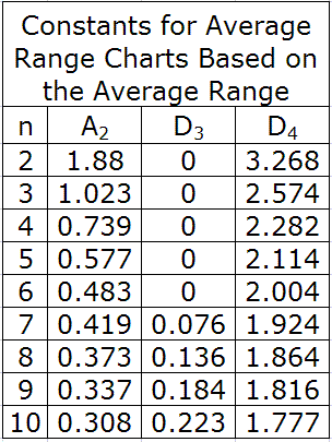
For this example, our subgroup size, n, is 4, A2 is 0.729, D3 is 0 and D4 is 2.282. When plugged into the above equations, they yield control limits of:
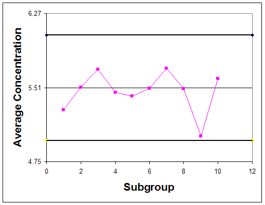
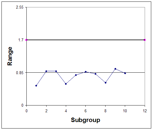
Graphically the control chart is represented by creating a plot of the average concentration values versus their subgroup number and creating a plot of each range value versus the subgroup number. Horizontal lines should be included on these plots which indicate the control limits. Control charts for this example are plotted in figures 3 and 4.
Interpreting Control Charts
If any of the following rules hold true for the centering control chart, the process is not in statistical control.
- One or more points fall outside the control limits.
- Seven or more consecutive points fall on the same side of the centerline.
- Ten of 11 consecutive points fall on the same side of the centerline.
- Three or more consecutive points fall on the same side of the centerline and all are located closer to the control limit than the centerline.
Observe that in both the control chart for the average concentrations, the historical data never exceeds or goes below the control limits. Also, none of the other rules above hold true for this chart. This suggests that the process is stable; however, to confirm this thought, future observations must be made. If the average acetic acid concentration and its range continues to stay within the control limits, the process is said to be stable.
In the event that the historical data did not stay within the control limits, the plots could have looked like figures 5 & 6.
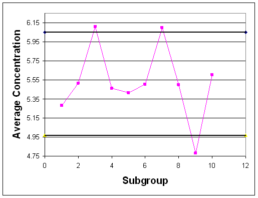
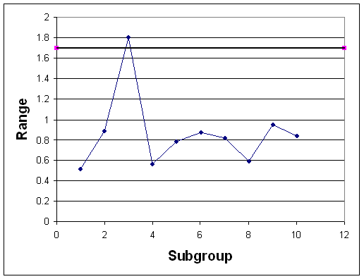
Observe that in each of these control charts, the historical data does not stay within the control limits for the process. Based on this observation, it can be predicted that future data will also not stay within the control limits for the process and the process is not stable. In conclusion, control charts allow you to use samples of data to determine the control limits for a process and evaluate if the process is stable or not.
In an industrial bioengineering process, it is desired to obtain a 75% proline to 25% hydroxyproline ratio in a specialized enzyme. The relative compositions can be analyzed using a fluorescent dye, where a fluorescence of 10 corresponds to the correct ratio of these two amino acids. To monitor the stability of this process, five reading are taken every 30 minutes for the duration of the 10 hour production process. The results were obtained using our random number sampler with a specified mean (10) and standard deviation (in this case 1.6). The results are in the table below

- Calculate the average and range for each data subgroup.
- Create an average and range chart for the entire time of production.
- Is this process in control?
Solution
The average and range can be calculated using the =AVERAGE() and =MAX()-MIN() functions of Microsoft excel.

b) The grand average is 10.2 and the average range is 3.8. Using Table 2, A2 = 0.577, D3 = 0, and D4 = 2.114. Therefore:

The charts are as follows:
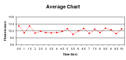
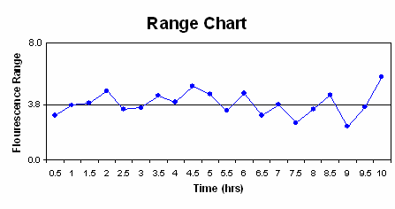
c) The first rule is not violated as none of the points fall outside the upper and lower control limits. Seven or more points do not fall on one side of the centerline (the maximum was six), so rule two is not violated. Rule three was not violated, as 10 of 11 points did not fall on the same side of the centerline (in ouir case, eight was the mx). Finally, rule four was not violated as none of the points were closer to the control limits then the centerline. Therefore, this process is under statistic control since none of the rules were violated.
Our random number sampler was designed based on which key principle:
- Data points obtained by taking the average of several random numbers are more likely to fit a Gaussian distribution.
- The area under a Gaussian distribution is always between zero and one and equal to the 'y' value of the CDF.
- The distribution of data points in a Gaussian distribution is caused by random uncertainties.
- A process under Gaussian statistical control will not have a data sample exceed the upper or lower control limit
- Answer
-
A
Which of the following would decrease the p-value if comparing two different data sets:
- Smaller sample size
- Smaller count of averaged random numbers
- Smaller standard deviation
- Smaller difference in mean values
- Answer
-
C
References
- Box, George E., William G. Hunter, and J S. Hunter. Statistics for Experimenters: An Introduction to Design, Data Analysis, and Model Building. New York: John Wiley & Sons. 43-45.
- Liptak, Bela G. "Process Control and Optimization." Instrument Engineers' Handbook 4: 405-413.
- Wheeler, Donald J., and David S. Chambers. Understanding Statistical Process Control. 2nd ed. Knoxville: SPC P. 37-88.
- Woolf, Peter, Amy Keating, Christopher Burge, and Michael Yaffe. Statistics and Probability Primer for Computational Biologists. Massachusetts Institute of Technology. 2004.