
2.2: Design Priniciples
- Page ID
- 93783
As you develop the structural layout of your Web site you also begin packaging its content as individual Web pages with specified links between them. A common way of modeling the content and links between Web pages is called storyboarding. This technique visually maps Web content to Web pages and describes the links that implement the logical relationships between topics. Storyboarding forces you to flesh out your topics and refine their relationships.
Content Packaging
Consider the following illustration of a portion of the structure of this HTML tutorial. This diagram represents the layout of the first section of tutorials with topics identified along with menu links to the associated pages.
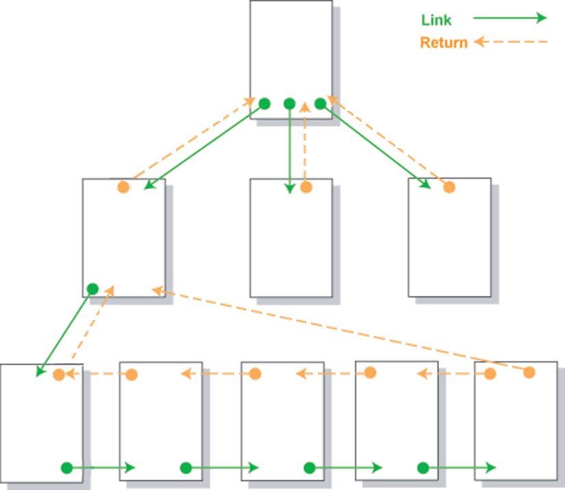
Figure \(\PageIndex{1}\): Structure of portion of HTML tutorial.
Since the pages appear inside frames there is no need for return links. The menu is always accessible for direct linkage to any page. Although additional linear links between pages would be an option, these extra links would be redundant.
Design Drawings
You shouldn't pay a lot of attention to the format and symbols used in the high-level storyboard in Figure 12-4. There are no formal graphical standards for storyboarding. You might, in fact, draw your layout in crayon on the back of a grocery bag and accomplish your purpose just as well. Sometimes professional developers become overly committed to using formal graphical tools to make design drawings and lose sight of their purpose, which is to construct mental models, or abstractions, of designs in order to manipulate them intellectually. The purpose is not to produce pretty drawings. Pick the symbols and techniques that work best for you. Of course, if you work professionally as a site designer, there may be in-house architectural standards for design drawings. However, you can always reproduce your conceptual drawings as design documentations when that time comes.
With this structural layout in hand the next step is to elaborate the content appearing on each page. One way to do this is with a text outline of topics, subtopics, and "talking points," much like you would do for a written report. For instance, the first page of this tutorial can be outlined as follows.
Internet History and Usage
- Introduction
- ARPANET
- Origins of ARPA
- Purposes of ARPANET
- Distributed packet switching (Leonard Kleinrock)
- ARPA network growth
- TCP/IP
- NSFNET
- Origins and purpose
- Defunding implications
- Internet definition
- WWW
- Hypertext concept (Ted Nelson)
- World Wide Web beginnings (Tim Berners-Lee)
- Browser development
- Technical Convergence
- Protocols
- Formatting language
- Internet Usage Statistics
- Country ranking by usage
- Regional ranking
- Internet Technologies
- Connection speeds
- Browser version
- Screen resolution
- Color depth
Since a Web page can be as much a visual experience as a textual one, some Web page authors utilize graphical storyboarding in addition to text outlines to indicate page content. This technique roughs out the main formatting characteristics of the page as well as organizes the content. The following illustration is one way to graphically characterize the first portion of the opening page of this tutorial.
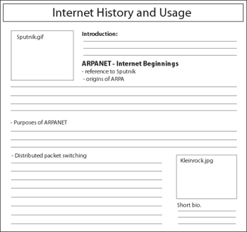
Figure \(\PageIndex{3}\): Storyboard for a Web page.
Although it is shown here as a graphic image, the storyboard for a page can be a hand drawing or an HTML layout of the page. You might wish to use WYSIWYG editors such as FrontPage or Dreamweaver to produce "quick and dirty" layouts. The purpose is not to generate specific content but to indicate some beginning page design thoughts. You might wish to note the main headings that appear on the page, any graphics or tables that need to be included, a rough estimate of the amount of space to be devoted to different topics, and any links to internal pages or external sites.
You should, though, at this point begin to firm up the basic, common design that will be used across all pages. In order to visually and operationally tie your pages together with a common "look and feel" it is appropriate to settle on design considerations such as page margins and paragraph styles, color schemes, heading sizes and colors, text fonts and sizes, link formats, and other general design characteristics that will be common to your pages.
One of the advantages of using HTML editors at this point is that you can experiment with different designs. As you settle these overall design issues you also can begin constructing the Cascading Style Sheets that will be applied to your pages. Use a linked style sheet for overall design and formatting with embedded or in-line style sheets to alter or enhance styles for particular pages.
Design Issues
The following are other design issues that you should keep in mind when storyboarding and developing a Web site:
- Repetition
- Contrast
- Proximity
- Alignment
- Load Time
- Horizontal Scrolling
- White Space
- Screen Resolution
Page Sizes
One major design issue relates to the appropriate size for a Web page. The width of the page needs to take into account the width of the browser window which, in turn, is determined by the user's screen resolution. Standard horizontal and vertical screen resolutions are 800x600, 1024x768, and 1280x1024 pixels.
Currently, 1366x768 is the most common screen resolution. Unless you have reason to do otherwise -- knowing, for example, that your population of visitors uses other resolutions -- then it makes sense to target your pages to 1366x768 screens. In short it is good practice to optimize Web pages for 1366x768, but use a liquid layout that stretches well for any resolution, from 800x600 to 1280x1024.
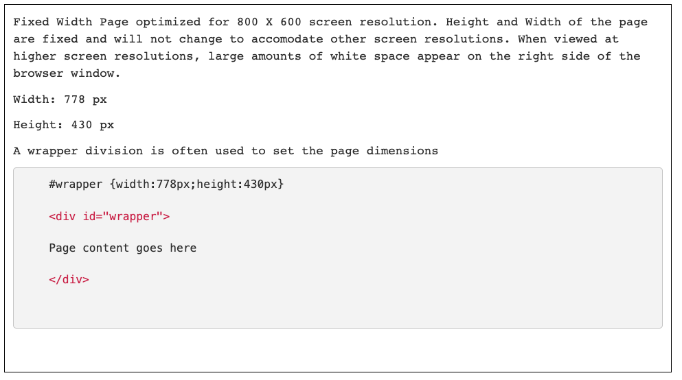
The browser window, though, contains borders, menu bars, status bars, scroll bars, and other trappings that reduce the amount of space within which a Web page is displayed. The following table gives the dimensions of the effective sizes of browser display windows under different screen resolutions.
| Screen Resolution | Browser Window Size |
| 800x600 | 778x430 |
| 1024x768 | 1004x598 |
| 1200x1024 | 1259x553 or more |
Horizontal Sizing
The browser word-wraps free-flowing text so that it always stays within page margins. Other page elements, however -- such as graphics or text containers that are of fixed sizes -- may not fit within these boundaries. The problem that is caused is a horizontal scroll bar on the browser window, something that should be avoided on all Web pages. There are few things more irritating, or unproductive for that matter, than having to scroll back and forth to view Web page content.
The following browser window illustrates the problem and the solution. The first shaded division has a width setting of 760 pixels, proper for a screen resolution of 800 x 600. However, when displayed in a browser on a 640 x 480 screen, the division extends beyond the page margin and introduces a horizontal scroll bar to view its entire width.
Page Widths
Here is a text paragraph. By default the browser word wraps text to keep it within the boundaries of the browser window. Other page elements, however, can extend beyond the margins of the page.
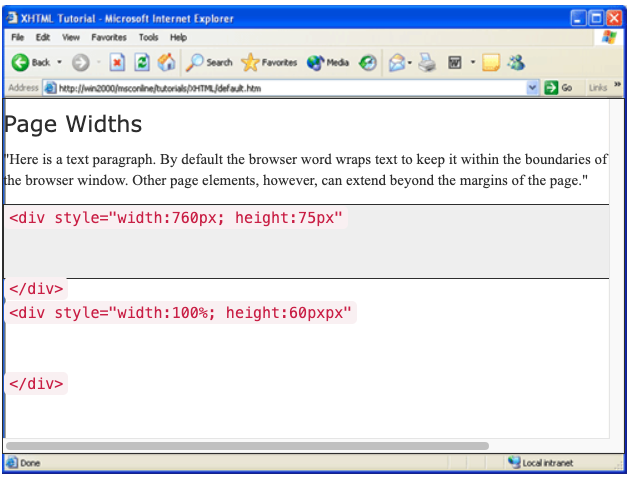
The best solution for sizing text blocks is to use a percentage measure as is done in the second division. The width shown here is 100%. Therefore, the division will extend only to the width of the page margins irrespective of screen resolution.
When displaying graphics, horizontal sizing is a little more problematic since adjusting widths may distort the picture or cause pixelization when forced to widths larger than its original size. It is always best to size the picture itself rather than adjusting it with style settings. Pick a size that fits within a 600 x 400 window to ensure that it fits properly within any other browser window.
Vertical Sizing
Obviously, there's not a lot that can be done about the vertical sizes of Web pages. They expand to encompass the amount of content. Of course, you can always subdivide your content into separate, shorter pages with links between them. The trade-off becomes one of vertical scrolling versus link clicking, neither of which has particular priority for user friendliness.
Design Mythologies
You may encounter page design guidelines that recommend nonscrolling pages in all cases -- that all pages should fit within the browser window without even vertical scrolling. Not only does this guideline make it difficult for the designer to find physical page breaks where none my logically exist, it introduces excessive clicking and linking that can disrupt the reader's flow of thought. It is best never to let physical containers dictate the flow of their content. Use reasoned judgement to determine how best to package your information.
Page Organization
Recognize that the reader's first impression is produced by what is seen at the top of the page when it first loads. In newspaper parlance this is the page area "above the fold" which provides the first clues about page content. This is the most important real estate on the page when it comes to serving the browsing needs of visitors.
Visitors arrive at a Web page looking for information. The initial page load should either provide that information or quickly direct visitors to it. A typical design for the top of each page includes,
- A common identity -- a banner, logo, and/or headings -- to tie the page visually to other pages of the site.
- The most important information on the page or a summary, possibly with links down-page to sections of detail information.
- A common menu of links to other major sections of the site.
- A menu of links pertinent to the content of the page.
Readers should know at first glance whether this page contains the information they are looking for. If so, they can scroll down to find it; if not, they can immediately navigate to other pages.
Page Layout Techniques
Fixed or Absolute Design
A fixed design utilizes CSS to configure a fixed-width block level element or page wrapper to format the page. A fixed design page is aligned with the left margin and the width of the page is set using a fixed unit such as pixels. The right hand side of the browser window will often contain empty or white space. When using a fixed page layout, it is possible to configure a page to look best at a certain screen resolution such as 1024 by 768. A disadvantage of the fixed design is that a page is designed to be optimized for a specific screen resolution. Viewing the page at other resolutions will include large amounts of white space on the right hand side of the browser window and horizontal scrolling will occur at lower screen resolutions.
A fixed layout is often preferred if you want tighter control over the appearance of your pages. Pages that contain lots of graphic images or other elements that are absolutely positioned, tend to benefit from a fixed page layout. If a fixed layout is used, the fixed dimensions should be set at reasonable levels to accommodate the most common screen resolution settings used by page visitors. This will help to prevent horizontal scrolling and a layout bordered by a sea of white space.
Liquid or Relative Design
A liquid design results in a web page layout that takes up 100% (or other percentage values) of the browser window regardless of the user's screen resolution. Unlike the fixed design, a liquid design uses percentages or a relative unit of measure to set the page width. With the liquid design there is no blank margin on the left or right side. A site that uses a liquid layout will expand and contract to fit the size of the browser window. A Web page with a width of 80% will always span 80% of the browser window regardless of the screen resolution.

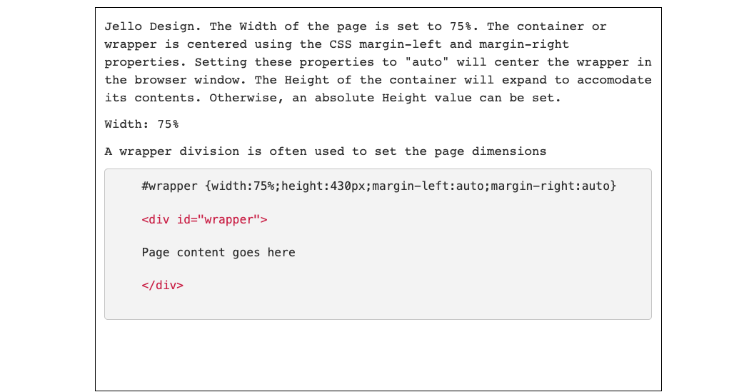
Jello Design
A jello design involves centering all content on the page. This design can be configured using a fixed width or liquid width. Regardless of the screen resolution, the content is always centered on the page. This is accomplished by using the "margin-left" and "margin-right" CSS properties.
When designing a page, there is no simple answer to which layout technique will work best. Designing for different resolutions can sometimes seem like you are standing between a rock and a hard place. The use of one method over the other will not solve all your problems. Regardless of which technique is used, it is important to always test your pages under a reasonably high resolution and a low resolution to see how it appears. In most cases, you will have to live with some imperfections when your site is viewed under extreme settings.