
15.3: Advanced Plot Formatting
- Page ID
- 85210

By Adam L. Lambert, chapter 15
In this section we will take a look at some more detailed plot formatting. For readability, the code presented will focus on the concept being discussed. Replicating example images may require additional code. For example, it is assumed that the basics of title, legend, axis, etc. are understood. These commands will only be shown when necessary. Also, initial examples will show the calculation of the data to be plotted. As we move through the chapter this code will be omitted for brevity.
Some of this formatting will utilize options which can be passed directly into a function, others will be accesses through an object. These concepts will be discussed in the examples.
Line and Marker Size
MATLAB allows us the specify the thickness of a line or the size of a marker. The unit for each of theses pecifications is called a point. A point is equal to 1/72 of an inch and is the smallest unit of measure in typography.
LineWidth
The width of a line can be specified using the LineWidth option for the plot command. Like many other options in MATLAB, this option is defined using a name-value pair. We can pass the name of the option and the value that we want the option to have directly into the plot command. Here is a short example plotting two lines with different thicknesses. When we plot y2, the LineWidth option is passed into the plot command. Note that the option is in string quotes. The value that follows is the value that we will set for the option.
clear all, format compact, close all;
% x-array
x = [0:0.1:5];
% y-arrays
y1 = sin(x);
y2 = sin(x+(pi/4));
figure
% plot y1 with default width (0.5 pts)
plot(x,y1,'r-')
hold on;
% plot y1 with custom width (2 pts)
plot(x,y2,'b-', 'LineWidth', 2)
As you can see in the plot below, the blue line is signicantly thicker than the red line. Using bold lines often makes plots easier to read and is advised in most cases. The exact size will have the be determined on a case by case basis, but each plot should be easy to look at and interpret.
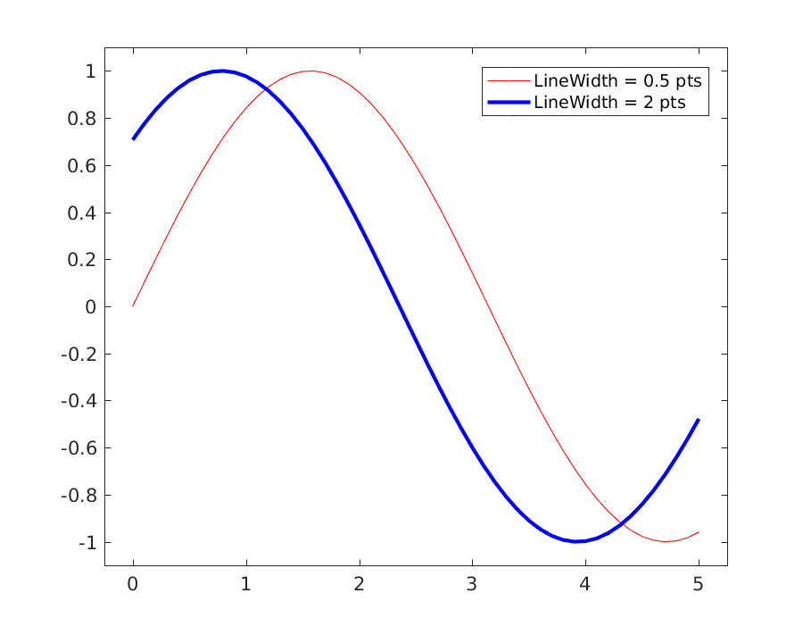
Caption: Results of the LineWidth option.
MarkerSize
For scatter plots of discrete data, the MarkerSize option is used to change the size of the marker. This option is a name-value pair as well. The default value for this option is 6 points. The code below compares the default size of the + marker with a custom size of 15 points.
n = 11;
% data 1
x1 = linspace(0,5,n);
y1 = linspace(2,7,n) + 2*rand(1,n);
% data 1
x2 = linspace(5,10,n);
y2 = linspace(2,7,n) + 2*rand(1,n);
figure
% plot y with default marker size
plot(x1,y1,'b+')
hold on;
% plot y with custom marker size
plot(x2,y2,'r+', 'MarkerSize', 15)
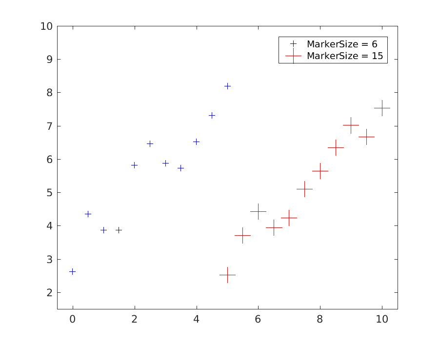
Caption: Results of the MarkerSize option.
Line and Marker Color
In earlier chapters we used letters to represent the colors that we were plotting. The letters were passed in as part of the LineSpec and we used 'r' for red and 'b' for blue, etc. In this chapter we'll learn how to specify colors using an RGB triplet. The colors created by your monitor, or any LED light, are all combinations of red, green, and blue. You can read about the RGB color model on Wikipedia.
https://en.Wikipedia.org/wiki/RGB_color_model
By passing an array with a value for red, a value for blue, and a value for green into the plot command, we can create custom colors for our plots.
Often the values for each channel range from 0-255 where 0 is completely absent and 255 is fully saturated. This is because there are 256 possibilities for an 8-bit slot of memory. MATLAB requires the values to be between 0 and 1, so we can look up RGB values for colors online and then divide them by 255.
Lines
This code will create two custom colors and then plots some lines. Also the line width is customized.
x1 = 0 : 0.5 : 5;
y1 = 8 - 0.2*x1 + 0*x1.^2 + 0.2*(x1-3).^3;
y2 = 6 - 0.7*x1 + 0*x1.^2 + 0.2*(x1-3).^3;
% define custom colors
custom_blue = [0,107,164]./255;
custom_orange = [255,128,14]./255;
figure;
% plot data with custom colors
plot(x1,y1,'-', 'Color', custom_blue, 'LineWidth', 2)
hold on;
plot(x1,y2,'-', 'Color', custom_orange, 'LineWidth', 2)
ylim([0,10])
As you can see, we use another name-value pair for the color option. In this case the value is an array of RGB values scales from 0-1. The first element is the red channel, the second element is the green channel, the third is the blue channel.
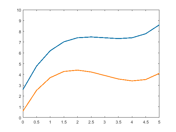
Caption: Lines plotted with custom colors.
As you can see these colors are softer and more aesthetic than the fully saturated values we get from the LineSpec.
Markers
Markers actually have two colors which can be changed, the border and the fill. This example will plot markers with a custom color for the fill, and the default black for the border. The size is also changed. Because the name-value pairs of the options are so long, we can split the command into multiple lines using the ellipsis (...) to break up the lines.
close all
% Lambert's Figure 15.3 doesn't specify the x1 & y1 vectors
% This is an approximation of y1 and y2
x1 = 0 : 0.5 : 5;
y1 = 8 - 0.2*x1 + 0*x1.^2 + 0.2*(x1-3).^3;
y2 = 6 - 0.7*x1 + 0*x1.^2 + 0.2*(x1-3).^3;
% define custom colors
custom_light_blue = [162,200,236]./255;
custom_light_orange = [255,188,121]./255;
figure;
% plot y with custom marker color
plot(x1,y1,'o','MarkerEdgeColor','k'...
,'MarkerFaceColor',custom_light_blue...
,'MarkerSize', 10)
hold on;
% plot y with custom marker color
plot(x1,y2,'d','MarkerEdgeColor','k'...
,'MarkerFaceColor',custom_light_orange...
,'MarkerSize', 10)
ylim([0,10])
The results of this code will look like this.
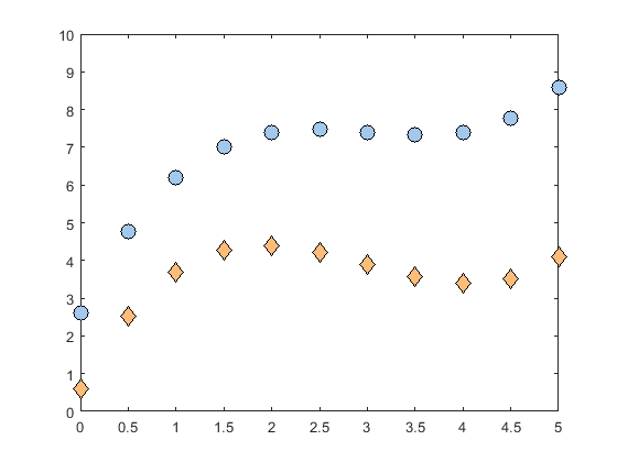
Caption: Markers with custom colored fill and black borders.
Axis
The axis command is fairly straightforward, but we can speed things up by automatically calculating the upper and lower bounds for each axis. This allows a plotting script to adapt to new data sets without manual editing. In this example we calculate the upper and lower bounds by finding the minimum and maximum values for each array and then subtracting a value which is scaled relative to the maximum value.
close all
x1 = 0 : 0.5 : 5;
y1 = 8 - 0.2*x1 + 0*x1.^2 + 0.2*(x1-3).^3;
% define custom colors
custom_light_blue = [162,200,236]./255;
figure;
% plot y with custom marker color
plot(x1,y1,'o','MarkerEdgeColor','k'...
,'MarkerFaceColor',custom_light_blue...
,'MarkerSize', 10)
% find x-axis limits
x_scale = 0.1;
x_min = min(x1) - x_scale*max(x1)
x_max = max(x1) + x_scale*max(x1)
% find y-axis limits
y_scale = 0.1;
y_min = min(y1) - y_scale*max(y1)
y_max = max(y1) + y_scale*max(y1)
% pass limits to axis command
axis([x_min, x_max, y_min, y_max])
In this case we use a scaling factor of 0.1 so the buffer will be 10% of the maximum value for each array.
We add it to the upper limit and subtract it from the lower limit. You can use whatever scaling factor makes
your plot look nice.
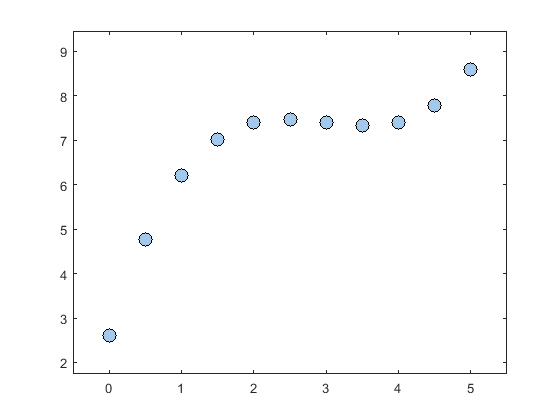
Caption: Automated axis scaling.
.