
15.5: Numerical Data- Histograms
- Page ID
- 39303

As I mentioned, sometimes we don’t actually care about the labels in a Series, only the values. This is when we’re trying to size up how often values of various magnitudes appear, irrespective of which specific objects of study those values go with.
My favorite plot is the histogram. It’s super powerful if you know how to read it, but underused because few people seem to know how. The idea is that we take a numeric, univariate data set, and divide it up into bins. Bins are sort of the reverse of quantiles: all bins have the same size range, but a different number of data points fall into each one.
Suppose we had data on the entire history of a particular NCAA football conference. A Series called “pts” has the number of points scored by each team in all that conference’s games. It looks like this:
Code \(\PageIndex{1}\) (Python):
print(pts)
| 0 7
| 1 35
| 2 40
| 3 17
| 4 10
| ...
| 399 14
| dtype: int64
Some basic summary statistics of interest include:
Code \(\PageIndex{2}\) (Python):
print("min: {}".format(pts.quantile(0)))
print(".25-quantile: {}".format(pts.quantile(.25)))
print(".5-quantile: {}".format(pts.quantile(.5)))
print(".75-quantile: {}".format(pts.quantile(.75)))
print("max: {}".format(pts.quantile(1)))
print("mean: {}".format(pts.mean()))
| min: 0.0
| .25-quantile: 17.0
| .5-quantile: 25.0
| .75-quantile: 32.0
| max: 55.0
| mean: 23.755
Looks like a typical score is in the 20’s, with the conference record being a whopping 55 points in one game. The IQR is 32− 17, or 15 points.
We can plot a histogram of this Series with this code:
Code \(\PageIndex{3}\) (Python):
pts.plot(kind='hist')
The result is in Figure 15.5.1. Stare hard at it. Python has divided up the points into ranges: 0 through 5 points, 6 through 11 points, 12 through 17, etc. Each of these ranges is a bin. The height of each blue bar on the plot is simply the number of games in which a team scored in that range.
Now what do we learn from this? Lots, if we know how to read it. For one thing, it looks like the vast majority of games have teams scoring between 12 and 38 points. A few teams have managed to eke out 40 or more, and there have been a modest number of singledigit scores or shutouts. Moreover, it appears that scores between 24 and 38 are considerably more common than those between 12 and 24. Finally, this data shows some evidence of being “bell-curvy” in the sense that values in the middle of the range are more common than values at either end, and it is (very roughly) symmetrical on both sides of the median.
This is even more precise information than the quantiles gave us. We get an entire birds-eye view of the data set. Whenever I’m looking at a numerical, univariate data set, pretty much the first thing I do is throw a histogram up on the screen and spend at least a couple minutes staring at it. It’s almost the best diagnostic tool available.
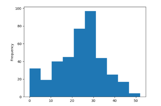
Figure \(\PageIndex{1}\): A histogram of the historical points-per-game for teams in a certain NCAA football conference.
Bin Size
Now one idiosyncrasy with histograms is that a lot depends on the bin size and placement. Python made its best guess at a decent bin size here by choosing ranges of 6 points each. But we can control this by passing a second parameter to the .plot() function, called “bins”:
Code \(\PageIndex{4}\) (Python):
pts.plot(kind='hist', bins=30)
Here we specifically asked for thirty bins in total, and we get the result in Figure 15.5.2. Now each bin is only two points wide, and as you can see there’s a lot more detail in the plot.
Whether that amount of detail is a good thing or not takes some practice to decide. Make your bins too large and you don’t get much precision in your histogram. Make them too small and the trees can overwhelm the forest. In this case, I’d say that Figure 15.5.2 is good in that it tells us something not apparent from Figure 15.5.1: there are quite a few shutouts (zero-point performances), not merely games with six-points-or-less. Whether the trough between 22 and 24 points is meaningful is another matter, and my guess is that part is obscuring the more general features apparent in the first plot.
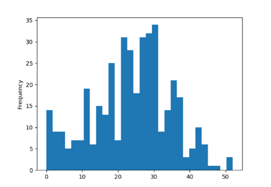
Figure \(\PageIndex{2}\): The same data set as in Figure 15.5.1, but with more (and smaller) bins.
The rule is: whenever you create a histogram, take a few minutes to experiment with different bin sizes. Often you’ll find a “sweet spot” where the amount of detail is just right, and you’ll get great insight into the data. But you do have to work at it a little bit.
Non-Bell-Curvy Data
Let’s return again to the YouTube example. We had some surprises when we looked at the quantiles and saw that the 1-quantile (max) was astronomically higher than the .9-quantile was. Let’s see what happens when we plot a histogram (show in Figure 15.5.3):
Code \(\PageIndex{5}\) (Python):
num_plays.plot(kind='hist', color="red")
Figure \(\PageIndex{3}\): A first attempt at plotting the YouTube num_plays data set.
Huh?? Wait, where are all the bars of varying heights? We seem to have got only a single one.
But they’re there! They’re just so small you can’t see them. If you stare at the x-axis – and your eyesight is good – you might see tiny signs of life at higher values. But the overall picture is clear: the vast, vast majority of videos in this set have between 0 and 100,000 plays.
Let’s see if we can get more detail by increasing the number of bins (say, to 1000):
Code \(\PageIndex{6}\) (Python):
num_plays.plot(kind='hist', bins=1000, color="red")
We now get the left-hand side of Figure 15.5.4. It didn’t really help much. Turns out the masses aren’t merely crammed below a hundred thousand plays; they’re crammed below one thousand. We need another approach if we’re going to see any detail on the lowplay videos.
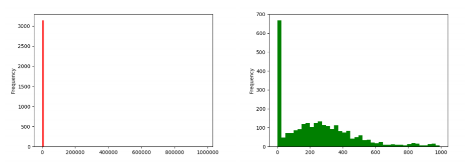
Figure \(\PageIndex{4}\): Further attempts at plotting the YouTube num_plays data set. On the left side, we decreased the bin size to no avail. On the right side, we gave up on plotting the popular videos and concentrated only on the unpopular ones, which does illuminate the lower end somewhat. (Don’t miss the x-axis ranges!)
The only way to really see the distribution on the low end is to only plot the low end. Let’s use a query to filter out only the videos with 1000 plays or fewer, and then plot a histogram of that:
Code \(\PageIndex{7}\) (Python):
unpopular_video_plays = num_plays[num_plays <= 1000]
unpopular_video_plays.plot(kind='hist', color="green")
This gives the right-hand side of Figure 15.5.4. Now we can at least see what’s going on. Looks like our Series has a crap-ton of videos that have never been viewed at all (recall our .1-quantile epiphany for this data set on p.151) plus a chunk that are in the 500-viewsor-fewer range.
The takeaway here is that not all data sets (by a long shot!) are bell-curvy. Statistics courses often present nice, symmetric data sets on physical phenomena like bridge lengths or actor heights or free throw percentages, which have nice bell curves and are nicely summarized by means and standard deviations. But for many social phenomena (like salaries, numbers of likes/followers/plays, lengths of Broadway show runs, etc.) the data looks more like this YouTube example. A few extremely large values dominate everything else by their sheer magnitude, which makes it more difficult to wrap your head around.
It also makes it more challenging to answer the question, “what’s the typical value for this variable?” It ain’t the mean, that’s for sure. If you asked me for the “typical” number of plays of one of these YouTube videos, I’d probably say “zero” since that’s an extremely common value. Another reasonable answer would be “somewhere in the low hundreds,” since there are quite a few videos in that range, as illustrated by the right-hand-side of Figure 15.5.4. But you’d be hard-pressed to try and sum up the entire data set with a single typical value. There just isn’t one for stuff like this.