
15.6: Numerical Data- Box Plots
- Page ID
- 39304

Let’s talk about one more type of plot in this chapter, even though it’s really most useful when dealing with bivariate data, as we’ll address in chapter 20. It’s called the box plot (also known as a “box-and-whisker” plot). We can create one by passing “kind="box"” to the .plot() method (here for the NCAA football data):
Code \(\PageIndex{1}\) (Python):
pts.plot(kind="box")
The result is shown in Figure 15.6.1, along with some annotations in red so you can figure out what’s going on.
For now, don’t worry about the mysterious word “None” at the bottom. (This indicates which “group” the box represents, and will feature prominently in our bivariate data chapter.) For a univariate data set like this one, the x-axis has no meaning. The y-axis, on the other hand, is easy to understand: it’s the number of points per football game.
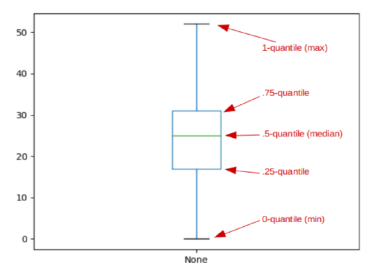
Figure \(\PageIndex{1}\): A box plot of the NCAA points data.
Now the thing to realize about box plots is that they’re essentially just a graphical way of showing quartiles; or, put another way, a graphical way of showing these five quantiles:
- The 0-quantile (the minimum value) is the y-value of the bottom “whisker.”
- The .25-quantile is the y-value of the bottom of the “box.”
- The .5-quantile (the median) is the y-value of the horizontal line within the box.
- The .75-quantile is the y-value of the top of the “box.”
- The 1-quantile (the maximum value) is the y-value of the top “whisker.”
Using your quantile knowledge from section 15.2, you’ll realize the following fact: the box alone contains exactly half the data points. This is a key insight. While the whiskers show the entire range of the data, the box shows the middle 50% of it. (And the height of the box is precisely the IQR.) This makes it very easy to grasp where the bulk of the data lies, and it reinforces the lesson we learned from the histogram on this data set (Figure 15.1 on page 161): a big chunk of the time, teams score in the 20’s.
You might object to showing an entire plot for this, since I’ve just revealed that it’s merely a fancy way to show five numbers. And you’re right, in a way. However, when we show multiple groups of data side-by-side, each with their own box, it becomes a particularly powerful tool. Stay tuned for that.
Outliers
What happens if we show our head-scratching YouTube data set as a box plot? You get the monstrosity in Figure 15.6.2.
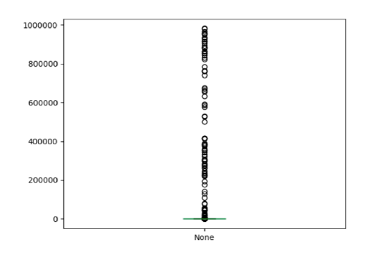
Figure \(\PageIndex{2}\): A box plot of a non-bell-curvy data set.
Geez Louise, does that look wacky. The little circles (which to me always looked like bubbles from fish breath) represent outliers, an important concept in data science. An outlier is basically any data point that’s so far out of the normal range that it seems strange. Python is essentially flagging it for us, so we can judge for ourselves whether it was a data entry error or just a strange data point. In this case, these aren’t errors – there’s just a handful of videos that have been played a ton of times. And this makes the whole box plot look weird.
Notice from Figure 15.6.2 that the entire box and both whiskers have gotten smooshed at the bottom of the figure, as if crushed by the gravity of a black hole. You’ll see that the top whisker doesn’t really mean “maximum,” since it’s way down there in thousandland despite the fact that we have videos with almost a million views. The top whisker truly means “the maximum reasonablelooking data point in the Series,” where “reasonable-looking” is something Pandas is trying to make an educated guess about. There are ways to tweak what counts as an outlier, but my purpose here is just to get you to realize that when you have a highly skewed data set (like YouTube), prepare to see lots of things that are considered “outliers,” and prepare to comb through all the mess on your box plots to try and discern the true meaning it’s trying to convey.