
20.4: One Categorical and One Numeric Variable
- Page ID
- 39344

Next let’s consider the case where we want to test for an association between one categorical and one numeric variable. This is the “gender vs. IQ” scenario from the last chapter. In the people example, we might look at gender vs. salary to whether different genders earn different amounts of money on average.
Grouped Box Plots
The best plot for this scenario (IMHO) is the grouped box plot. It’s the same as the chapter 15 box plots, except that we draw a different box (and pair of “whiskers”) for each group.
Here’s the command in Pandas:
Code \(\PageIndex{1}\) (Python):
people.boxplot('salary',by='gender')
This produces the plot on the left-hand side of Figure 20.1. Refer back to section 15.6 (p. 165) for instructions on how to interpret each part of the box and whiskers. From the plot, it doesn’t look like there’s much difference between the males and females, although those identifying with neither gender look perhaps to be somewhat of a salary disadvantage.
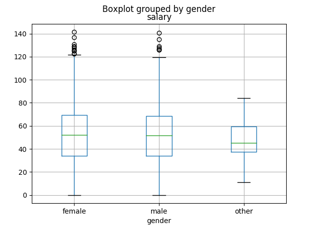
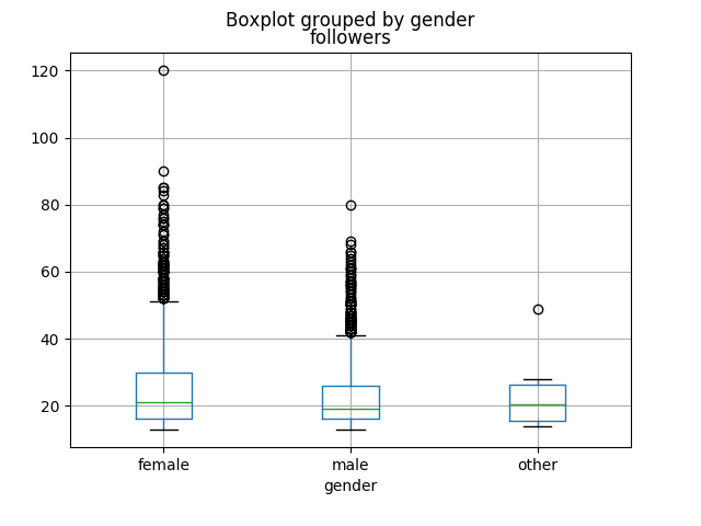
Figure \(\PageIndex{1}\): Grouped box plots of salary (left) and number of social media followers (right), grouped by gender.
Similarly, we get the plot on the right-hand side with this code:
Code \(\PageIndex{2}\) (Python):
people.boxplot('salary',by='followers')
This looks more skewed (females appear to perhaps have more followers on average than males), but of course we won’t know for sure until we run the right statistical test.
The t-test
The test we’ll use for significance here is called the t-test (sometimes “Student’s t-test”) and is used to determine whether the means of two groups are significantly different.1 Remember, we can get the mean salary for each of the groups by using the .groupby() method:
Code \(\PageIndex{3}\) (Python):
people.groupby('gender')['salary'].mean()
| gender
| female 52.031283
| male 51.659983
| other 48.757000
Females have the edge over males, 52.03 to 51.66. Our question is: is this “enough” of a difference to justify generalizing to the population?
To run the t-test, we first need a Series with just the male salaries, and a different Series with just the female salaries. These two Serieses are not usually the same size. Let’s use a query to get those:
Code \(\PageIndex{4}\) (Python):
female_salaries = people[people.gender=="female"]['salary']
male_salaries = people[people.gender=="male"]['salary']
and then we can feed those as arguments to the ttest_ind() function:
Code \(\PageIndex{5}\) (Python):
scipy.stats.ttest_ind(female_salaries, male_salaries)
| Ttest_indResult(statistic=0.52411385896, pvalue=0.60022263724)
This output is a bit more readable than the χ2 was. The second number in that output is labeled “pvalue”, which is over .05, and therefore we conclude that there is no evidence that average salary differs between males and females.
Just to complete the thought, let’s run this on the followers variable instead:
Code \(\PageIndex{6}\) (Python):
female_followers = people[people.gender=="female"]['followers']
male_followers = people[people.gender=="male"]['followers']
scipy.stats.ttest_ind(female_salaries, male_salaries)
| Ttest_indResult(statistic=9.8614730266, pvalue=9.8573024317e-23)
Warning! When you first look at that p-value, you may be tempted to say “9.857 is waaay greater than .05, so I guess this is a ‘no evidence’ result as well.” Not so fast! If you look at the entire number – including the ending – you see:
9.857302431746571e-23
that sneaky little “e-23” at the end is the kicker. This is how Python displays numbers in scientific notation. The “e” means “times-ten-to-the.” In mathematics, we’d write that number as:
9.857302431746571 × 10⁻²³
which is:
.000000000000000000000009857302431746571
Wow! That’s clearly waaay less than .05, and so we can say the average number of followers does depend significantly on the gender.
Be careful with this. It’s an easy mistake to make, and can lead to embarrassingly wrong slides in presentations.
More than Two Groups: ANOVA
By the way, the t-test is only appropriate when your categorical variable has two values (male vs. female, for example, or vaccinated vs. non-vaccinated). If there are more than two, the appropriate test to run is called an “ANOVA” (ANalysis Of VAriance). It’s beyond the scope of this text, but it’s described in any intro stats textbook and is eminently Googleable.