
4.1: Graphics
- Page ID
- 14929

The main commands that we will use in this chapter are
plot, subplot,figure and hold
and the customizations
xlim, ylim, xlabel, ylabel, and title.
Plots in Matlab are created by simply “connecting the dots.” This means that you have to provide the actual coordinates of the points − both the x and y coordinates. It is not enough to simply say plot y = x2, you must give exactly which x values you want squared.
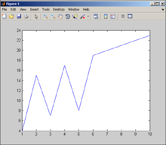
Example 4.1.1: Basic Plot
Define:
>> x = [1:10]; y = [4 15 7 17 8 19:23];
Then to plot the corresponding coordinates, connected by line segments, use
plot(x,y)
That’s all you do. The resulting plot is:
Let’s take the last example and add some markers and labels.
Example 4.1.2: Plot with labels
>> x = [1:10]; y = [4 15 7 17 8 19:23];
>> plot(x,y,'-->b')
>> title('My plot')
>> xlim([0,11])
>> ylim([0,30])
>> text(7,15,'My function')
The plot is now:
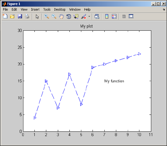
In this last example, you can see that there is a title, the limits on the graph are now 0 to 11 (for x) and 0 to 30 (for y), and there is text on the screen, starting at the coordinate (7,15). The symbols '-->b ' indicate that the lines should be dashed, the points marked with triangles and the lines colored blue (the default color if none is provided).
If you want to plot more than one set of data in the same figure window, there are two ways to do this. You can put both in the same plot command or by using the hold command with two plot commands (see next example).
Example 4.1.3: Two Functions - one plot command
>> x1 = [1:10];y1 = [4 15 7 17 8 19:23];
>> x2 = [3:3:12];y2 = [0 5 3 10];
>> plot(x1,y1,x2,y2,'+')
>> xlim([0,13]),ylim([-1,25])
The plot is now:
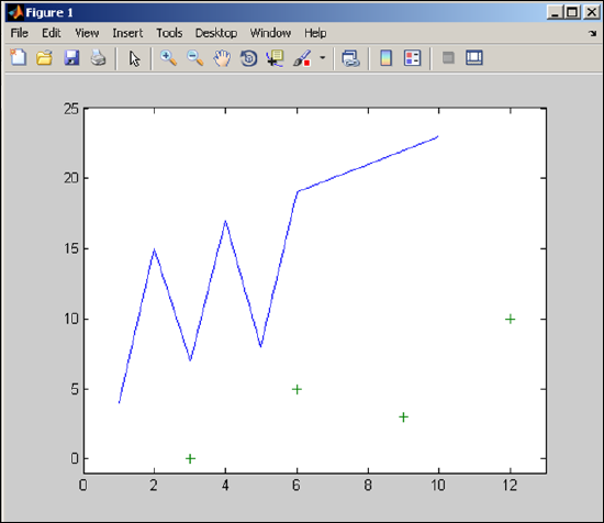
So, from this example we can see that if you want to use the same plot command, you simply list the pairings, (with any details following each pair) x1,y1,x2,y2,x3,y3,· · · . The default colors start with blue followed by green. The symbol '+' means that the second plot is points (not lines) marked with plus signs.
Example 4.1.4: Two Functions - two plot commands
We use data from the last example, but use the hold command.
>> x1 = [1:10];y1 = [4 15 7 17 8 19:23];
>> x2 = [3:3:12];y2 = [0 5 3 10];
>> hold on
>> plot(x1,y1)
>> plot(x2,y2,'+')
>> xlim([0,13]),ylim([-1,25])
The plot is now:
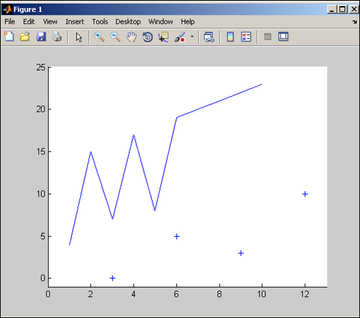
In the last example, if you didn’t include the hold command, the second plot would simply overwrite the first. Also, since we didn’t specify new colors, both plots are blue (the default color of a single plot). Here we look at the subplot command as well as bar graphs and pie charts to create multiple graphs on the same figure.
Example 4.1.5: The subplot command
>> x = [1,2,4,5,8]; y = [x;1:5];
>> subplot(2,3,1), bar(x)
>> subplot(2,3,2), bar(y)
>> subplot(2,3,3), bar3(y)
>> subplot(2,1,2), pie(x)
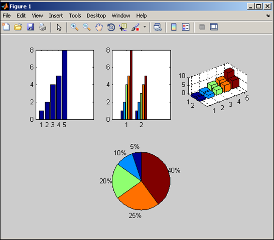
In this example, the subplot on each line does two things. First, it (invisibly) subdivides the figure into rows and columns and second, it indicates where the plot will be shown (counting across the rows). That is:
subplot(# rows,# columns, location)
You can see in the example that even though the plot was “broken up” into 2 rows and 3 columns in the first three subplot lines, the fourth line re-subdivides the plot into 2 rows and 1 column so that the final plot can take up the entire bottom of the plot. Using the subplots does not require the hold command.
The previous examples give just a beginning of the graphics capabilities of Matlab (including 3D as in the last example). We will see more graphics in the remainder of the text, but we suggest reading through the help files for (many) more details.