
15.1: Graphing
- Page ID
- 15006

Graphing is a great way for interpreting technical and scientific data. Two areas will be discussed: 1) graphical presentation of data, 2) graphical analysis.
Mathcad provides several graphing options.
The easiest way to begin a plot is to use the graphing toolbox.
OR
Use the menu options Insert/Graph/X-Y Plot
OR
Shortcut [Shift + 2]
The toolbar looks like
and clicking on the first button creates a blank plot
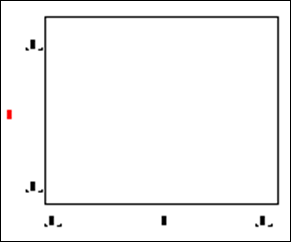
There are six place holders in the empty graph. The centered place holders are used for x-coordinate and y-coordinate data and the other four are for the x and y bounds.
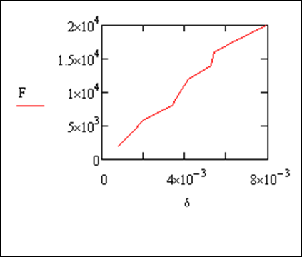
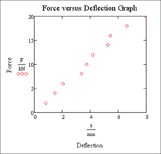
Example 15.1.1
An engineer is testing a new material to find its modulus of elasticity, defined as the stress over the strain (or N/m). Plot the data given F vs. δ.
Solution
\[F:=\begin{pmatrix}
2\\
4\\
6\\
8\\
10\\
12\\
14\\
16\\
18\\
20
\end{pmatrix}.kN\nonumber\]
\[δ:=\begin{pmatrix}
0.82\\
1.47\\
2.05\\
3.37\\
3.75\\
4.17\\
5.25\\
5.44\\
6.62\\
7.97
\end{pmatrix}.mm\nonumber\]
If you wish to make any plot bigger, click on the plot. Grab the bottom right hand handle with the mouse and drag it to make it larger. If you want to reposition a plot, click on the plot, point to the outside edge of the area until you see the hand, hold the mouse button down and drag the plot to a new location.
Note
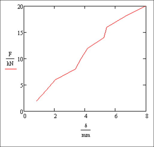
Mathcad always plots in base units. So the plot in example 47 is in bNewtons for the F and in meters for the δ. Here we show the enlarged plot with the units removed. As you see the plot now shows the values in the above tables with a unit on the axis. The center place holders have the data value divided by the unit F/kN and δ/mm.
However, in example 47 suppose we really want to see just the data points, not the connecting lines. To do this, double click the graph to bring up the formatting dialog box.
Go to the TRACES tab to add a symbol and remove the line. As you can see from the other tabs in this dialog box, you make many changes to the way the graph is formatted. A possible, reformatted graph appears below.
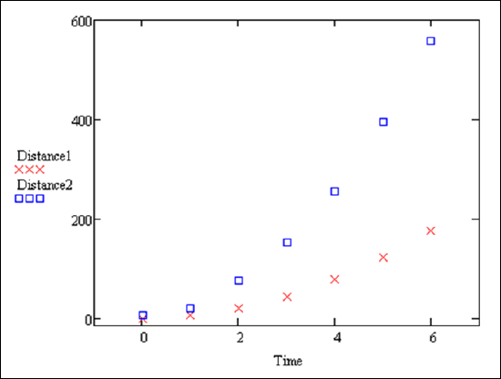
How about plotting multiple curves on the same plot? We demonstrate this in the following example.
Example 15.1.2
Begin by entering the data for the variables Time, Distance1 and Distance2.
\[Time:=\begin{pmatrix}
0\\
1\\
2\\
3\\
4\\
5\\
6
\end{pmatrix}\nonumber\]
\[Distance1:=\begin{pmatrix}
0\\
4.9\\
19.6\\
44.1\\
78.4\\
122.5\\
176.4
\end{pmatrix}\nonumber\]
\[Distance2:=\begin{pmatrix}
5\\
19.8\\
76.8\\
153.3\\
256.2\\
394.5\\
559.2
\end{pmatrix}\nonumber\]
Open a new plot and put Time in the x-axis. For the y-axis, enter Distance1 and then type a comma (important!!). This will move you to a new line where you can type Distance2. When you are done, click outside the graph to see the plot. To customize the plot, double click the plot and use the Formatting dialog box. See if you can match the plot below:
If you want to see a plot of a predefined function, you can use a Quickplot.
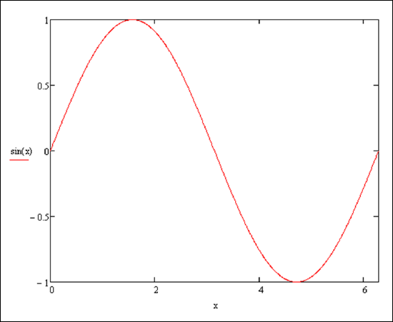
Example 15.1.3
Simply open a new plot, enter the variable x on the x-axis and a function, say sin(x) on the y-axis. The default plot has x from -10 to 10.
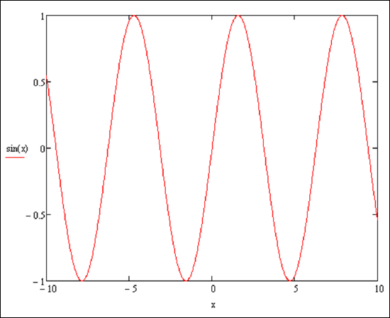
In example 15.1.3 if you want to change the x values, first single click on the plot. The numbers -10 and 10 appear at the bottom. One at a time simply click on them and type in the new values 0 and 2π (using the Greek toolbar).
Now for a more advanced example...
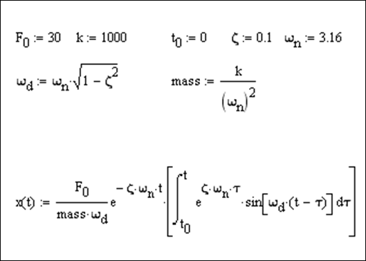
Example 15.1.4
Here is the vibration response of a damped signal of freedom system to a step input.
with resulting plot:
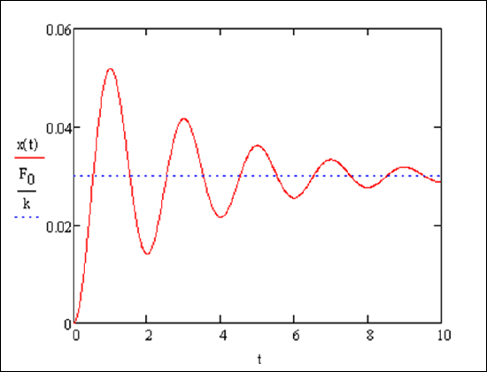
The last example may be difficult to reproduce. Mastering how to input all of these parts into Mathcad takes time. Be patient.