4.8: Extending the Settings Browser
- Page ID
- 44003

As explained in the Section 5.2, the Settings Browser is by default able to manage simple preference types. These default possibilities are generally enough. But there are some situations where it can be very helpful to be able to handle more complex preference values.
As an example, let us focus on the text selection preferences. We have the primary selection and three other optional kinds of text selection, the secondary selection, the ‘find and replace’ selection and the selection bar. For all selections, a background color can be set. For the primary, the secondary and the find and replace selection, a text color can also be chosen.
Declaring selection settings individually
So far, according to the default possibilities, a setting can be declared for each of the text selection characteristics so that each corresponding preference can be changed individually from the Settings Browser. Settings declared for a particular selection kind can be grouped together as children of a setting group. As an immediate improvement, for an optional text selection, a boolean setting can be used instead of a simple group.
As an example, let’s take the secondary selection. This text selection kind is optional and one can set a background and a text color for it. Corresponding preferences are declared as instance variables of ThemeSettings. Their values can be read and changed from the current theme by getting its associated ThemeSettings instance. Thus, the two color settings can be declared as children of the #useSecondarySelection boolean setting as given below:
(aBuilder setting: #useSecondarySelection)
    target: UITheme;
    targetSelector: #currentSettings;
    label: 'Use the secondary selection' translated;
    with: [
        (aBuilder setting: #secondarySelectionColor)
            label: 'Secondary selection color' translated.
        (aBuilder setting: #secondarySelectionTextColor)
            label: 'Secondary selection text color' translated].
The Figure \(\PageIndex{1}\) shows these setting declarations in the Settings Browser. The look and feel is clean but in fact two observations can be made:
- it takes three lines for each selection kind. This is a little bit uncomfortable because the view for one selection takes a lot of vertical space,
- the underlying model is not explicitly designed. The settings for one selection kind are grouped together in the Settings Browser, but corresponding preference values are declared as separated instance variables of
ThemeSettings. In the next section we see how to improve this first solution with a better design.

An improved selection preference design
A better solution would be to design the concept of text selection preference. Then, we have only one value to manage for each selection preference instead of three. A text selection preference is basically made of two colors, one for the background and the second for the text. Except the primary selection, each selection is optional. Then, we could design a text selection preference as follow:
Object subclass: #TextSelectionPreference
    instanceVariableNames: 'backgroundColor textColor mandatory used'
    classVariableNames: 'FindReplaceSelection PrimarySelection SecondarySelection
        SelectionBar'
    poolDictionaries: ''
    category: 'Settings-Tools'
TextSelectionPreference is made of four instance variables. Two of them are the colors. If the mandatory instance variable is set to false, then the used boolean instance variable can be changed. Instead, if the mandatory is set to true, then the used instance variable is set to true and is not changeable.
TextSelectionPreference has also four class variables, one for each kind of possible text selection preference. The getters and setters have also to be implemented to be able to manage these preferences from the Settings Browser. As an example, for PrimarySelection:
TextSelectionPreference class>>primarySelection
    ^ PrimarySelection
        ifNil: [PrimarySelection := self new
            textColor: Color black;
            backgroundColor: (Color blue alpha: 0.5);
            mandatory: true;
            yourself]
You can notice that the mandatory attribute is initialized to true.
Another example with the selection bar preference:
TextSelectionPreference class>>selectionBar
    ^ SelectionBar
        ifNil: [SelectionBar := self new
            backgroundColor: Color lightBlue veryMuchLighter;
            mandatory: false;
            yourself]
Here, you can notice that the preference is declared as optional and with no text color.
For these preferences to be changeable from the Settings Browser, we have to declare two methods. The first one is for the setting declaration and the second is to implement the view.
The setting declaration is implemented as follow:
TextSelectionPreference class>>selectionPreferenceOn: aBuilder
<systemsettings>
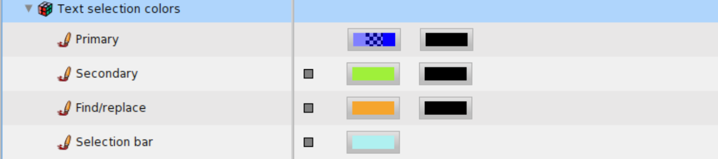
(aBuilder group: #selectionColors)
label: 'Text selection colors' translated;
parent: #appearance;
target: self;
with: [(aBuilder setting: #primarySelection) order: 1;
label: 'Primary'.
(aBuilder setting: #secondarySelection)
label: 'Secondary'.
(aBuilder setting: #findReplaceSelection)
label: 'Find/replace'.
(aBuilder setting: #selectionBar)
label: 'Selection bar']
As you can see, there is absolutely nothing new in this declaration. The only thing that changes is that the value of the preferences are of a user defined class. In fact, in case of user defined or application specific preference class, the only particular thing to do is to implement one supplementary method for the view. This method must be named settingInputWidgetForNode: and must be implemented as a class method.
The method settingInputWidgetForNode: responsibility is to build the input widget for the Settings Browser. This method takes a SettingDeclaration as argument. SettingDeclaration is basically a model and its instances are managed by the Settings Browser.
Each SettingDeclaration instance serves as a preference value holder. Indeed, each setting that you can view in the Settings Browser is internally represented by a SettingDeclaration instance.
For each of our text selection preferences, we want to be able to change their colors and if the selection is optional, have the possibility to enable or disable their. Regarding the colors, depending on the selection preference value, only the background color is always shown. Indeed, if the text color of the preference value is nil, this means that having a text color does not make sense and then the corresponding color chooser is not built.
The settingInputWidgetForNode: method can be implemented as below:
TextSelectionPreference class>>settingInputWidgetForNode: aSettingDeclaration
    | preferenceValue backColorUI usedUI uiElements |
    preferenceValue := aSettingDeclaration preferenceValue.
    usedUI := self usedCheckboxForPreference: preferenceValue.
    backColorUI := self backgroundColorChooserForPreference: preferenceValue.
    uiElements := {usedUI. backColorUI},
        (preferenceValue textColor
            ifNotNil: [ { self textColorChooserForPreference: preferenceValue } ]
            ifNil: [{}]).
    ^ (self theme newRowIn: self world for: uiElements)
        cellInset: 20;
        yourself
This method simply adds some basic elements in a row and returns the row. First, you can notice that the actual preference value, an instance of TextSelectionPreference, is obtained from the SettingDeclaration instance by sending #preferenceValue to it. Then, the user interface elements can be built based on the actual TextSelectionPreference instance.
The first element is a checkbox or an empty space returned by the #usedCheckboxForPreference: invocation. This method is implemented as follow:
TextSelectionPreference class>>usedCheckboxForPreference: aSelectionPreference
    ^ aSelectionPreference optional
        ifTrue: [self theme
            newCheckboxIn: self world
            for: aSelectionPreference
            getSelected: #used
            setSelected: #used:
            getEnabled: #optional
            label: ''
            help: 'Enable or disable the selection']
        ifFalse: [Morph new height: 1;
            width: 30;
            color: Color transparent]
The next elements are two color choosers. As an example, the background color chooser is built as follows:
TextSelectionPreference class>>backgroundColorChooserForPreference:
        aSelectionPreference
    ^ self theme
        newColorChooserIn: self world
        for: aSelectionPreference
        getColor: #backgroundColor
        setColor: #backgroundColor:
        getEnabled: #used
        help: 'Background color' translated
Now, in the Settings Browser, the user interface looks as shown in Figure \(\PageIndex{2}\), with only one line for each selection kind instead of three as in our previous version.