
18.2: Analysis Techniques for Laboratory
- Page ID
- 50312
\( \newcommand{\vecs}[1]{\overset { \scriptstyle \rightharpoonup} {\mathbf{#1}} } \)
\( \newcommand{\vecd}[1]{\overset{-\!-\!\rightharpoonup}{\vphantom{a}\smash {#1}}} \)
\( \newcommand{\dsum}{\displaystyle\sum\limits} \)
\( \newcommand{\dint}{\displaystyle\int\limits} \)
\( \newcommand{\dlim}{\displaystyle\lim\limits} \)
\( \newcommand{\id}{\mathrm{id}}\) \( \newcommand{\Span}{\mathrm{span}}\)
( \newcommand{\kernel}{\mathrm{null}\,}\) \( \newcommand{\range}{\mathrm{range}\,}\)
\( \newcommand{\RealPart}{\mathrm{Re}}\) \( \newcommand{\ImaginaryPart}{\mathrm{Im}}\)
\( \newcommand{\Argument}{\mathrm{Arg}}\) \( \newcommand{\norm}[1]{\| #1 \|}\)
\( \newcommand{\inner}[2]{\langle #1, #2 \rangle}\)
\( \newcommand{\Span}{\mathrm{span}}\)
\( \newcommand{\id}{\mathrm{id}}\)
\( \newcommand{\Span}{\mathrm{span}}\)
\( \newcommand{\kernel}{\mathrm{null}\,}\)
\( \newcommand{\range}{\mathrm{range}\,}\)
\( \newcommand{\RealPart}{\mathrm{Re}}\)
\( \newcommand{\ImaginaryPart}{\mathrm{Im}}\)
\( \newcommand{\Argument}{\mathrm{Arg}}\)
\( \newcommand{\norm}[1]{\| #1 \|}\)
\( \newcommand{\inner}[2]{\langle #1, #2 \rangle}\)
\( \newcommand{\Span}{\mathrm{span}}\) \( \newcommand{\AA}{\unicode[.8,0]{x212B}}\)
\( \newcommand{\vectorA}[1]{\vec{#1}} % arrow\)
\( \newcommand{\vectorAt}[1]{\vec{\text{#1}}} % arrow\)
\( \newcommand{\vectorB}[1]{\overset { \scriptstyle \rightharpoonup} {\mathbf{#1}} } \)
\( \newcommand{\vectorC}[1]{\textbf{#1}} \)
\( \newcommand{\vectorD}[1]{\overrightarrow{#1}} \)
\( \newcommand{\vectorDt}[1]{\overrightarrow{\text{#1}}} \)
\( \newcommand{\vectE}[1]{\overset{-\!-\!\rightharpoonup}{\vphantom{a}\smash{\mathbf {#1}}}} \)
\( \newcommand{\vecs}[1]{\overset { \scriptstyle \rightharpoonup} {\mathbf{#1}} } \)
\(\newcommand{\longvect}{\overrightarrow}\)
\( \newcommand{\vecd}[1]{\overset{-\!-\!\rightharpoonup}{\vphantom{a}\smash {#1}}} \)
\(\newcommand{\avec}{\mathbf a}\) \(\newcommand{\bvec}{\mathbf b}\) \(\newcommand{\cvec}{\mathbf c}\) \(\newcommand{\dvec}{\mathbf d}\) \(\newcommand{\dtil}{\widetilde{\mathbf d}}\) \(\newcommand{\evec}{\mathbf e}\) \(\newcommand{\fvec}{\mathbf f}\) \(\newcommand{\nvec}{\mathbf n}\) \(\newcommand{\pvec}{\mathbf p}\) \(\newcommand{\qvec}{\mathbf q}\) \(\newcommand{\svec}{\mathbf s}\) \(\newcommand{\tvec}{\mathbf t}\) \(\newcommand{\uvec}{\mathbf u}\) \(\newcommand{\vvec}{\mathbf v}\) \(\newcommand{\wvec}{\mathbf w}\) \(\newcommand{\xvec}{\mathbf x}\) \(\newcommand{\yvec}{\mathbf y}\) \(\newcommand{\zvec}{\mathbf z}\) \(\newcommand{\rvec}{\mathbf r}\) \(\newcommand{\mvec}{\mathbf m}\) \(\newcommand{\zerovec}{\mathbf 0}\) \(\newcommand{\onevec}{\mathbf 1}\) \(\newcommand{\real}{\mathbb R}\) \(\newcommand{\twovec}[2]{\left[\begin{array}{r}#1 \\ #2 \end{array}\right]}\) \(\newcommand{\ctwovec}[2]{\left[\begin{array}{c}#1 \\ #2 \end{array}\right]}\) \(\newcommand{\threevec}[3]{\left[\begin{array}{r}#1 \\ #2 \\ #3 \end{array}\right]}\) \(\newcommand{\cthreevec}[3]{\left[\begin{array}{c}#1 \\ #2 \\ #3 \end{array}\right]}\) \(\newcommand{\fourvec}[4]{\left[\begin{array}{r}#1 \\ #2 \\ #3 \\ #4 \end{array}\right]}\) \(\newcommand{\cfourvec}[4]{\left[\begin{array}{c}#1 \\ #2 \\ #3 \\ #4 \end{array}\right]}\) \(\newcommand{\fivevec}[5]{\left[\begin{array}{r}#1 \\ #2 \\ #3 \\ #4 \\ #5 \\ \end{array}\right]}\) \(\newcommand{\cfivevec}[5]{\left[\begin{array}{c}#1 \\ #2 \\ #3 \\ #4 \\ #5 \\ \end{array}\right]}\) \(\newcommand{\mattwo}[4]{\left[\begin{array}{rr}#1 \amp #2 \\ #3 \amp #4 \\ \end{array}\right]}\) \(\newcommand{\laspan}[1]{\text{Span}\{#1\}}\) \(\newcommand{\bcal}{\cal B}\) \(\newcommand{\ccal}{\cal C}\) \(\newcommand{\scal}{\cal S}\) \(\newcommand{\wcal}{\cal W}\) \(\newcommand{\ecal}{\cal E}\) \(\newcommand{\coords}[2]{\left\{#1\right\}_{#2}}\) \(\newcommand{\gray}[1]{\color{gray}{#1}}\) \(\newcommand{\lgray}[1]{\color{lightgray}{#1}}\) \(\newcommand{\rank}{\operatorname{rank}}\) \(\newcommand{\row}{\text{Row}}\) \(\newcommand{\col}{\text{Col}}\) \(\renewcommand{\row}{\text{Row}}\) \(\newcommand{\nul}{\text{Nul}}\) \(\newcommand{\var}{\text{Var}}\) \(\newcommand{\corr}{\text{corr}}\) \(\newcommand{\len}[1]{\left|#1\right|}\) \(\newcommand{\bbar}{\overline{\bvec}}\) \(\newcommand{\bhat}{\widehat{\bvec}}\) \(\newcommand{\bperp}{\bvec^\perp}\) \(\newcommand{\xhat}{\widehat{\xvec}}\) \(\newcommand{\vhat}{\widehat{\vvec}}\) \(\newcommand{\uhat}{\widehat{\uvec}}\) \(\newcommand{\what}{\widehat{\wvec}}\) \(\newcommand{\Sighat}{\widehat{\Sigma}}\) \(\newcommand{\lt}{<}\) \(\newcommand{\gt}{>}\) \(\newcommand{\amp}{&}\) \(\definecolor{fillinmathshade}{gray}{0.9}\)Data Analysis (for introductory students)
To continue on the previous section when we get data from experiments we wish to analysis it to be able to make reasonable conclusions. There are multiple methods of analysis for data, but for this introduction class we will look at just two: Fitting and Fast Fourier Transform (FFT).
In a typical experiment we would have one independent variable and one dependent variable (in the cases were there are a lot of independent variables producing different effects we would need to go to more sophisticated analysis techniques that are not the focus of this course - however from a computer point of view the functions to do these sophisticated analyzes are available in programs like Octave). Here we will show how one might use the fitting method for laboratory results and the FFT method to analyze data acquired in noisy circumstances (i.e. reality) and possibly pull out some useful data.
Fitting
During an experiment we will vary some variable to get results that, of course, we would like to draw some conclusions about. One of the most common techniques is to see if there is a relationship (such as a linear or quadratic) between the independent variable and dependent variable. To do that one must fit a model to the data. The most common fitting technique (or regression)1 is the least square method. In Octave (and MATLAB/Scilab, Python, IDL, etc.) there are routines available to do this type of fit for polynomials and other functions. Here we will detail the Octave method of doing one of these fits with the additional component of including error. Another fitting technique, the spline, will be demonstrated in the next section on FFTs.
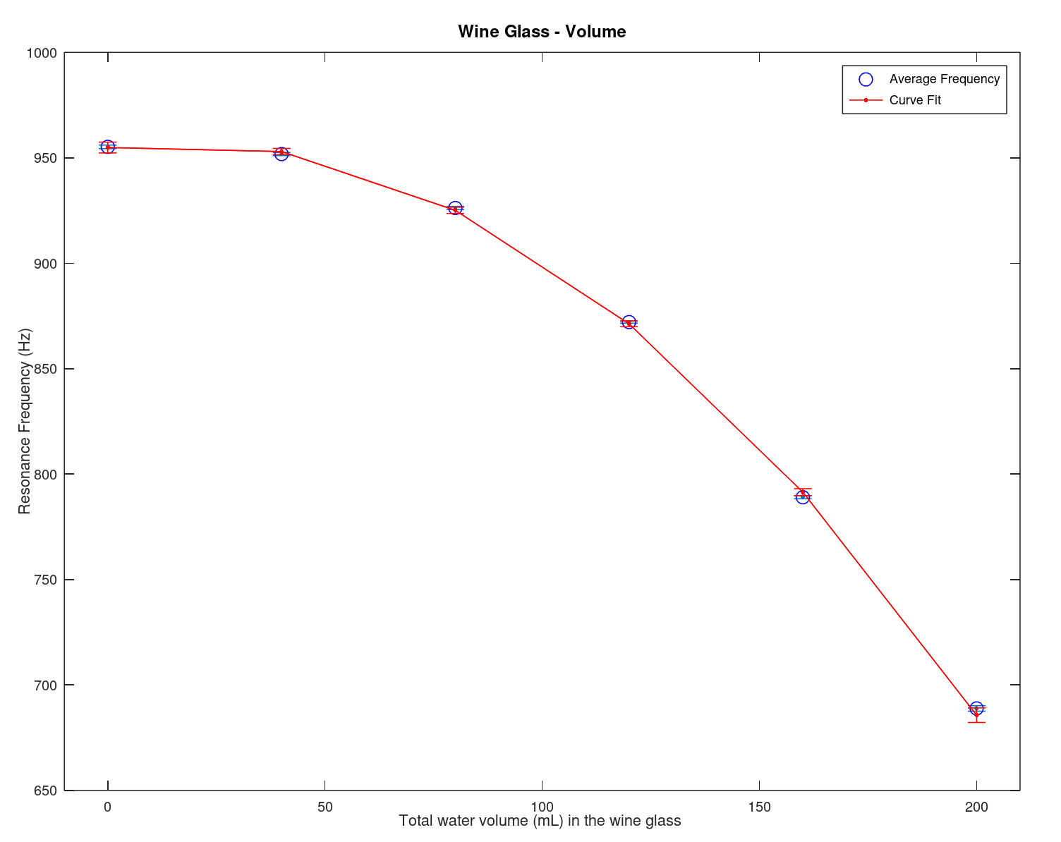
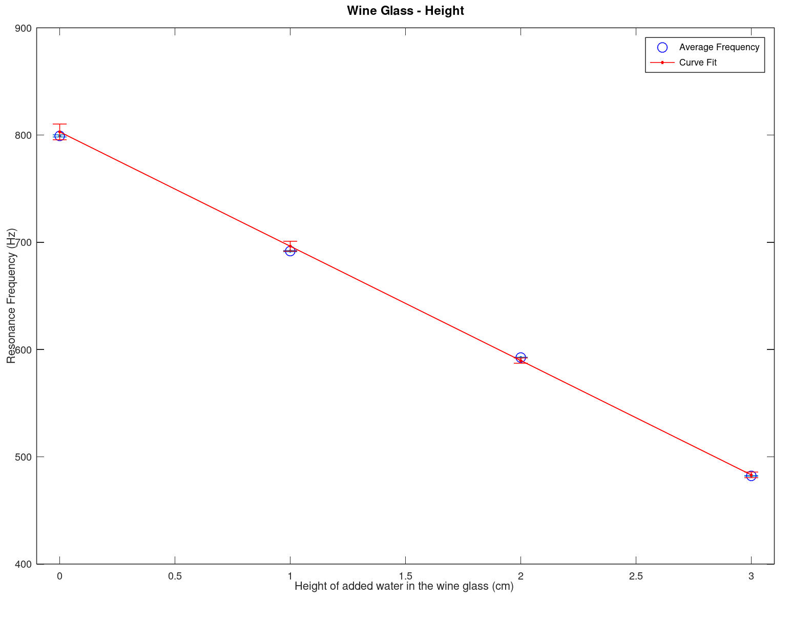
- Here we display the results of an experiment along with there model fit establishing a relationship (the data and the script are below)
 |
 |
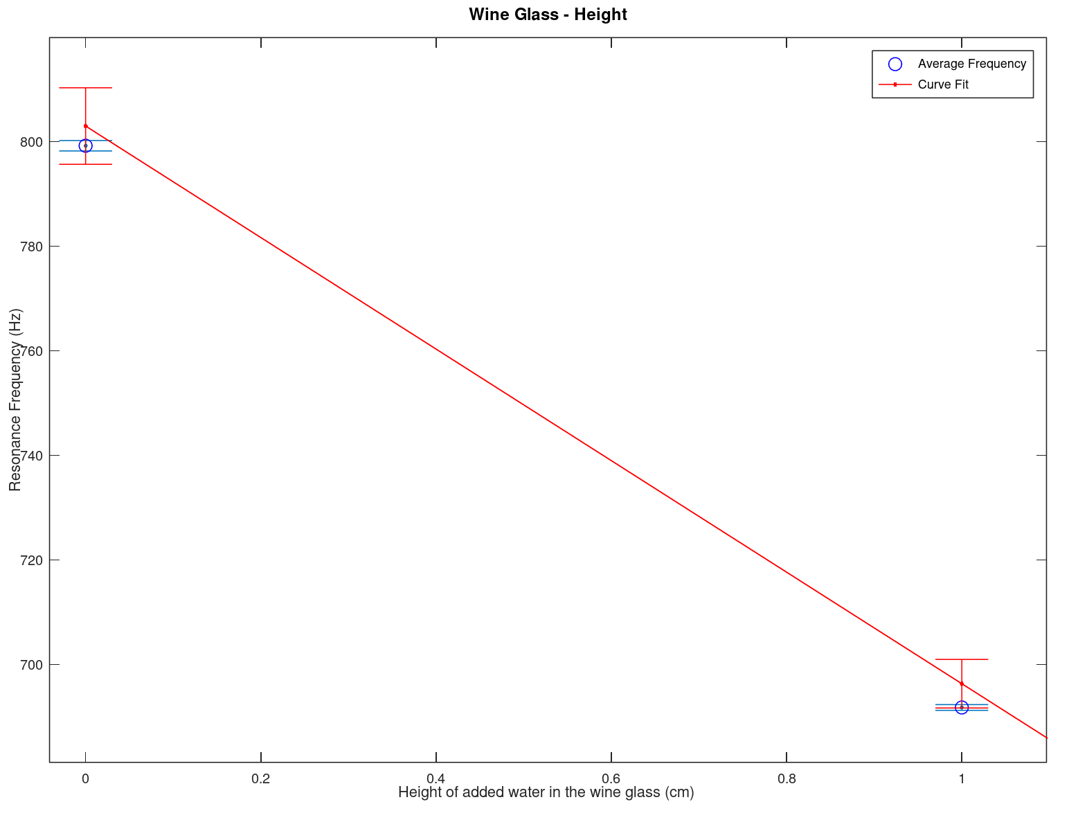 |
| This is a plot of the data from an experiment with errors and the model from the least square fit on the data with errors (different for each model point). To get more detail open the image in another window (or run the program below in Octave). The relationship between the resonance frequency and the volume in the wine glass is \(-(8.1152 \times 10^{-3} \pm 2.6242 \times 10^{-4}) x^2 + (0.277000 \pm 0.050156) x + (954.88 \pm 2.1531)\) | This is a similar plot as on the left but with resonance frequency versus height. The equation is \(-(106.62 \pm 2.1685) x + (802.96 \pm 5.5370)\) | Close up of error bars for the graph on the left (height vs frequency) to emphasis the different errors on both the data and the model from the least square fit. Another possible way to display this would be by a confidence interval, however for this class (and simplicity) we would like to stick with error bars. Confidence intervals should normally be investigated in your junior or senior year. |
- The code for the data and the fit with some notes in the comments
Fitting as shown in this part is commonly done in laboratory along with other techniques.
FFT
The Fast Fourier Transform (FFT) is the method of taking a Fourier transform in computers. The theory of these can wait until later courses, but we can still use the function as it is readily available in Octave (and MATLAB/Scilab, Python, IDL, etc.). As stated previously in other sections the Fourier transform transforms a time-space signal into a frequency-space signal and this transformation results in a different view of the data. For the purposes of this section, the FFT's main purpose for engineers is to extract hidden signals/data from time dependent signals and utilize that information for analysis or even cleaning up noise.
Example (FFT and some fitting as well)
For this example we create a program that generates some "perfect" data and then adds random noise to it plus a 60 Hz noise (which itself has random noise). With this very noise data we use the FFT and a spline fit to try and clean the data to see if we can find the original data. Note that while we know we added a 60 Hz noise we want to pretend that we do not have prior knowledge of what noise has corrupted our data. Instead we will see if there is any noise on our data with a specific frequency characteristic. BTW, why 60 Hz? This question is for you to answer.
- Here we display the results where (A) is the data we get from the instrument, what do we see in (A)?
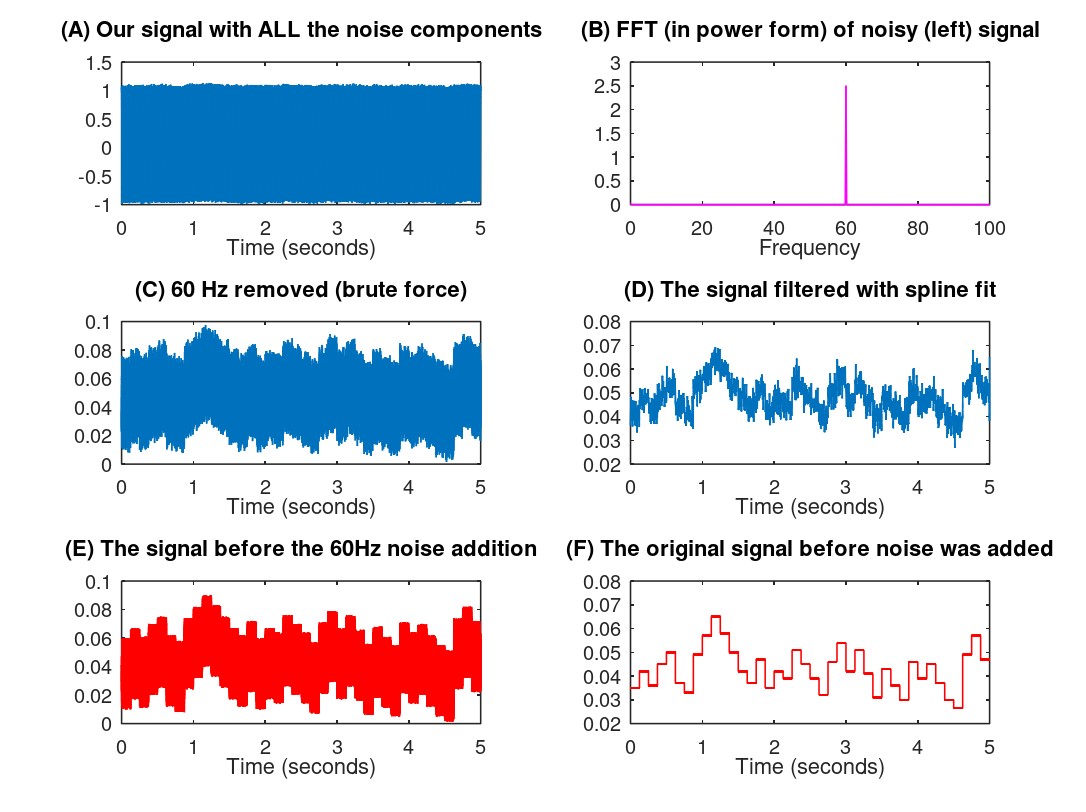
- (B) is our data when we apply an FFT (actually a power density spectrum)
- Here we can see that there is a 60 Hz signal which we did not want so we define that as noise - pretty obvious isn't it?
- This "noise" was certainly not obvious in (A)
- (C) is our data with the 60 Hz removed just by zeroing out that component (we could do better but it obscures the topic)
- Note we do this because the 60 Hz is noise, if it was not noise then the FFT analysis (B) above would be enough
- Just zeroing out the component has as an undesirable side effect of zeroing out any actual signal we are interested in
- (D) is our spline fit that in this case acts as a filter
- With (D) we can actually see some data which we could not see in (A)
- (E) and (F) are the actually data that we generated (which in a real world situation we would not know)
- (E) is the data with random noise added but not the 60 Hz noise
- (C) and (E) compare favorably though (C) is still pretty noisy
- (F) is the original pristine signal created with zero noise (which is NOT how reality works)
- (D) and (F) compare favorably
- We have used some of our previously described techniques to take a very noisy signal (A) that seemingly is useless and through analysis (B) and a cleaning process (C and D) produce a reasonable signal (D)
- Caveat: Any cleaning procedure will lose some of your signal so the engineer or scientist has to be very gentle on the data
- This is a little bit like art restoration where you have to look at each piece carefully and slowly clean it without destroying the art
- Example program is below...
There are many different applications of FFTs and there are other useful transformations as well (like the Radon Transform) so this is just a brief introduction of all the possible analysis techniques and data recovery techniques. Now we will look at an FFT-based idea that is primarily for analysis.
Spectrogram (FFT-based function)
For analysis in a number of fields a spectrogram is a useful tool. Spectrograms can be used with any signal (wave) such as sound or electromagnetic waves. It is an image of what someone is hearing or seeing and is a convenient presentation that allows a engineer or scientist to see signals with a different view point.
This analysis method is used in many different fields such as speech analysis, bird identification2, seismology, vibration analysis for materials, audio engineering, astronomy, etc. For a classic demonstration of the spectrogram we will analysis a bird call made by a professor.
Example
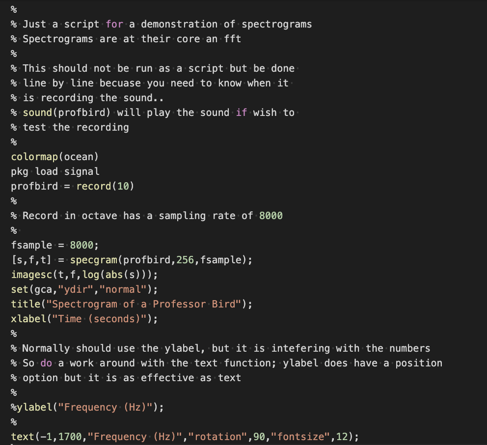
Because record sound requires different machine configuration this Octave program will have to be run, modified, and experimented with on your personal computer.
 |
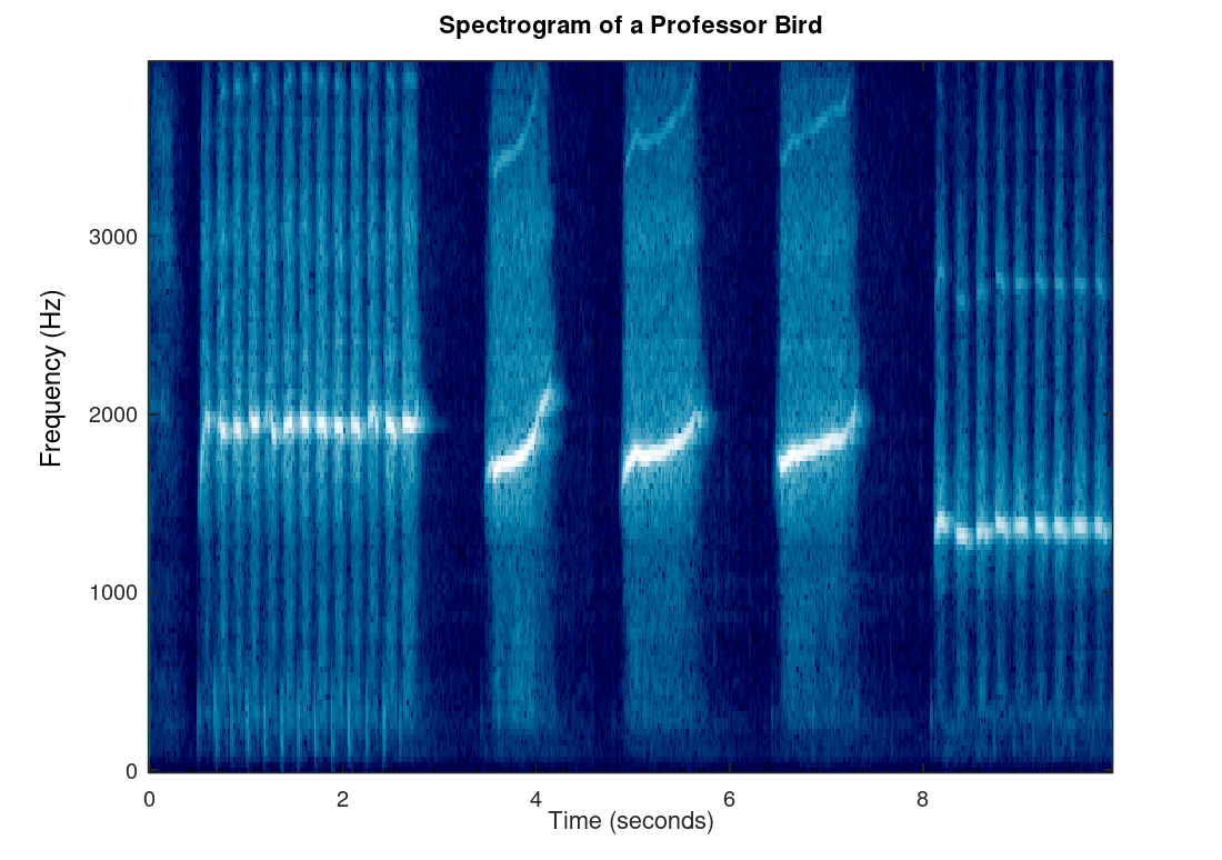 |
| This scrip demonstrates how to make a spectrogram of sound for use in identifying birds (or other things). Because the record function is depending on machine configuration this Octave program will have to be run, modified, and experimented with on your own computer which shouldn't be difficult since Octave is free. | Spectrogram of the sound coming from the rare professor bird. A human can hear best between 1000 Hz and 5000 Hz3 so you would anticipate that a whistle would be in that range (which it is). Also notice the quick chirping followed by longer chirping. |
- This is an example of a public domain image from the National Park Service of a spectrogram on their Soundscapes of Mount Rainier web site.
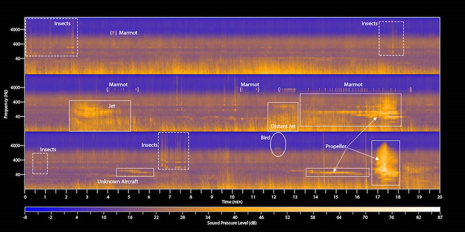 |
| Spectrogram taken at Mount Rainier by the National Park Service. This spectrogram has been marked up with known sounds to help the general public understand some uses of spectrograms. There are more spectrograms at the web site linked above. |
Final thoughts
This concludes are discussion of various techniques that engineers and scientists use computers for in their efforts to aid the world through knowledge and useful products. This is a small smattering of all the techniques used by engineers and scientists. A student should take a numerical methods course and signals and systems course (or a combination of them in the same course) to learn more and especially other important methods not discussed herein.
1Regression and curve fitting can, to some, mean the same thing and to others mean a different thing. Fitting as described here is not drawing a line from data point to data point, but more a regression to produce the best model (curve) of the data. If we wish to delve into the debates of the two subjects, please feel free to use you favorite web search to wade into the thorny issues of definitions.
2In ornithology the spectrogram is also called the sonogram (which can be confused with the medical sonogram which is not the same idea). Ornithology has been using this technique for decades and there are many examples available including apps that describe the sound of a bird usually accompanied with a spectrogram.
3The full range of human hearing is from about 20 Hz to 20000 Hz though this varies depending on genetics and age.