
2.4: Typography
- Page ID
- 93785
\( \newcommand{\vecs}[1]{\overset { \scriptstyle \rightharpoonup} {\mathbf{#1}} } \)
\( \newcommand{\vecd}[1]{\overset{-\!-\!\rightharpoonup}{\vphantom{a}\smash {#1}}} \)
\( \newcommand{\id}{\mathrm{id}}\) \( \newcommand{\Span}{\mathrm{span}}\)
( \newcommand{\kernel}{\mathrm{null}\,}\) \( \newcommand{\range}{\mathrm{range}\,}\)
\( \newcommand{\RealPart}{\mathrm{Re}}\) \( \newcommand{\ImaginaryPart}{\mathrm{Im}}\)
\( \newcommand{\Argument}{\mathrm{Arg}}\) \( \newcommand{\norm}[1]{\| #1 \|}\)
\( \newcommand{\inner}[2]{\langle #1, #2 \rangle}\)
\( \newcommand{\Span}{\mathrm{span}}\)
\( \newcommand{\id}{\mathrm{id}}\)
\( \newcommand{\Span}{\mathrm{span}}\)
\( \newcommand{\kernel}{\mathrm{null}\,}\)
\( \newcommand{\range}{\mathrm{range}\,}\)
\( \newcommand{\RealPart}{\mathrm{Re}}\)
\( \newcommand{\ImaginaryPart}{\mathrm{Im}}\)
\( \newcommand{\Argument}{\mathrm{Arg}}\)
\( \newcommand{\norm}[1]{\| #1 \|}\)
\( \newcommand{\inner}[2]{\langle #1, #2 \rangle}\)
\( \newcommand{\Span}{\mathrm{span}}\) \( \newcommand{\AA}{\unicode[.8,0]{x212B}}\)
\( \newcommand{\vectorA}[1]{\vec{#1}} % arrow\)
\( \newcommand{\vectorAt}[1]{\vec{\text{#1}}} % arrow\)
\( \newcommand{\vectorB}[1]{\overset { \scriptstyle \rightharpoonup} {\mathbf{#1}} } \)
\( \newcommand{\vectorC}[1]{\textbf{#1}} \)
\( \newcommand{\vectorD}[1]{\overrightarrow{#1}} \)
\( \newcommand{\vectorDt}[1]{\overrightarrow{\text{#1}}} \)
\( \newcommand{\vectE}[1]{\overset{-\!-\!\rightharpoonup}{\vphantom{a}\smash{\mathbf {#1}}}} \)
\( \newcommand{\vecs}[1]{\overset { \scriptstyle \rightharpoonup} {\mathbf{#1}} } \)
\( \newcommand{\vecd}[1]{\overset{-\!-\!\rightharpoonup}{\vphantom{a}\smash {#1}}} \)
\(\newcommand{\avec}{\mathbf a}\) \(\newcommand{\bvec}{\mathbf b}\) \(\newcommand{\cvec}{\mathbf c}\) \(\newcommand{\dvec}{\mathbf d}\) \(\newcommand{\dtil}{\widetilde{\mathbf d}}\) \(\newcommand{\evec}{\mathbf e}\) \(\newcommand{\fvec}{\mathbf f}\) \(\newcommand{\nvec}{\mathbf n}\) \(\newcommand{\pvec}{\mathbf p}\) \(\newcommand{\qvec}{\mathbf q}\) \(\newcommand{\svec}{\mathbf s}\) \(\newcommand{\tvec}{\mathbf t}\) \(\newcommand{\uvec}{\mathbf u}\) \(\newcommand{\vvec}{\mathbf v}\) \(\newcommand{\wvec}{\mathbf w}\) \(\newcommand{\xvec}{\mathbf x}\) \(\newcommand{\yvec}{\mathbf y}\) \(\newcommand{\zvec}{\mathbf z}\) \(\newcommand{\rvec}{\mathbf r}\) \(\newcommand{\mvec}{\mathbf m}\) \(\newcommand{\zerovec}{\mathbf 0}\) \(\newcommand{\onevec}{\mathbf 1}\) \(\newcommand{\real}{\mathbb R}\) \(\newcommand{\twovec}[2]{\left[\begin{array}{r}#1 \\ #2 \end{array}\right]}\) \(\newcommand{\ctwovec}[2]{\left[\begin{array}{c}#1 \\ #2 \end{array}\right]}\) \(\newcommand{\threevec}[3]{\left[\begin{array}{r}#1 \\ #2 \\ #3 \end{array}\right]}\) \(\newcommand{\cthreevec}[3]{\left[\begin{array}{c}#1 \\ #2 \\ #3 \end{array}\right]}\) \(\newcommand{\fourvec}[4]{\left[\begin{array}{r}#1 \\ #2 \\ #3 \\ #4 \end{array}\right]}\) \(\newcommand{\cfourvec}[4]{\left[\begin{array}{c}#1 \\ #2 \\ #3 \\ #4 \end{array}\right]}\) \(\newcommand{\fivevec}[5]{\left[\begin{array}{r}#1 \\ #2 \\ #3 \\ #4 \\ #5 \\ \end{array}\right]}\) \(\newcommand{\cfivevec}[5]{\left[\begin{array}{c}#1 \\ #2 \\ #3 \\ #4 \\ #5 \\ \end{array}\right]}\) \(\newcommand{\mattwo}[4]{\left[\begin{array}{rr}#1 \amp #2 \\ #3 \amp #4 \\ \end{array}\right]}\) \(\newcommand{\laspan}[1]{\text{Span}\{#1\}}\) \(\newcommand{\bcal}{\cal B}\) \(\newcommand{\ccal}{\cal C}\) \(\newcommand{\scal}{\cal S}\) \(\newcommand{\wcal}{\cal W}\) \(\newcommand{\ecal}{\cal E}\) \(\newcommand{\coords}[2]{\left\{#1\right\}_{#2}}\) \(\newcommand{\gray}[1]{\color{gray}{#1}}\) \(\newcommand{\lgray}[1]{\color{lightgray}{#1}}\) \(\newcommand{\rank}{\operatorname{rank}}\) \(\newcommand{\row}{\text{Row}}\) \(\newcommand{\col}{\text{Col}}\) \(\renewcommand{\row}{\text{Row}}\) \(\newcommand{\nul}{\text{Nul}}\) \(\newcommand{\var}{\text{Var}}\) \(\newcommand{\corr}{\text{corr}}\) \(\newcommand{\len}[1]{\left|#1\right|}\) \(\newcommand{\bbar}{\overline{\bvec}}\) \(\newcommand{\bhat}{\widehat{\bvec}}\) \(\newcommand{\bperp}{\bvec^\perp}\) \(\newcommand{\xhat}{\widehat{\xvec}}\) \(\newcommand{\vhat}{\widehat{\vvec}}\) \(\newcommand{\uhat}{\widehat{\uvec}}\) \(\newcommand{\what}{\widehat{\wvec}}\) \(\newcommand{\Sighat}{\widehat{\Sigma}}\) \(\newcommand{\lt}{<}\) \(\newcommand{\gt}{>}\) \(\newcommand{\amp}{&}\) \(\definecolor{fillinmathshade}{gray}{0.9}\)Usually, Web pages are meant to be read rather than viewed. This means that you need to devote thought to the text styling that can make your pages most legible and readable while fitting in with other design considerations. Typography is this relationship between letterforms on a page, playing a dual role in the visual design of the page and in enhancing its readability.
The term font has become the catch-all term to denote text characteristics employed on a page. More accurate, the term typeface refers to a consistent visual design for the symbols of the alphabet; a font family is a related set of typefaces, including their rendering in bold, italic, and other typographical off-shoots. The following illustration shows some common terminology used in describing text styling.

Outline Fonts

Most digital fonts -- such as Microsoft TrueType and Adobe PostScript -- are stored as character outlines using mathematical descriptions of the characters. Use of these outline fonts means that only one outline per character is needed to produce all the sizes of that character; it can be scaled to different sizes and even skewed and rotated without losing its characteristic shape.
In order to be displayed on a computer screen or on printed paper, the outlines need to be "filled in," or rasterized as pixel points. Rasterizing software performs this function as shown in the accompanying illustration.
Font Families
It is important to remember that a Web page can only display those fonts that are installed on the user's computer Therefore, nonstandard fonts should be avoided. The table below contains common PC and MAC fonts.
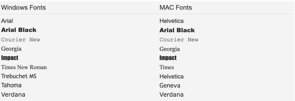
Of course, most users have other software installed on their systems which come with additional fonts to support those applications. Those fonts may or may not be accessible for browser display.
Fonts can be classified as serif and sans-serif (without-serif) styles. Serifs are the small "tick marks" at the end of character strokes. You can see this difference in the Times New Roman (serif) and Arial (sans-serif) fonts shown below:
Generally one serif font for text and one sans serif font for headings (or vice-versa) are a good combination. A page should contain no more than two different typefaces or four different type variations such as type size and bold or italic style.
Font Size
Readability is affected by font sizes. Print type is traditionally measured in points, which is 1/72 of an inch (on paper). However, computer screens are based on pixels, rather than points, so rendering software must translate point sizes to pixels units taking into account screen resolution. You can see from the two lines below how 12-point type size equates to approximately 16-pixel type size on the screen.
16px Times New Roman (screen)
While print type size is based on absolute units of measure such as points and pixels,relative units such as percentages and em (preferred), should be used in web documents since absolute font sizes render inconsistently across platforms and can't be resized by the browser.
1 em unit is equivalent to 12 points. A type size of 1 em makes for comfortable reading by most people. If smaller sizes are necessary, then choose fonts with wider spacing and larger x-heights. The x-height is the height of lower-case letters measured from the baseline. The following two lines are displayed at .67em size in Arial and Verdana type faces. The latter line is not as crowded at that size and is easier to read.
A quick brown fox jumps over the lazy dog.
Incidentally, Verdana is becoming a popular Web font because it is designed to map accurately to pixel positions on a screen. Also, a non-serif font such as Arial or Verdana is easier to read on screen, while a serif font such as Times New Roman is easier to read on paper.
While print type size is based on absolute units of measure such as points and pixels,relative units such as percentages and em (preferred), should be used in web documents since absolute font sizes render inconsistently across platforms and can't be resized by the browser.
1 em unit is equivalent to 12 points.
Line Size
Readability also depends on line height and line length. In general, default spacing in the browser provides decent spacing between lines. A line length of approximately 60 to 80 characters permits good tracking of the eyes from the end of one line to the beginning of the next. The following lines contain approximately 75 Verdana characters at 9-pt size.
The standard Lorem Ipsum passage, used since the 1500s: "Lorem ipsum dolor sit amet, consectetur adipisicing elit, sed do eiusmod tempor incididunt ut labore et dolore magna aliqua. Ut enim ad minim veniam, quis nostrud exercitation ullamco laboris nisi ut aliquip ex ea commodo consequat. Duis aute irure dolor in reprehenderit in voluptate velit esse cillum dolore eu fugiat nulla pariatur. Excepteur sint occaecat cupidatat non proident, sunt in culpa qui officia deserunt mollit anim id est laborum."
Lorem Ipsum is simply dummy text of the printing and typesetting industry. Lorem Ipsum has been the industry's standard dummy text ever since the 1500s, when an unknown printer took a galley of type and scrambled it to make a type specimen book. It has survived not only five centuries, but also the leap into electronic typesetting, remaining essentially unchanged.
White Space
A prevelant mistake of page authors is to crowd too much information between tiny margins. It can be monotonous and tiring reading line after line of text from border to border without breaks. Make sure you leave plenty of white space in the margins and that sufficient numbers of headings and graphics break up the monotony of the page.
Text Color
Color can be used for text variety. As in the case with graphic images, choose a small number of coordinated colors and be consistent in their use. Readers tend to see colors, as they do text sizes, as visual clues with logical meaning. For instance, you will normally use different font sizes for different levels of headings. The size of the font comes to mean a certain type of topical change in content. By the same token, colors take on expected meanings. Be consistent in the color cues you give to readers.
 ecorative Fonts
One way to introduce nonstandard fonts on a Web page is to use graphic images of letterforms like the character "D" in the previous heading. This technique ensures that the font will be displayed irrespective of the visitor's installed fonts, and it introduces variety to the page. Use graphic letters selectively, though, since they increase page download times and they increase the risk of cluttering the page with hard-to-read characters.
Dynamic Style Settings
The current page is rendered in 10pt Arial font. You can see how changing fonts and sizes changes the appearance and readability of this page by clicking the following buttons:
| Arial Verdana Georgia Times New Roman Courier New |
.67em (8pt) .75em (9pt) .83em (10pt) 1 em (12pt) 1.2 em (14pt) |
Enhancing the Usability of A Page
The following guidelines should be used to help increase the readability of your Web pages:
- Use common fonts such as Arial (Helvetica), Verdana, or Times New Roman (Times). San serif fonts are easier to read on a computer screen, whereas serif fonts are easier to read in print. Use the CSS media types - @print and @screen to set appropriate fonts for each media type.
- Avoid long blocks of text and long paragraphs. Be concise
- When possible use relative units such as the em when setting font size - 1 em = 12 pt.
- Hyperlink keywords or phrases, not entire sentences
- Avoid the use of the words "click here"
- Always check grammar and spelling