
5.4: Text and Background Colors
- Page ID
- 93811
\( \newcommand{\vecs}[1]{\overset { \scriptstyle \rightharpoonup} {\mathbf{#1}} } \)
\( \newcommand{\vecd}[1]{\overset{-\!-\!\rightharpoonup}{\vphantom{a}\smash {#1}}} \)
\( \newcommand{\dsum}{\displaystyle\sum\limits} \)
\( \newcommand{\dint}{\displaystyle\int\limits} \)
\( \newcommand{\dlim}{\displaystyle\lim\limits} \)
\( \newcommand{\id}{\mathrm{id}}\) \( \newcommand{\Span}{\mathrm{span}}\)
( \newcommand{\kernel}{\mathrm{null}\,}\) \( \newcommand{\range}{\mathrm{range}\,}\)
\( \newcommand{\RealPart}{\mathrm{Re}}\) \( \newcommand{\ImaginaryPart}{\mathrm{Im}}\)
\( \newcommand{\Argument}{\mathrm{Arg}}\) \( \newcommand{\norm}[1]{\| #1 \|}\)
\( \newcommand{\inner}[2]{\langle #1, #2 \rangle}\)
\( \newcommand{\Span}{\mathrm{span}}\)
\( \newcommand{\id}{\mathrm{id}}\)
\( \newcommand{\Span}{\mathrm{span}}\)
\( \newcommand{\kernel}{\mathrm{null}\,}\)
\( \newcommand{\range}{\mathrm{range}\,}\)
\( \newcommand{\RealPart}{\mathrm{Re}}\)
\( \newcommand{\ImaginaryPart}{\mathrm{Im}}\)
\( \newcommand{\Argument}{\mathrm{Arg}}\)
\( \newcommand{\norm}[1]{\| #1 \|}\)
\( \newcommand{\inner}[2]{\langle #1, #2 \rangle}\)
\( \newcommand{\Span}{\mathrm{span}}\) \( \newcommand{\AA}{\unicode[.8,0]{x212B}}\)
\( \newcommand{\vectorA}[1]{\vec{#1}} % arrow\)
\( \newcommand{\vectorAt}[1]{\vec{\text{#1}}} % arrow\)
\( \newcommand{\vectorB}[1]{\overset { \scriptstyle \rightharpoonup} {\mathbf{#1}} } \)
\( \newcommand{\vectorC}[1]{\textbf{#1}} \)
\( \newcommand{\vectorD}[1]{\overrightarrow{#1}} \)
\( \newcommand{\vectorDt}[1]{\overrightarrow{\text{#1}}} \)
\( \newcommand{\vectE}[1]{\overset{-\!-\!\rightharpoonup}{\vphantom{a}\smash{\mathbf {#1}}}} \)
\( \newcommand{\vecs}[1]{\overset { \scriptstyle \rightharpoonup} {\mathbf{#1}} } \)
\(\newcommand{\longvect}{\overrightarrow}\)
\( \newcommand{\vecd}[1]{\overset{-\!-\!\rightharpoonup}{\vphantom{a}\smash {#1}}} \)
\(\newcommand{\avec}{\mathbf a}\) \(\newcommand{\bvec}{\mathbf b}\) \(\newcommand{\cvec}{\mathbf c}\) \(\newcommand{\dvec}{\mathbf d}\) \(\newcommand{\dtil}{\widetilde{\mathbf d}}\) \(\newcommand{\evec}{\mathbf e}\) \(\newcommand{\fvec}{\mathbf f}\) \(\newcommand{\nvec}{\mathbf n}\) \(\newcommand{\pvec}{\mathbf p}\) \(\newcommand{\qvec}{\mathbf q}\) \(\newcommand{\svec}{\mathbf s}\) \(\newcommand{\tvec}{\mathbf t}\) \(\newcommand{\uvec}{\mathbf u}\) \(\newcommand{\vvec}{\mathbf v}\) \(\newcommand{\wvec}{\mathbf w}\) \(\newcommand{\xvec}{\mathbf x}\) \(\newcommand{\yvec}{\mathbf y}\) \(\newcommand{\zvec}{\mathbf z}\) \(\newcommand{\rvec}{\mathbf r}\) \(\newcommand{\mvec}{\mathbf m}\) \(\newcommand{\zerovec}{\mathbf 0}\) \(\newcommand{\onevec}{\mathbf 1}\) \(\newcommand{\real}{\mathbb R}\) \(\newcommand{\twovec}[2]{\left[\begin{array}{r}#1 \\ #2 \end{array}\right]}\) \(\newcommand{\ctwovec}[2]{\left[\begin{array}{c}#1 \\ #2 \end{array}\right]}\) \(\newcommand{\threevec}[3]{\left[\begin{array}{r}#1 \\ #2 \\ #3 \end{array}\right]}\) \(\newcommand{\cthreevec}[3]{\left[\begin{array}{c}#1 \\ #2 \\ #3 \end{array}\right]}\) \(\newcommand{\fourvec}[4]{\left[\begin{array}{r}#1 \\ #2 \\ #3 \\ #4 \end{array}\right]}\) \(\newcommand{\cfourvec}[4]{\left[\begin{array}{c}#1 \\ #2 \\ #3 \\ #4 \end{array}\right]}\) \(\newcommand{\fivevec}[5]{\left[\begin{array}{r}#1 \\ #2 \\ #3 \\ #4 \\ #5 \\ \end{array}\right]}\) \(\newcommand{\cfivevec}[5]{\left[\begin{array}{c}#1 \\ #2 \\ #3 \\ #4 \\ #5 \\ \end{array}\right]}\) \(\newcommand{\mattwo}[4]{\left[\begin{array}{rr}#1 \amp #2 \\ #3 \amp #4 \\ \end{array}\right]}\) \(\newcommand{\laspan}[1]{\text{Span}\{#1\}}\) \(\newcommand{\bcal}{\cal B}\) \(\newcommand{\ccal}{\cal C}\) \(\newcommand{\scal}{\cal S}\) \(\newcommand{\wcal}{\cal W}\) \(\newcommand{\ecal}{\cal E}\) \(\newcommand{\coords}[2]{\left\{#1\right\}_{#2}}\) \(\newcommand{\gray}[1]{\color{gray}{#1}}\) \(\newcommand{\lgray}[1]{\color{lightgray}{#1}}\) \(\newcommand{\rank}{\operatorname{rank}}\) \(\newcommand{\row}{\text{Row}}\) \(\newcommand{\col}{\text{Col}}\) \(\renewcommand{\row}{\text{Row}}\) \(\newcommand{\nul}{\text{Nul}}\) \(\newcommand{\var}{\text{Var}}\) \(\newcommand{\corr}{\text{corr}}\) \(\newcommand{\len}[1]{\left|#1\right|}\) \(\newcommand{\bbar}{\overline{\bvec}}\) \(\newcommand{\bhat}{\widehat{\bvec}}\) \(\newcommand{\bperp}{\bvec^\perp}\) \(\newcommand{\xhat}{\widehat{\xvec}}\) \(\newcommand{\vhat}{\widehat{\vvec}}\) \(\newcommand{\uhat}{\widehat{\uvec}}\) \(\newcommand{\what}{\widehat{\wvec}}\) \(\newcommand{\Sighat}{\widehat{\Sigma}}\) \(\newcommand{\lt}{<}\) \(\newcommand{\gt}{>}\) \(\newcommand{\amp}{&}\) \(\definecolor{fillinmathshade}{gray}{0.9}\)Browsers display black text on a white background unless different color style settings are applied. A background color for the page or for any text container can also be specified. Text and background colors can be designated in style sheets using hexadecimal values, RGB values, or color names.
Hexadecimal Colors
#rrggbb
A value of hexadecimal "00" (the smallest 2-digit hexadecimal value and equivalent to decimal 0) in the color position means the absence of the color; a value of "FF" (the largest 2-digit hexadecimal value and equivalent to decimal 255) means the color is at full intensity. Thus, a hexadecimal value of "#FF0000" represents the color red: "FF" in the "rr" position assigns full intensity to red; "00" in the "gg" and "bb" positions represent the absence of green and blue color intensities.
Likewise, a value of "#00FF00" is (lime) green and a value of "#0000FF" is blue. White is represented by all colors at full intensity: "#FFFFFF"; black is the absence of color: "#000000". In between these extremes are colors of every hue and intensity to over 16 million colors although not all colors can be displayed accurately on all computer monitors.
Some colors can also be represented in the shortened three digit format of #rgb. For example, the color #F00 is equal to the color #FF0000, and the color #1BF is the same as #11BBFF.
RGB Colors
An RGB color specification uses decimal values to indicate the combined intensities of red, green, and blue hues. Values can range from 0 (smallest) through 255 (largest). These RGB values are given in style sheets in the following format,
rgb(r,g,b)
using a decimal value to indicate the intensities of the three colors. Thus, coding an RGB value of rgb(255,0,0) indicates red, rgb(0,255,0) indicates (lime) green, and rgb(0,0,255) indicates blue. As in the case with hexadecimal values, a full spectrum of over 16 million colors can be represented by combinations of red, green, and blue intensities.
Color Names
Colors can also be specified with special color names. Most browsers recognize over 200 color names. The common set of 16 Windows colors is shown below by color names and their associated hexadecimal and RGB values.
| Color Name | Hex Value | RGB Value |
|---|---|---|
| Black | #000000 | rgb(0,0,0) |
| Maroon | #800000 | rgb(128,0,0) |
| Green | #008000 | rgb(0,128,0) |
| Olive | #808000 | rgb(128,128,0) |
| Navy | #000080 | rgb(0,0,128) |
| Purple | #800080 | rgb(128,0,128) |
| Teal | #008080 | rgb(0,128,128) |
| Silver | #C0C0C0 | rgb(192,192,192) |
| Gray | #808080 | rgb(128,128,128) |
| Red | #FF0000 | rgb(255,0,0) |
| Lime | #00FF00 | rgb(0,255,0) |
| Yellow | #FFFF00 | rgb(255,255,0) |
| Blue | #0000FF | rgb(0,0,255) |
| Fuchsia | #FF00FF | rgb(255,0,255) |
| Aqua | #00FFFF | rgb(0,255,255) |
| White | #FFFFFF | rgb(255,255,255) |
Color Styles Properties
Colors can be applied either to the text on a page or to the background of the container holding the text. These two style properties are shown in the following table.
| Color Name | Hex Value |
|---|---|
| color | #rrggbb rgb(r,g,b) color name |
| background-color | #rrggbb rgb(r,g,b) color name |
Colors can be applied as broadly as the entire page by associating a color style with the <body> tag down to a single text character by associating a color style with a <span> tag surrounding the character. Hexadecimal, RGB, and color-name values can be used in any combination for specifying color properties.
Variations of background and foreground colors are shown in the following code. Browser display for this page appears in Figure \(\PageIndex{4}\).
<!DOCTYPE html><html lang="en"><head><meta charset="utf-8"><title>Color Page</title><style>body {color:white; background-color:silver}.PARAstyle {color:rgb(0,0,0)}.PHRASEstyle {color:#0000FF}.TEXTstyle {color:green; background-color:yellow}</style></head><body><p>This page contains three paragraphs. The entire page is styled with a background color of silver and a foreground color of white. This first paragraph uses these page default color settings.</p><p class="PARAstyle">This second paragraph sets its own text color to black using an RGB value. Within this paragraph <span class="PHRASEstyle">this string of text is changed to blue, while the phrase <span class="TEXTstyle"> <b>green on yellow</b></span> has its own color style setting.</span></p><p>This third paragraph reverts to the default color settings for the page.</p></body></html>
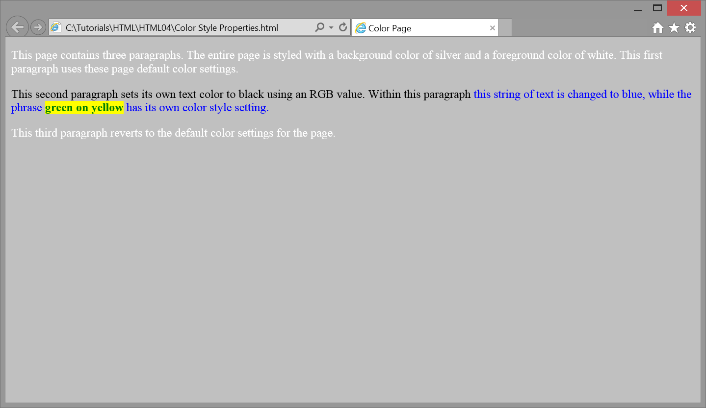
The entire page has a silver background with white lettering given by the style setting for the body selector. Three style classes are defined for application to the second paragraph in order to override these page settings. The PARAstyle class is applied to the paragraph to set its text to black [rgb(0,0,0)]; the PHRASEstyle class is applied to a portion of the paragraph to change its text color from black to blue [#0000FF]; the TEXTstyle class is applied to a substring of text to display green letters on a yellow background.
Of course, you are not likely to employ so many different colors on your pages since excessive use of colors can detract from the informational content on the page; however, the above example gives you an idea of how flexible it is to apply foreground and background colors to page elements.
Transparency
In addition to colors, elements can be given a transparency value through the CSS property opacity. The opacity property can be assigned a number value between 0 and 1, with 0 being fully transparent (invisible), and 1 being fully opaque (solid). For example, the following text is fully black (#000000), but has an opacity value of 0.5 which makes it halfway transparent. Since it is on a white background, it will appear grey.
opacity: 0.5; color: #000000;
Halfway transparent text
While this effect may seem somewhat trivial (being that you could have simply assigned the text to be grey), opacity can serve a variety of uses in creative web design. It can apply to a variety of elements such as images, and can be used when objects overlap each other with different CSS techniques.
Internet explorer version 8 and less do not support the opacity property. These older browsers use the property filter. The filter property uses a functional notation to set the opacity of an object, where 0 is completely transparent (invisible) and 100 is completely opaque (solid). For example, setting an element with an opacity value of 50% like in the previous example would look like the following:
filter: alpha(opacity=50);
It can be helpful to include both the opacity and filter properties in order to provide maximum browser compatibility.
Gradient - TOP
CSS allows for more than just solid background colors. Color gradients may be used as well.
Gradients are smooth transitions from one color to another. They can be added to a web page using CSS and setting color stops, which tell the gradient which colors to transition to and from. A minimum of two color stops are required for any given gradient.
There are two types of gradients, linear and radial, which can transition from any set number of color stops and from any direction: top to bottom, left to right, even diagonal. Color stops can be specified by color names, hexadecimal code, or rgb values for any desired color. To increase the number of colors in a gradient, add more color stops in the order you wish for them to appear.
Gradients have not always been supported by the major browsers. Older browsers may have compatibility issues with gradients. These issues should not occur on browsers later than: Internet Explorer 10, Google Chrome 26.0, Firefox 16.0, Safari 6.1, and Opera 12.1. Earlier versions of Google Chrome, Firefox, Safari, and Opera supported gradients with an appropriate prefix in the CSS. Our examples will depict these prefixes.
Linear Gradients
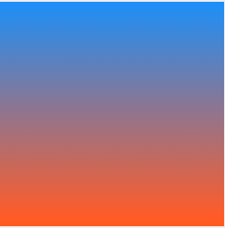
Linear gradients transition in a straight line from one side of the container to the other. The default direction is from the top to the bottom of the container. If you do not specify a starting direction, it is assumed the gradient begins at the top.
Here is an example of a linear gradient with two color stops: #3399FF and #FF6600. This example shows the prefixes for older browser compatibility.
<!DOCTYPE html><html lang="en"><head><meta charset="utf-8"><title>Linear Gradient</title><style>#linearGradient{background: -webkit-linear-gradient(top, #3399FF, #FF6600);background: -o-linear-gradient(top, #3399FF, #FF6600);background: -moz-linear-gradient(top, #3399FF, #FF6600);background: linear-gradient(top, #3399FF, #FF6600);width: 200px;height: 200px;}</style></head><body><div id="linearGradient"></div></body></html>
Radial Gradients
Radial gradients transition in all directions from a given point in their container. These work in much of the same way as linear gradients but are declared differently. By default, a gradient starts in the center of the container and the shape is determined by the width and height of the container.
For example, if the container is a perfect square, the gradient will be a perfect circle. If the container is a rectangle, the gradient will appear to be more of an oval shape.
Here is an example of a radial gradient with two color stops: #3399FF, #FF6600, and #33CC33. This example shows the prefixes for older browser compatibility.
<!DOCTYPE html><html lang="en"><head><meta charset="utf-8"><title>Radial Gradient</title><style>#radialGradient{background: -webkit-radial-gradient(#3399FF, #FF6600, #33CC33);background: -o-radial-gradient(#3399FF, #FF6600, #33CC33);background: -moz-radial-gradient(#3399FF, #FF6600, #33CC33);background: radial-gradient(#3399FF, #FF6600, #33CC33);width: 200px;height: 200px;}</style></head><body><div id="radialGradient"></div></body></html>
