
11.6: Checkboxes
- Page ID
- 93849
\( \newcommand{\vecs}[1]{\overset { \scriptstyle \rightharpoonup} {\mathbf{#1}} } \)
\( \newcommand{\vecd}[1]{\overset{-\!-\!\rightharpoonup}{\vphantom{a}\smash {#1}}} \)
\( \newcommand{\dsum}{\displaystyle\sum\limits} \)
\( \newcommand{\dint}{\displaystyle\int\limits} \)
\( \newcommand{\dlim}{\displaystyle\lim\limits} \)
\( \newcommand{\id}{\mathrm{id}}\) \( \newcommand{\Span}{\mathrm{span}}\)
( \newcommand{\kernel}{\mathrm{null}\,}\) \( \newcommand{\range}{\mathrm{range}\,}\)
\( \newcommand{\RealPart}{\mathrm{Re}}\) \( \newcommand{\ImaginaryPart}{\mathrm{Im}}\)
\( \newcommand{\Argument}{\mathrm{Arg}}\) \( \newcommand{\norm}[1]{\| #1 \|}\)
\( \newcommand{\inner}[2]{\langle #1, #2 \rangle}\)
\( \newcommand{\Span}{\mathrm{span}}\)
\( \newcommand{\id}{\mathrm{id}}\)
\( \newcommand{\Span}{\mathrm{span}}\)
\( \newcommand{\kernel}{\mathrm{null}\,}\)
\( \newcommand{\range}{\mathrm{range}\,}\)
\( \newcommand{\RealPart}{\mathrm{Re}}\)
\( \newcommand{\ImaginaryPart}{\mathrm{Im}}\)
\( \newcommand{\Argument}{\mathrm{Arg}}\)
\( \newcommand{\norm}[1]{\| #1 \|}\)
\( \newcommand{\inner}[2]{\langle #1, #2 \rangle}\)
\( \newcommand{\Span}{\mathrm{span}}\) \( \newcommand{\AA}{\unicode[.8,0]{x212B}}\)
\( \newcommand{\vectorA}[1]{\vec{#1}} % arrow\)
\( \newcommand{\vectorAt}[1]{\vec{\text{#1}}} % arrow\)
\( \newcommand{\vectorB}[1]{\overset { \scriptstyle \rightharpoonup} {\mathbf{#1}} } \)
\( \newcommand{\vectorC}[1]{\textbf{#1}} \)
\( \newcommand{\vectorD}[1]{\overrightarrow{#1}} \)
\( \newcommand{\vectorDt}[1]{\overrightarrow{\text{#1}}} \)
\( \newcommand{\vectE}[1]{\overset{-\!-\!\rightharpoonup}{\vphantom{a}\smash{\mathbf {#1}}}} \)
\( \newcommand{\vecs}[1]{\overset { \scriptstyle \rightharpoonup} {\mathbf{#1}} } \)
\(\newcommand{\longvect}{\overrightarrow}\)
\( \newcommand{\vecd}[1]{\overset{-\!-\!\rightharpoonup}{\vphantom{a}\smash {#1}}} \)
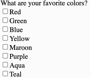
\(\newcommand{\avec}{\mathbf a}\) \(\newcommand{\bvec}{\mathbf b}\) \(\newcommand{\cvec}{\mathbf c}\) \(\newcommand{\dvec}{\mathbf d}\) \(\newcommand{\dtil}{\widetilde{\mathbf d}}\) \(\newcommand{\evec}{\mathbf e}\) \(\newcommand{\fvec}{\mathbf f}\) \(\newcommand{\nvec}{\mathbf n}\) \(\newcommand{\pvec}{\mathbf p}\) \(\newcommand{\qvec}{\mathbf q}\) \(\newcommand{\svec}{\mathbf s}\) \(\newcommand{\tvec}{\mathbf t}\) \(\newcommand{\uvec}{\mathbf u}\) \(\newcommand{\vvec}{\mathbf v}\) \(\newcommand{\wvec}{\mathbf w}\) \(\newcommand{\xvec}{\mathbf x}\) \(\newcommand{\yvec}{\mathbf y}\) \(\newcommand{\zvec}{\mathbf z}\) \(\newcommand{\rvec}{\mathbf r}\) \(\newcommand{\mvec}{\mathbf m}\) \(\newcommand{\zerovec}{\mathbf 0}\) \(\newcommand{\onevec}{\mathbf 1}\) \(\newcommand{\real}{\mathbb R}\) \(\newcommand{\twovec}[2]{\left[\begin{array}{r}#1 \\ #2 \end{array}\right]}\) \(\newcommand{\ctwovec}[2]{\left[\begin{array}{c}#1 \\ #2 \end{array}\right]}\) \(\newcommand{\threevec}[3]{\left[\begin{array}{r}#1 \\ #2 \\ #3 \end{array}\right]}\) \(\newcommand{\cthreevec}[3]{\left[\begin{array}{c}#1 \\ #2 \\ #3 \end{array}\right]}\) \(\newcommand{\fourvec}[4]{\left[\begin{array}{r}#1 \\ #2 \\ #3 \\ #4 \end{array}\right]}\) \(\newcommand{\cfourvec}[4]{\left[\begin{array}{c}#1 \\ #2 \\ #3 \\ #4 \end{array}\right]}\) \(\newcommand{\fivevec}[5]{\left[\begin{array}{r}#1 \\ #2 \\ #3 \\ #4 \\ #5 \\ \end{array}\right]}\) \(\newcommand{\cfivevec}[5]{\left[\begin{array}{c}#1 \\ #2 \\ #3 \\ #4 \\ #5 \\ \end{array}\right]}\) \(\newcommand{\mattwo}[4]{\left[\begin{array}{rr}#1 \amp #2 \\ #3 \amp #4 \\ \end{array}\right]}\) \(\newcommand{\laspan}[1]{\text{Span}\{#1\}}\) \(\newcommand{\bcal}{\cal B}\) \(\newcommand{\ccal}{\cal C}\) \(\newcommand{\scal}{\cal S}\) \(\newcommand{\wcal}{\cal W}\) \(\newcommand{\ecal}{\cal E}\) \(\newcommand{\coords}[2]{\left\{#1\right\}_{#2}}\) \(\newcommand{\gray}[1]{\color{gray}{#1}}\) \(\newcommand{\lgray}[1]{\color{lightgray}{#1}}\) \(\newcommand{\rank}{\operatorname{rank}}\) \(\newcommand{\row}{\text{Row}}\) \(\newcommand{\col}{\text{Col}}\) \(\renewcommand{\row}{\text{Row}}\) \(\newcommand{\nul}{\text{Nul}}\) \(\newcommand{\var}{\text{Var}}\) \(\newcommand{\corr}{\text{corr}}\) \(\newcommand{\len}[1]{\left|#1\right|}\) \(\newcommand{\bbar}{\overline{\bvec}}\) \(\newcommand{\bhat}{\widehat{\bvec}}\) \(\newcommand{\bperp}{\bvec^\perp}\) \(\newcommand{\xhat}{\widehat{\xvec}}\) \(\newcommand{\vhat}{\widehat{\vvec}}\) \(\newcommand{\uhat}{\widehat{\uvec}}\) \(\newcommand{\what}{\widehat{\wvec}}\) \(\newcommand{\Sighat}{\widehat{\Sigma}}\) \(\newcommand{\lt}{<}\) \(\newcommand{\gt}{>}\) \(\newcommand{\amp}{&}\) \(\definecolor{fillinmathshade}{gray}{0.9}\)A checkbox, like a radio button, provides the user with choices. In the case of a series of checkboxes, however, the choices are not mutually exclusive; rather, the user can select one or more of the choices. For those boxes that are checked, a checkmark appears in the box. Unchosen boxes remain empty. A set of checkboxes is illustrated below.
The <input type="checkbox"> Tag
The general format for coding a checkbox is similar to that for a radio button. An <input type="checkbox"> tag is required for each checkbox.
| <input type="checkbox" id="id" name="name" value="text" checked="checked" disabled="disabled" readonly="readonly" required="required" > |
<input type="checkbox"> tag.The <input type="checkbox"> tag only displays a checkbox. In order to provide a label for the checkbox, text can appear either before or after the tag to place it to the left or right of the checkbox.
The id Attribute
An id can be assigned to a checkbox if there is a need to identify it for script processing, normally by a browser script. Otherwise, an id is not needed.
The name Attribute
Checkboxes may need to be named with name attributes so that chosen values can be associated with the names for server script processing. As is the case with radio buttons, all checkboxes in a group can have the same name. Unlike radio buttons, however, a common name does not force the choices to be mutually exclusive. The name simply takes on more than one value if more than one choice is made. This presents some processing peculiarities, but it is valid to do this. A better solution is to assign different names to the checkboxes. Each name then becomes associated with a different value irrespective of the number of checks made by the user. If a set of checkboxes is involved only in browser processing, then id values, rather than names, can be coded for the checkboxes.
The value Attribute
Similar to a radio button, the value associated with a checkbox is given in the checkbox's value attribute. When a form is submitted for server processing, this value is associated with the name of the particular checkbox. For browser processing, the value is associated with the checkbox's id. Values do not have to match the labels. Normally, abbreviated codes are used for values, and more descriptive text is used for labels.
The checked Attribute
Checkboxes can be pre-checked by coding checked="checked" for as many different checkboxes as you want pre-checked.
The various settings for checkboxes are shown below for the set appearing above in Figure 10-21. In this example, all checkboxes are assigned different names to differentiate them for server processing. No checkboxes are pre-checked. No id values are assigned since these checkboxes are processed by a server script rather than a browser script.
What are your favorite colors?<br><input type="checkbox" name="Color1" value="R">Red<br><input type="checkbox" name="Color2" value="G">Green<br><input type="checkbox" name="Color3" value="B">Blue<br><input type="checkbox" name="Color4" value="Y">Yellow<br><input type="checkbox" name="Color5" value="M">Maroon<br><input type="checkbox" name="Color6" value="P">Purple<br><input type="checkbox" name="Color7" value="A">Aqua<br><input type="checkbox" name="Color8" value="T">Teal<br>
The disabled Attribute
The disabled attribute is used to disable and grays out the control so that the user can not interact with it. The disabled attribute is often associated with controls that are assigned default values using the value attribute. With the disabled attribute, users are not able to change or copy the default value.
The readonly Attribute
The readonly attribute is similar to the disabled attribute and is used to prevent the user from changing the value of the control. The readonly attribute is often associated with controls that are assigned default values using the value attribute. Unlike controls assigned the disabled attribute, the contents of a control with the readonly attribute can be copied.
The required Attribute
The required attribute is new to HTML 5. It can be included with the text, url, email, and password text box controls. When the attribute is set to true, it specifies that the field must contain a value before submitting the form.