
11.10: Grouping and Labels
- Page ID
- 93853
\( \newcommand{\vecs}[1]{\overset { \scriptstyle \rightharpoonup} {\mathbf{#1}} } \)
\( \newcommand{\vecd}[1]{\overset{-\!-\!\rightharpoonup}{\vphantom{a}\smash {#1}}} \)
\( \newcommand{\dsum}{\displaystyle\sum\limits} \)
\( \newcommand{\dint}{\displaystyle\int\limits} \)
\( \newcommand{\dlim}{\displaystyle\lim\limits} \)
\( \newcommand{\id}{\mathrm{id}}\) \( \newcommand{\Span}{\mathrm{span}}\)
( \newcommand{\kernel}{\mathrm{null}\,}\) \( \newcommand{\range}{\mathrm{range}\,}\)
\( \newcommand{\RealPart}{\mathrm{Re}}\) \( \newcommand{\ImaginaryPart}{\mathrm{Im}}\)
\( \newcommand{\Argument}{\mathrm{Arg}}\) \( \newcommand{\norm}[1]{\| #1 \|}\)
\( \newcommand{\inner}[2]{\langle #1, #2 \rangle}\)
\( \newcommand{\Span}{\mathrm{span}}\)
\( \newcommand{\id}{\mathrm{id}}\)
\( \newcommand{\Span}{\mathrm{span}}\)
\( \newcommand{\kernel}{\mathrm{null}\,}\)
\( \newcommand{\range}{\mathrm{range}\,}\)
\( \newcommand{\RealPart}{\mathrm{Re}}\)
\( \newcommand{\ImaginaryPart}{\mathrm{Im}}\)
\( \newcommand{\Argument}{\mathrm{Arg}}\)
\( \newcommand{\norm}[1]{\| #1 \|}\)
\( \newcommand{\inner}[2]{\langle #1, #2 \rangle}\)
\( \newcommand{\Span}{\mathrm{span}}\) \( \newcommand{\AA}{\unicode[.8,0]{x212B}}\)
\( \newcommand{\vectorA}[1]{\vec{#1}} % arrow\)
\( \newcommand{\vectorAt}[1]{\vec{\text{#1}}} % arrow\)
\( \newcommand{\vectorB}[1]{\overset { \scriptstyle \rightharpoonup} {\mathbf{#1}} } \)
\( \newcommand{\vectorC}[1]{\textbf{#1}} \)
\( \newcommand{\vectorD}[1]{\overrightarrow{#1}} \)
\( \newcommand{\vectorDt}[1]{\overrightarrow{\text{#1}}} \)
\( \newcommand{\vectE}[1]{\overset{-\!-\!\rightharpoonup}{\vphantom{a}\smash{\mathbf {#1}}}} \)
\( \newcommand{\vecs}[1]{\overset { \scriptstyle \rightharpoonup} {\mathbf{#1}} } \)
\(\newcommand{\longvect}{\overrightarrow}\)
\( \newcommand{\vecd}[1]{\overset{-\!-\!\rightharpoonup}{\vphantom{a}\smash {#1}}} \)
\(\newcommand{\avec}{\mathbf a}\) \(\newcommand{\bvec}{\mathbf b}\) \(\newcommand{\cvec}{\mathbf c}\) \(\newcommand{\dvec}{\mathbf d}\) \(\newcommand{\dtil}{\widetilde{\mathbf d}}\) \(\newcommand{\evec}{\mathbf e}\) \(\newcommand{\fvec}{\mathbf f}\) \(\newcommand{\nvec}{\mathbf n}\) \(\newcommand{\pvec}{\mathbf p}\) \(\newcommand{\qvec}{\mathbf q}\) \(\newcommand{\svec}{\mathbf s}\) \(\newcommand{\tvec}{\mathbf t}\) \(\newcommand{\uvec}{\mathbf u}\) \(\newcommand{\vvec}{\mathbf v}\) \(\newcommand{\wvec}{\mathbf w}\) \(\newcommand{\xvec}{\mathbf x}\) \(\newcommand{\yvec}{\mathbf y}\) \(\newcommand{\zvec}{\mathbf z}\) \(\newcommand{\rvec}{\mathbf r}\) \(\newcommand{\mvec}{\mathbf m}\) \(\newcommand{\zerovec}{\mathbf 0}\) \(\newcommand{\onevec}{\mathbf 1}\) \(\newcommand{\real}{\mathbb R}\) \(\newcommand{\twovec}[2]{\left[\begin{array}{r}#1 \\ #2 \end{array}\right]}\) \(\newcommand{\ctwovec}[2]{\left[\begin{array}{c}#1 \\ #2 \end{array}\right]}\) \(\newcommand{\threevec}[3]{\left[\begin{array}{r}#1 \\ #2 \\ #3 \end{array}\right]}\) \(\newcommand{\cthreevec}[3]{\left[\begin{array}{c}#1 \\ #2 \\ #3 \end{array}\right]}\) \(\newcommand{\fourvec}[4]{\left[\begin{array}{r}#1 \\ #2 \\ #3 \\ #4 \end{array}\right]}\) \(\newcommand{\cfourvec}[4]{\left[\begin{array}{c}#1 \\ #2 \\ #3 \\ #4 \end{array}\right]}\) \(\newcommand{\fivevec}[5]{\left[\begin{array}{r}#1 \\ #2 \\ #3 \\ #4 \\ #5 \\ \end{array}\right]}\) \(\newcommand{\cfivevec}[5]{\left[\begin{array}{c}#1 \\ #2 \\ #3 \\ #4 \\ #5 \\ \end{array}\right]}\) \(\newcommand{\mattwo}[4]{\left[\begin{array}{rr}#1 \amp #2 \\ #3 \amp #4 \\ \end{array}\right]}\) \(\newcommand{\laspan}[1]{\text{Span}\{#1\}}\) \(\newcommand{\bcal}{\cal B}\) \(\newcommand{\ccal}{\cal C}\) \(\newcommand{\scal}{\cal S}\) \(\newcommand{\wcal}{\cal W}\) \(\newcommand{\ecal}{\cal E}\) \(\newcommand{\coords}[2]{\left\{#1\right\}_{#2}}\) \(\newcommand{\gray}[1]{\color{gray}{#1}}\) \(\newcommand{\lgray}[1]{\color{lightgray}{#1}}\) \(\newcommand{\rank}{\operatorname{rank}}\) \(\newcommand{\row}{\text{Row}}\) \(\newcommand{\col}{\text{Col}}\) \(\renewcommand{\row}{\text{Row}}\) \(\newcommand{\nul}{\text{Nul}}\) \(\newcommand{\var}{\text{Var}}\) \(\newcommand{\corr}{\text{corr}}\) \(\newcommand{\len}[1]{\left|#1\right|}\) \(\newcommand{\bbar}{\overline{\bvec}}\) \(\newcommand{\bhat}{\widehat{\bvec}}\) \(\newcommand{\bperp}{\bvec^\perp}\) \(\newcommand{\xhat}{\widehat{\xvec}}\) \(\newcommand{\vhat}{\widehat{\vvec}}\) \(\newcommand{\uhat}{\widehat{\uvec}}\) \(\newcommand{\what}{\widehat{\wvec}}\) \(\newcommand{\Sighat}{\widehat{\Sigma}}\) \(\newcommand{\lt}{<}\) \(\newcommand{\gt}{>}\) \(\newcommand{\amp}{&}\) \(\definecolor{fillinmathshade}{gray}{0.9}\)You can visually group together a set of controls on your form by placing a group box around them. A group box displays a labeled border around the set of controls.
The <fieldset> and <legend> Tags
A box is placed around a form control with the <fieldset> tag. The box is labeled with text coded in an enclosed <legend> tag. A fieldset is an in-line HTML element; therefore, it must be enclosed inside a block-level tag. The general formats for the two tags are shown below.
    <fieldset>
      <legend>text</legend>
      ...form control
    </fieldset>
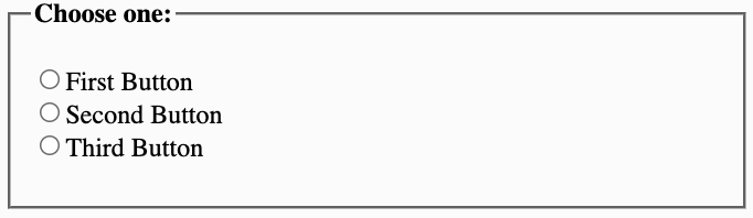
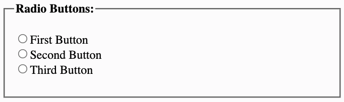
<fieldset> and <legend> tags.A example group of fieldsets is shown in Figure \(\PageIndex{3}\).
Code for these fieldsets is shown below. Since a fieldset expands to fill the width of its container, it is usually necessary to assign it a fixed width to control its placement and appearance. Note that the example fieldsets are assigned a width of 180 pixels to keep them from each stretching across the width of their enclosing division, permitting them to display side by side; also, they are vertically aligned at the top of their container division. A style sheet is applied to both the <fieldset> and <legend> tags to effect their styling.
    <style>
      fieldset {width:180px; vertical-align:top}
      legend   {font-family:verdana; font-size:9pt; font-weight:bold; color:royalblue}
    </style>

    <div> <-- Block level container for fieldsets -->
        <fieldset>
            <legend>Radio Buttons:</legend>
            <input name="Radio" type="radio" />First Button<br />
            <input name="Radio" type="radio" />Second Button<br />
            <input name="Radio" type="radio" />Third Button<br />
        </fieldset>

        <fieldset>
            <legend>Checkboxes:</legend>
            <input name="Box1" type="checkbox"/> First Checkbox<br />
            <input name="Box2" type="checkbox"/>Second Checkbox<br />
            <input name="Box3" type="checkbox"/> Third Checkbox<br />
            <input name="Box4" type="checkbox"/>Fourth Checkbox<br />
            <input name="Box5" type="checkbox"/> Fifth Checkbox<br />
        </fieldset>

        <fieldset>
            <legend>Selection List:</legend>
            <select size="5">
                <option>First Option</option>
                <option>Second Option</option>
                <option>Third Option</option>
                <option>Fourth Option</option>
                <option>Fifth Option</option>
                <option>Sixth Option</option>
                <option>Seventh Option</option>
            </select>
        </fieldset>
    </div>
The <label> Tag
Some form controls automatically have labels associated with them (buttons) while most do not (text boxes, checkboxes, radio buttons, text areas, and menus). The <label> tag is used to define a label for HTML form controls that do not have implicit labels. If you click the text within the label element, it toggles the control.
The "for" attribute associates a label with another control explicitly: the value of the for attribute must be the same as the value of the "id" attribute of the associated control element.
The code below demonstrates the use of the <label> tag:
    <form action="ThisPage.htm">
    <p>Please enter the following information:</p>

    <table>
    <tr>
      <td>Name: </td>
      <td><label for="TheName">Enter Name</label><input id="TheName" type="text"></td>
    </tr>
    <tr>
      <td>Password: </td>
      <td><label for="TheName">Enter Password</label><input id="ThePassword" type="password"></td>
    </tr>
    </table>

    </form>
<label> tag.The text between the opening and closing <label> tag becomes the label for the control. If the <label> tag is coded to the left of the control, the label appears on the left. On the other hand, if the <label> tag is coded to the right of the control, the label appears on the right.
The label tag is important for form page accessibility. It is helpful to visually challenged individuals who are using assistive technology software. The software is able to match up the label with the form control. all form controls are required to have an associated label.
Form Control Layout using CSS
In previous sections of this tutorial, tables were used to control the layout of form control elements. An alternative is to use CSS to format and display form controls. The advantage to using CSS is that it requires less code - elimnation of table tags and the line break tag. The code below demonstrates how to layout form controls using CSS.
<style>form#myForm {width:400px} label {width: 120px; float:left; text-align:right; margin-top: 10px; padding-right:10px} input {margin-top: 10px;} div#mySubmit {margin-top:10px;padding-bottom:10px}</style>-----------------------------------------------<div><form><div><label for="FName">First Name:</label><input type="text" id="FName"/></div><div><label for="LName">Last Name:</label><input type="text" id="LName"/></div><div id="mySubmit"><input type="submit" value="Submit Form"/></div></form></div>
Using the CSS method, <div> elements are used to organize form elements. Each <label> and <input> control pair are coded within there own division container. The entire form area is given a width of 400px using the "myForm" id selector. Label element selectors are key to aligning the text - this selector is configured to float on the left with the text aligned to the right. The float causes the input controls to wrap around the right side of the labels. The input controls are also configured with a top margin. The submit button is styled using the "mySubmit" id selector. Left margin and bottom padding are applied to the submit button.