
2: Document Markup
- Page ID
- 45733

\( \newcommand{\vecs}[1]{\overset { \scriptstyle \rightharpoonup} {\mathbf{#1}} } \)
\( \newcommand{\vecd}[1]{\overset{-\!-\!\rightharpoonup}{\vphantom{a}\smash {#1}}} \)
\( \newcommand{\dsum}{\displaystyle\sum\limits} \)
\( \newcommand{\dint}{\displaystyle\int\limits} \)
\( \newcommand{\dlim}{\displaystyle\lim\limits} \)
\( \newcommand{\id}{\mathrm{id}}\) \( \newcommand{\Span}{\mathrm{span}}\)
( \newcommand{\kernel}{\mathrm{null}\,}\) \( \newcommand{\range}{\mathrm{range}\,}\)
\( \newcommand{\RealPart}{\mathrm{Re}}\) \( \newcommand{\ImaginaryPart}{\mathrm{Im}}\)
\( \newcommand{\Argument}{\mathrm{Arg}}\) \( \newcommand{\norm}[1]{\| #1 \|}\)
\( \newcommand{\inner}[2]{\langle #1, #2 \rangle}\)
\( \newcommand{\Span}{\mathrm{span}}\)
\( \newcommand{\id}{\mathrm{id}}\)
\( \newcommand{\Span}{\mathrm{span}}\)
\( \newcommand{\kernel}{\mathrm{null}\,}\)
\( \newcommand{\range}{\mathrm{range}\,}\)
\( \newcommand{\RealPart}{\mathrm{Re}}\)
\( \newcommand{\ImaginaryPart}{\mathrm{Im}}\)
\( \newcommand{\Argument}{\mathrm{Arg}}\)
\( \newcommand{\norm}[1]{\| #1 \|}\)
\( \newcommand{\inner}[2]{\langle #1, #2 \rangle}\)
\( \newcommand{\Span}{\mathrm{span}}\) \( \newcommand{\AA}{\unicode[.8,0]{x212B}}\)
\( \newcommand{\vectorA}[1]{\vec{#1}} % arrow\)
\( \newcommand{\vectorAt}[1]{\vec{\text{#1}}} % arrow\)
\( \newcommand{\vectorB}[1]{\overset { \scriptstyle \rightharpoonup} {\mathbf{#1}} } \)
\( \newcommand{\vectorC}[1]{\textbf{#1}} \)
\( \newcommand{\vectorD}[1]{\overrightarrow{#1}} \)
\( \newcommand{\vectorDt}[1]{\overrightarrow{\text{#1}}} \)
\( \newcommand{\vectE}[1]{\overset{-\!-\!\rightharpoonup}{\vphantom{a}\smash{\mathbf {#1}}}} \)
\( \newcommand{\vecs}[1]{\overset { \scriptstyle \rightharpoonup} {\mathbf{#1}} } \)
\(\newcommand{\longvect}{\overrightarrow}\)
\( \newcommand{\vecd}[1]{\overset{-\!-\!\rightharpoonup}{\vphantom{a}\smash {#1}}} \)
\(\newcommand{\avec}{\mathbf a}\) \(\newcommand{\bvec}{\mathbf b}\) \(\newcommand{\cvec}{\mathbf c}\) \(\newcommand{\dvec}{\mathbf d}\) \(\newcommand{\dtil}{\widetilde{\mathbf d}}\) \(\newcommand{\evec}{\mathbf e}\) \(\newcommand{\fvec}{\mathbf f}\) \(\newcommand{\nvec}{\mathbf n}\) \(\newcommand{\pvec}{\mathbf p}\) \(\newcommand{\qvec}{\mathbf q}\) \(\newcommand{\svec}{\mathbf s}\) \(\newcommand{\tvec}{\mathbf t}\) \(\newcommand{\uvec}{\mathbf u}\) \(\newcommand{\vvec}{\mathbf v}\) \(\newcommand{\wvec}{\mathbf w}\) \(\newcommand{\xvec}{\mathbf x}\) \(\newcommand{\yvec}{\mathbf y}\) \(\newcommand{\zvec}{\mathbf z}\) \(\newcommand{\rvec}{\mathbf r}\) \(\newcommand{\mvec}{\mathbf m}\) \(\newcommand{\zerovec}{\mathbf 0}\) \(\newcommand{\onevec}{\mathbf 1}\) \(\newcommand{\real}{\mathbb R}\) \(\newcommand{\twovec}[2]{\left[\begin{array}{r}#1 \\ #2 \end{array}\right]}\) \(\newcommand{\ctwovec}[2]{\left[\begin{array}{c}#1 \\ #2 \end{array}\right]}\) \(\newcommand{\threevec}[3]{\left[\begin{array}{r}#1 \\ #2 \\ #3 \end{array}\right]}\) \(\newcommand{\cthreevec}[3]{\left[\begin{array}{c}#1 \\ #2 \\ #3 \end{array}\right]}\) \(\newcommand{\fourvec}[4]{\left[\begin{array}{r}#1 \\ #2 \\ #3 \\ #4 \end{array}\right]}\) \(\newcommand{\cfourvec}[4]{\left[\begin{array}{c}#1 \\ #2 \\ #3 \\ #4 \end{array}\right]}\) \(\newcommand{\fivevec}[5]{\left[\begin{array}{r}#1 \\ #2 \\ #3 \\ #4 \\ #5 \\ \end{array}\right]}\) \(\newcommand{\cfivevec}[5]{\left[\begin{array}{c}#1 \\ #2 \\ #3 \\ #4 \\ #5 \\ \end{array}\right]}\) \(\newcommand{\mattwo}[4]{\left[\begin{array}{rr}#1 \amp #2 \\ #3 \amp #4 \\ \end{array}\right]}\) \(\newcommand{\laspan}[1]{\text{Span}\{#1\}}\) \(\newcommand{\bcal}{\cal B}\) \(\newcommand{\ccal}{\cal C}\) \(\newcommand{\scal}{\cal S}\) \(\newcommand{\wcal}{\cal W}\) \(\newcommand{\ecal}{\cal E}\) \(\newcommand{\coords}[2]{\left\{#1\right\}_{#2}}\) \(\newcommand{\gray}[1]{\color{gray}{#1}}\) \(\newcommand{\lgray}[1]{\color{lightgray}{#1}}\) \(\newcommand{\rank}{\operatorname{rank}}\) \(\newcommand{\row}{\text{Row}}\) \(\newcommand{\col}{\text{Col}}\) \(\renewcommand{\row}{\text{Row}}\) \(\newcommand{\nul}{\text{Nul}}\) \(\newcommand{\var}{\text{Var}}\) \(\newcommand{\corr}{\text{corr}}\) \(\newcommand{\len}[1]{\left|#1\right|}\) \(\newcommand{\bbar}{\overline{\bvec}}\) \(\newcommand{\bhat}{\widehat{\bvec}}\) \(\newcommand{\bperp}{\bvec^\perp}\) \(\newcommand{\xhat}{\widehat{\xvec}}\) \(\newcommand{\vhat}{\widehat{\vvec}}\) \(\newcommand{\uhat}{\widehat{\uvec}}\) \(\newcommand{\what}{\widehat{\wvec}}\) \(\newcommand{\Sighat}{\widehat{\Sigma}}\) \(\newcommand{\lt}{<}\) \(\newcommand{\gt}{>}\) \(\newcommand{\amp}{&}\) \(\definecolor{fillinmathshade}{gray}{0.9}\)Section 2:
Document Markup
Section Contents
Learning Objectives
By the end of this section, you should be able to demonstrate:
- the ability to create an HTML document structured to support CSS styling
- the ability to create a CSS file that adapts styling based on device capabilities
- the ability to create basic images using canvas
- the ability to integrate audio and video to a page
- the ability to utilize special device features
- the ability to integrate external font styles
Chapter 7
Markup Languages
Document markup is a notation method that defines how particular pieces of information are meant to be formatted. The term comes from the practice of marking up manuscripts to notate changes that need to be made. Markup in terms of programming languages is used to identify a language that specifies how a document is to appear.
If you have ever used multiple colors of ink or highlighter when making notes and ascribed meaning to those colors for yourself (e.g., yellow highlighter is important, red ink is a definition) then you have already practiced document markup. You are providing additional layers of information along with the written text, in this case visual cues as to the purpose of the written information.
Some popular markup languages are hypertext markup language (HTML), extensible markup language (XML) and extensible hypertext markup language (XHTML).These were each created to fulfill particular needs in defining the layout and structure of the material.
HTML5 
Hypertext markup language is used to aid in the publication of web pages by providing a structure that defines elements like tables, forms, lists and headings, and identifies where different portions of our content begin and end. It can be used to embed other file formats like videos, audio files, documents like PDFs and spreadsheets, among others. HTML is the most relied upon language in the creation of web sites. In this text we will focus on HTML5. While it is technically still in draft form, many proposed elements are already supported by the newer versions of most of the popular browsers.
History
In the beginning, back to the first days of the Internet and ARPA, the primary purpose of creating a page was to share research and information. HTML tags were only meant to provide layout and formatting of a page. As such, early implementations of HTML were somewhat limited as there was little demand for features beyond the basics. Headings, bullets, tables, and color were about all developers had to utilize. As sites were created for other more commercial uses, developers found creative ways of using these tools to get their pages looking more like magazines, advertisements, and what they had drawn on paper. Having been one of those developers, I recall the days of just-get-it-looking-right techniques, splicing page-sized images into tables so graphics were (usually) where we wanted them, nesting tables within tables to create complex layouts, and other methods that violate today’s best practices.
Current State
While not formally finalized, many browsers are already supporting a number of features proposed in drafts of HTML5, including things like canvas and media support that greatly improve the browser’s ability to process and display complex materials without requiring extensive coding and extensions. In the past, sites that used video and audio players had to integrate support for many players, and would have to include the libraries and formatted files for those systems in their sites. By providing a solution to using these media forms within HTML5, we can improve on the user experience and reduce the efforts necessary to provide them.
While these new features do reduce the amount of programming required to implement higher level elements, and include interactive elements that exceed document markup activities, HTML5 is still considered a markup language.
In these languages, we use tags to ascribe additional meaning to our text, which provide instruction to the browser as to how to display the text on the screen, but are not necessarily displayed to the user. In HTML and XHTML these tags are fixed, or predefined, meaning the names that can be used in the tags are limited to what browsers are able to recognize. In XML, tags are defined by the person creating the content as they are typically used in conjunction with data sources and provide information.
W3C Standards
The World Wide Web Consortium,1 or W3C, is an international community that supports web development through the creation of open standards that provide the best user experience possible for the widest audience of users. This group of professionals and experts come together to determine how CSS and HTML should operate, what tags should be included as features, and more. The W3C is also your best reference point in determining the accessibility of your site through the use of tools that analyze your code for W3C compliance. These tools confirm if you have fully implemented elements in your code, like providing alternate text descriptions of images in the event that the image cannot load, or the user is visually impaired.
In addition to the creation of accessibility standards, among many others, the W3C also provides tutorials and examples and is likely the most exhaustive reference you will find.
 CSS
CSS
CSS stands for cascading style sheet, and is used to create rules about the color, font, and layout of our pages. It also determines when those rules are to be used, based on information like the device connecting to the page, or in response to a user’s action. CSS can be used by not only HTML but any XML based language. By separating as much of the look and feel of a page from HTML as possible, we actually separate content from appearance. This makes it possible to quickly create several different versions of the appearance of our site, without recreating the content in each version. Our best approach is to use HTML to define the structure (and only structure) of our pages whenever possible, laying the groundwork for CSS to know where to apply the actual style.
History
As HTML grew in popularity, demands on its feature set also grew. Combined with the variety of browser implementations and their varied approaches to rendering and support, creating robust, visually appealing sites involved a significant amount of time and effort. To reduce these, and separate the duties of presentation from those of content, proposals were sought to define a new system of managing these features. CSS was born out of CHSS, or Cascading Hypertext Style Script, and extends our capabilities by allowing us to go far beyond the styling limits of HTML by giving us more power over images, making pages appear more newspaper or magazine-like with layout and typography affects, and reducing load time.
Introduced for public use in 1996, CSS1 contained the ability to apply rules by identifying elements (selectors), and most of the properties still in use today. CSS2 added the ability to adapt for different displays and devices, as well as positioning elements by specific values on the page. CSS2.1 followed with the introduction of additional features, but these were not considered substantial enough to warrant a full version number change.
Current State
While commonly referred to as CSS3, the numbering no longer applies to the language as a whole. The developers have decided to break the language into modules, allowing different aspects of the language to be revised and released independent of one another. This allows for stable modules to stay numbered as they are (since they are not actually changing), while those under more active development can be pushed out as needed. At the moment, most of the “current” modules are at version number 3. Some have not really changed from 2.1, while work on version 4 of selected modules is already underway.
Document Object Model
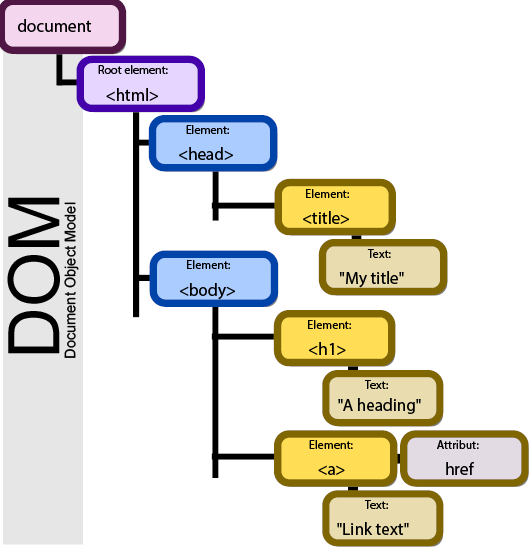 By Birger Eriksson CC-BY-SA-3.0
Figure 20 Document Object Model
Our ability to manipulate and create webpages consistently across formats comes from the document object model API, typically referred to as DOM. This API defines the order and structure of document files as well as how the file is manipulated to create, edit, or remove contents.
The DOM is built to be language and platform independent so any software or programming language can use it to interface with documents. It defines the interface methods and object types that represent elements of documents, the semantics and behavior of attributes of those objects, and also defines how they relate to one another. The DOM, effectively, is what gives rise to the tags we are about to study below. Languages that use the DOM, however, are not required to include all of its features, and may generate additional features of their own.
Figure 20 depicts an example of a document’s model in tree format, with nested elements appearing to the right and below their parents. In this example, we are shown an HTML page with a section for the head and the body, which includes a page title and a link as its contents. This structure provides the ability for us to traverse, or move around the document, by referring to an object’s name or attribute.
HTML
File Format
Before we can create our first web page, we need to create a file that our service will recognize as a web page. To do this, we can open our chosen text editor (see a short list of potentials in the section on Integrated Development Environments), and create a new document if one was not created automatically. We will immediately select “Save As” from your editor’s File menu, and give your new page its name. If this is going to be the front page, or first page you want a user to see for your site, you should name it index. Index is the default file name most web servers look for in any folder of your website; it saves your users from having to know and type the page name as part of the URL.
In many text editors, underneath or near where you enter the file name is another drop down selector that allows you to pick a file type. This is the extension (what comes after the period in the file name), or file type, that identifies what kind of data the file represents. This tells our operating system, applications, and browsers what conventions were used to create the content so it can be reassembled into usable form. Since we are creating a basic web page, we will use the .htm extension (.html is also acceptable, just be consistent to make your life easier). If your editor does not have .htm or .html in its list, then select “All” and make index.htm your file name.
Additional Notes
If you ever come across an unfamiliar extension and want to know more about it, sites like filext.com can help you determine what programs can open it and what it is for.
Once we have saved our file as index.htm, we are ready to begin. Saving as soon as we create a file is useful as the text editor will then know what syntax is expected. This will enable features like color coding and highlighting that your editor supports.
Document Type
Every HTML page we create should declare its document type (doctype) in the first line. This will identify which spec of HTML is included so the browser knows how to interpret the tags within. Earlier version of the HTML specifications used two definitions for HTML: HTML 4.01 and XHTML. Both of these contained two additional properties of strict and transitional.
With HTML5, much of this has been eliminated, leaving one general doctype declaration of <!DOCTYPE html>. This should be the first line of code in any HTML page you create. We will not cover the older doctype formats as all of our examples will focus on HTML5. Keep in mind, though, that code examples you find online with anything other than the tag above may be outdated approaches to what is shown.
Learn more
Keywords, search terms: xml, html, css, dom, document markup,
W3C Documentation for XML: http://www.w3.org/TR/2004/REC-xml11-20040204/
W3C Documentation for CSS: http://www.w3.org/Style/CSS/
W3C Specifications for HTML:http://www.w3.org/community/webed/wiki/HTML/Specifications
Chapter 9
Tags, Attributes
In order to add content to our page, we will set up our file with some basic structure. First, we will use tags to identify information about where parts of our page start and end. We will do this by using our first set of tags, <html> and </html>. We refer to these as a set because both use the same predefined word (HTML), and the latter uses the backslash (/) to indicate that it marks the close of that tag set. The act of placing a set of tags around content and other code is often referred to as “wrapping” what is between the tags. This is a good way to create a mental picture of what you are doing.
Next, we will put in a few more tags and then save our file and see some results. In between (typically referred to this as “inside”) your HTML tags, add an empty set of tags labeled head, and another labeled body. Then create two more sets labeled header and footer inside your body tags. Your resulting file should look like this:
- <html>
- <head>
- </head>
- <body>
- <header>
- </header>
- <footer>
- </footer>
- </body>
- </html>
Now we will add some spacing (see Spacing from our Good Practices section), and the ubiquitous Hello World in between the close of our header and start of our footer tags:
- <html>
- <head>
- </head>
- <body>
- <header>
- </header>
- Hello World
- <footer>
- </footer>
- </body>
- </html>
Now we can better see how elements can be placed within one another, called nesting. If we save our file again, and double click the icon for our file in our documents folder to open it, it should open in your computer’s default browser as a white page with Hello World in the upper left corner. Congratulations! You have just made your first web page. Before you ask, though, unless you have created your own server, you will not be able to show your page to someone unless they are at your computer or you send them the file(s) you created. Since only the browser is needed to view the output of HTML, JavaScript, and CSS files, we will be able to view our pages without a server until the PHP examples later on.
As we continue to make changes, you can keep your editor and browser open at the same time. After you save your file in your text editor, you can simply refresh the page in your browser to see your changes.
Additional Notes
As we look at HTML elements, keep in mind that browsers will do their best to adjust for mistakes like missing tags. Different browsers will react to these problems in their own way, so just because it shows up correct in one browser does not mean it will in others.
Some tags, like those for including images, do not need a closing tag in order to work as no content is necessary inside the tags. In this case, we simply use the tag itself where we want it. In older versions of HTML one of the differences between document types was how we closed single tag elements. HTML, for example, wanted a break written as <br> while an XHTML document wanted <br/>. HMTL5 will recognize either of these.
Head
Getting back into our document, we see that the first set of tags is called head. This is where we will put information about the page itself (called metadata) and where we will connect to any other resources like scripts and files that are not part of the page we are using. It is important that your <head> tags are always the first set of tags after <html>, as this is the order in which browsers expect the information.
To provide some basic information about our page or site, we will add some meta tags inside our head to give it a title, keywords, a description, and other details. These pieces of information help the user and bots understand what the page is about.
Each of these items are all parts of the meta tag (<meta/>). Some tags have special features that can be added to their definitions; these are called attributes. Meta tags support attributes like name and content. How we define these attributes will help the browser understand our page better. We will set our title as Our First Page, add the keywords beginning html, learning, and CSIT-107, and for a description we will put in a couple lines about what we are doing, and finally, add our name:
- <head>
- <title>Our First Page</title>
- <meta name="keywords" content="beginning html, learning, CSIT-107" />
- <meta name="description" content="A beginning web page for CSIT-107 SUNY Fredonia" />
- <meta name="author" content="Your Name Here" />
- </head>
There are a few things in this example for us to look at. First, you will note that title has its own tag. What you put in this tag is what will appear as the title in your browser window, and on the tab in your browser for this page (You can only have one set of these tags in a document). Keep in mind, this title will not appear on the page itself. If we want to include it as part of our page content, we would do that from within the body tags.
Next, we see that the values assigned to name and content are placed in quotes. The quotes identify what belongs to that attribute. While it is standard practice to use double-quoted strings, we can also use single quotes. These can be useful when creating HTML statements like those above as output from other languages (we will see examples of this in PHP).
You might also note that our keywords are comma separated, meaning we break them up by placing commas between different values; we do not need to add separate quotes around each word or phrase.
In the HTML5 specs, the meta tag can also have attributes named charset and http-equiv. Charset allows us to specify a particular set of characters we want to use for the page, an http-equiv supports content-type, default-style, and refresh as options. This lets us tell the browser what type of page we have (in our case, text/html), name a default style sheet (we will get to this later) and specify in terms of seconds how often we want to refresh the page, if at all.
Since our content will not be changing unless we change the page ourselves, and we do not have a style sheet yet, we will just add our content type declaration for now:
- <meta http-equiv="content-type" content="text/html" />
Meta is also where we will define cache items like how long our page can be cached before it expires, or if we even want content to expire, as in these examples:
- <META HTTP-EQUIV="EXPIRES" CONTENT="Mon, 22 Jul 2002 11:12:01 GMT">
- <META HTTP-EQUIV="CACHE-CONTROL" CONTENT="NO-CACHE">
Body
All of the content that we wish to have on the screen should be encompassed by a set of body tags. The header, content, footer, and div (an all-purpose tag derived from “division”) sections are examples of what we can put in our body tags, which we will see in the next example. Keep in mind that using these tags does not prevent us from seeing content that is not within the body. Tags are used to guide the interpreter in how to display the document. Unless it is specifically within the <head> tags, browsers may elect to display any content that is not properly nested in different ways.
Header, Footer
The header and footer tags are new in HTML5. They were added due to the volume of sites that define a top and bottom section to their pages. Allowing these tags makes it easier to define and find those parts of the layout. The header and footer should be nested within your body tags, but are not a requirement. For our example, we will put a screen title in our header and a copyright in our footer:
- <body>
- <header>
- <h1>This is our first page!</h1>
- </header>
- Hello World
- <footer>
- © 2013 Your Name Here
- </footer>
- </body>
After saving your file and refreshing your browser, you should see our sentence in the top left, followed by Hello World, and then © 2013 Your Name Here. We made our title text extra-large by wrapping it in <h1> tags. H1 stands for heading one, the largest heading by default. We can also use h2 through h6 to access additional styles. Just as in a written document, we use these headings to distinguish different portions of our text. Your browser is applying a default style to make h1 look as it does on your screen. Later, we will see how to override this default style to make our headings look how we want them to. Using these headings allows us to quickly identify different portions of content not only for the reader, but also for search engines, which typically consider content in these tags as indicators of what your site is about, reducing our SEO efforts later.
Div/Span
While <p> helps us split up our text, we also need a mechanism to separate different pieces of content like we did when we used header and footer. This will allow us to define more than just a top, middle and bottom to our page. To do this, we can wrap those sections in <div> tags. Div stands for divide—it defines a section of content that should be treated as separate from other content. Span is very similar to div, except that it should identify inline content, meaning material that is within a block of text. Ultimately, a div will place a line break before and after its tags, while a span will not. Aside from this, these tags are functionally equivalent. While these tags seem very plain now, they are very useful when creating complex layouts, and are the tags we will use most often.
While div and span are effective for styling, we should strive to use the best set of tags available so browsers, users, and bots are able to understand our site and its layout, like the <header> and <footer> that we have already used in our code. Just keep in mind, not all of these are supported in all browsers. If you are wondering which browsers will work with what tags, you can refer to caniuse.com to see what is available.
To create organization for our site, we will add some more conceptual sections to our file. You will notice the layout does not actually go left or right as we are labeling our divs (everything will organize top-to-bottom). This is because we need to add CSS for the full effect. We will pick this example up again later to add the CSS needed to create the layout we want:
- <body>
- <header>
- <h1>This is our first page! </h1>
- </header>
- <div id="left">
- some menu items
- </div>
- <div id="content">
- Hello World
- </div>
- <div id="right">
- and some content on the right
- </div>
- <footer>
- © 2013 Your Name Here
- </footer>
- </body>
Chapter 10
Text Layout
While all of the following tags are supported in HTML5, some of them are exclusive to the new specification, and will require a browser that is HTML5 compatible to work correctly.
Paragraphs
To build upon our basic structure a bit, we can break a long section of text into paragraphs. We can do this by adding breaks (<br/>) in our code. If we are going to do this a number of times, and if we want to style our paragraphs down the line, we should instead wrap each one in a set of paragraph tags, <p></p>. Using the paragraph tags allows us to automatically add spacing around our content to separate it from the rest of the page.
Before:
- <body>
- This is some text. It is really long. We want to break this into paragraphs so it looks more like a document. This is some text. It is really long. We want to break this into paragraphs so it looks more like a document. This is some text. It is really long. We want to break this into paragraphs so it looks more like a document. This is some text. It is really long. We want to break this into paragraphs so it looks more like a document. This is some text. It is really long. We want to break this into paragraphs so it looks more like a document. This is some text. It is really long. We want to break this into paragraphs so it looks more like a document. This is some text. It is really long. We want to break this into paragraphs so it looks more like a document. This is some text. It is really long. We want to break this into paragraphs so it looks more like a document. This is some text. It is really long. We want to break this into paragraphs so it looks more like a document. This is some text. It is really long. We want to break this into paragraphs so it looks more like a document. This is some text. It is really long. We want to break this into paragraphs so it looks more like a document. This is some text. It is really long. We want to break this into paragraphs so it looks more like a document. This is some text. It is really long. We want to break this into paragraphs so it looks more like a document. This is some text. It is really long. We want to break this into paragraphs so it looks more like a document.
- </body>
After:
- <body>
- <p>
- This is some text. It is really long. We want to break this into paragraphs so it looks more like a document. This is some text. It is really long. We want to break this into paragraphs so it looks more like a document. This is some text. It is really long. We want to break this into paragraphs so it looks more like a document. This is some text. It is really long. We want to break this into paragraphs so it looks more like a document. This is some text. It is really long. We want to break this into paragraphs so it looks more like a document. This is some text. It is really long. We want to break this into paragraphs so it looks more like a document.
- </p>
- <p>
- This is some text. It is really long. We want to break this into paragraphs so it looks more like a document. This is some text. It is really long. We want to break this into paragraphs so it looks more like a document. This is some text. It is really long. We want to break this into paragraphs so it looks more like a document. This is some text. It is really long. We want to break this into paragraphs so it looks more like a document.
- </p>
- </body>
Ordered, Unordered Lists
If you are not familiar with the protocol for lists, unordered lists are intended for items that relate, but do not need to be in a particular order. Ordered lists, on the other hand, are for items that need to be ordered for a reason, like instructions that need to be followed in correct sequence.
Ordered and unordered lists are alphanumeric and unordered lists of items, respectively. Using these we can create lists to have them display on the screen as we are used to seeing a list of items, or we can take a list we have defined and use it as a group of common objects or ideas to build things like menus and navigation when we add additional CSS.
When we use the tags <ol> (ordered lists) or <ul> (unordered lists), we placed nested <li> tags in each to represent each item in the list.
|
|
|
|
Definition Lists
A related set of tags can be used when you want to list definitions. These are <dl> for the list itself, with <dt> nested inside for terms and <dd> also nested, for definition, following its corresponding <dt>.
|
Coffee Bean-based caffeinated beverage Tea Leaf-based caffeinated beverage Water Standard H20 |
Address
The address tag allows us to specify text that belongs to an address or contact information for the content creator, making it easier for applications to find the information needed for tools like mapping and generating references.
- <address>
- Article by <a href="mailto:professor@school.edu">Prof. Essor</a>.<br>
- Fredonia, NY<br>
- USA
- </address>
Article by Prof. Essor.
Fredonia, NY
USA
Article
Article tags are meant to be used on content that can be re-used outside of its original site. It is meant for news articles, blog posts, and other types of content that would be republished in multiple locations.
- <article>
- <h1>Our Blog Post</h1>
- <p>This is our great content that is now identified as something that can exist on its own as a piece of work.</p>
- </article>
Aside
The aside is intended for use when you want to mark a piece of content that is related to the material it is nested within. It created primarily to define related information, like part of an article or blog.
- <p>
- This is some text. It is really long. We want to break this into paragraphs so it looks more like a document. This is some text. It is really long. We want to break this into paragraphs so it looks more like a document. This is some text. It is really long. We want to break this into paragraphs so it looks more like a document. This is some text. It is really long. We want to break this into paragraphs so it looks more like a document.
- </p>
- <aside>
- <h4>Side Bar</h4>
- <p>This is something related to our content that is not actually a part of it</p>
- </aside>
Button
A button is similar to the submit button, but unlike other input styles, it can include text or an image. Its default formatting gives it a beveled button appearance.
|
|
Caption
The caption tag is for tables, and allows you to define a label to be printed near the table for reference. You can only have one caption per table, and it must be after the opening table tag.
|
|
Cite
While cite has been included in previous versions of HTML, the current HTML5 specification intends for it to be used to define the title of a work that is included in the document. Previous versions limited this tag to proper citations of written publications.
|
|
Entities
In the examples in the Header, Footer section, we placed a copyright symbol on the screen using “©” which told the browser what symbol we wanted to use. This is a reserved symbol, or entity, in HTML. We can call entities by using &[entity name here]; or &[entity number here];. For example, means non-breaking space, or just a standard space. This is one way to insert extra spaces in our output. Since the browser would skip all the extra spaces in our code, we can add non-breaking space entities to tell the browser we do want it displayed on the screen.
The table below includes examples of other popular symbols (there are plenty more). Keep in mind, when you use entity names, they are case sensitive.
|
Result |
Description |
Name |
Number |
|
non-breaking space |
|
  |
|
|
< |
less than |
< |
< |
|
> |
greater than |
> |
> |
|
& |
ampersand |
& |
& |
|
© |
copyright |
© |
© |
|
® |
registered trademark |
® |
® |
|
™ |
trademark |
™ |
™ |
Figure
The figure tag allows us to label an image, portrait, or other visual art included in an image tag to identify the content as such.
- <figure><img src="ourimage.jpg"/></figure>
Figcaption
Figcaption, like caption, allows us to add a caption to our image like we would for a table.
- <figure>
- <img src="ourimage.jpg"/>
- <figcaption>Figure 1</figcaption>
- </figure>
Mark
Most text altering tags have been skipped in this text as they can be easily achieved through CSS (and to maintain separation of duties). However, the mark tag is worth a look as an easy way to achieve a highlighting effect. It can be useful to insert this tag when generating output for things like search results.
|
Here is a sentence with some highlighted text. |
Meter
The meter tag allows us to generate a visual image based on provided values. This is intended for values that are already known or loaded to the screen like a chart or graph. There is also a Progress tag for monitoring file actions in progress like a download.
|
|

Nav
If we have a group of links we want in one place (i.e. a menu or list of references), we can include them inside nav tags so browsers recognize them as a group of links. This is especially useful for screen reader software, as the tags provide an indicator as to what the links are for.
- <nav>
- <a href="//">Home</a> |
- <a href="/css/">CSS</a> |
- <a href="/js/">JavaScript</a> |
- <a href="/js/jquery/">jQuery</a>
- </nav>
Progress
The progress tag was created to help display the status of an upload or download. It takes two attributes including the current amount (which we would change using JavaScript) and the total or highest value of what we are monitoring. If we are showing the percentage of an upload we might use:
|
|
Or, if we want to show the actual amount moved, or are moving a number of items, we can use the number completed and the total number instead of a percent, and the image will calculate it for us:
|
|

Time
Another new-to-HTML5 element is time. The time tag is flexible in that it can specify a 24 hour formatted value, a full Gregorian calendar date, or both a date and time. The use of this tag by itself will not change any visual styling on the page, but allows applications on our devices to find the information in order to support features like creating calendar entries or reminders based on the information.
- <p>The daily meeting will be at <time>10:00</time> every morning.</p>
- <p>The next monthly meeting will be on <time datetime="2013-08-01">August first</time>.</p>
Chapter 11
Navigation
A feature found on almost every websites is a navigation system for moving between pages. These are typically menus, where groups of common pages are created to give the site a hierarchical organization. While the approach to visual styling and interaction with menus comes in great variety, most follow a basic principle of using unordered lists of links, and the application of CSS to those lists in order to turn them into the colorful, interactive elements we are accustomed to. While there are drawbacks that we will discuss in Visually Impaired Considerations, alternative approaches can still utilize linked lists to some extent.
Since we created our menu earlier, we already know the contents and structure of our navigation. Our group label, or top-level labels, and the nested <ul>s represent the contents of the list for that menu item.
Some popular approaches to providing a means of navigation are menu bars with drop downs, bread crumbs, and event driven responses. Menu bars are the most frequently utilized element, where hovering or clicking over an item in the menu brings up additional choices related to the main item. Typically referred to as drop down menus, they can be styled to move in any direction. Nesting lists within lists can give us a multi-tier menu that allows us the ability to select from a large number of pages with little effort.
Breadcrumbs are typically depicted as a horizontal delimited list of pages, similar to:
- Home >> Sports >> Football >> Buffalo Bills >> Patriots >> Golf
The breadcrumb does not follow a hierarchical notation, but acts more like a brief history of where you have been on the site, allowing you to skip back several steps at once without using your browser’s back button. These can be helpful in sites with large amounts of content where the user’s experience may not be particularly linear, as they move between topics or sections, like news or reference sites.
Event-driven navigation is useful in narrowing the user experience to a fixed set of paths. This method will only make certain links available under certain conditions, restricting the options a user has on a particular page to what they are allowed to do, which may be based on a variety of rules such as if they are logged in, previous links or decisions they have made, or if something in the system needs their attention.
These approaches can be used by themselves, or in combination to provide your user experience.
Linking
Links in HTML can take two forms, both of which are created with the anchor tag (<a>). They can either point to a resource in another location, or to a location within the document. The former are used far more frequently than the latter, however internal links are coming back into popularity with the rise of infinite scrolling.
Absolute, Base, and Relative Path
The href attribute of an anchor tag defines the actual location the link will represent. Absolute and relative paths are two reference methods for connecting sites and pages. While both methods can be used when creating links that point to content in our own site, only absolute can be used when pointing to content that is outside of your domain.
Absolute paths are the entire length of the link required to identify one resource, whether it is a page, image, script, or media file. The URL http://www.msn.com/news/index.htm tells us we want to go to the index page in the news folder of the msn.com website. If this was our site, and we wanted to go to the index.htm file in the sports folder, we could write it as http://www.msn.com/sports/index.htm (absolute) or ../sports/index.htm (relative). The initial .. instructs the browser that our intention is to go back one layer of depth (i.e. “up” one level in folders) and then into the sports folder, which in this example sits in the same parent folder as our news page.
Using just an initial / without .. tells the server that we want to start at the root folder of the server and navigate from there, meaning we start with the base path.
A base path is everything needed to get us to the index page of the root folder of the site. This is typically http://www.yoursitename.com, and is the part you find missing in the relative path above. The combination of the base path, and relative path, equals your absolute path.
Target
While the anchor tag supports several attributes, one of the most important of these is “target.” This attribute describes where links will be loaded, like a new tab or the same tab/browser window we are already using. The attribute can take any of the following values to define that location.
|
Value |
Description |
|
_blank |
Opens the linked document in a new window or tab |
|
_self |
Opens the linked document in the same frame as it was clicked (this is default) |
|
_parent |
Opens the linked document in the parent frame |
|
_top |
Opens the linked document in the full body of the window |
|
framename |
Opens the linked document in a named frame |
Within the Page
We can add links to a page that move the user around the page itself, which is useful on pages with long content. To do this, we use an anchor tag to define where we want our destination to be. When we create our link, we simply reference the name of our anchor, preceded by a pound sign in place of a traditional URL.
|
Some text here. Some more text. |
Graphics
Images are the greatest contributors to the visual appeal of your site, and typically account for the majority of bandwidth used in loading your pages. By using a combination of image types, and newer techniques found in HTML5 like canvas, and reproducing images using CSS, we can balance quality against size to reduce our bandwidth needs and allow our site to be more flexible.
Formats
Images are files, just like any other document in your computer, but they can be coded and formatted differently to reproduce the image you want to see. We find these referred to as raster and vector graphics. These formats represent two very different methods of creating an image.
Raster
The image files most of us are already familiar with using are typically raster format. Examples of these are JPEG, GIF and BMP. When we interact with pictures we took on digital cameras for example, we are dealing with JPEG or JPG files. Raster files recreate an image by recording the color value of pixels, which represent the smallest single point on a screen that can be assigned a color by the display. The higher the number of pixels (or density, measured as pixels per inch) translates to how sharp the image is, and how large it can be rendered without losing quality.
The number of colors available in the image file is based on the length of the value available to each point. If we only allowed a single binary character for each pixel point, we would be able to keep our file size as small as possible. This however would mean we could only represent our image in black and white (binary only allows us two options, 0 or 1, so we can only represent two colors.). When we allow longer values to represent a single point, we can assign values a larger range of colors. Once we scale these up, however, we trade away our smaller image sizes in order to have more colorful pictures. Large images can slow down the user experience, and if loading takes too long, users will leave.
Traditionally, we have faced this trade off by using different image formats in different areas of our site. While reserving JPG for our larger images or photos, we can use GIF for smaller icons and indicators. GIFs limit us to 256 colors, but since most icons use few colors, we are able to capitalize on the benefits of this format here. It is important to note that raster images will quickly lose quality when rendered at sizes larger than the original image’s width or height.
Vector
Vector images store information about colors and locations as definitions of angles, lines, and curves in mathematical format. The benefit of a vector formatted image is that it can be scaled both up and down in size without distortion or degradation in quality. This is due to the fact that the image is “drawn” by the browser each time it is loaded, and the processor performs the steps necessary to recreate the image. Since the image can be scaled, the same image file can be drawn very large, or very small, without changing the file size. We will get some hands-on experience in how vector images are drawn when we look at the new Canvas features in HTML.
|
Format |
Compression |
Platforms |
Colors |
Notes |
|
Unix, Win, Mac |
24-bit per pixel; 16.7 million colors. |
JPEG is a compression algorithm; the format is actually JFIF (JPEG File Interchange Format) |
||
|
GIF (Graphic Interchange Format) |
Lossless |
Unix, Win, Mac |
8-bit; 256 colors (216 web palette). |
LZW compression algorithm developed by CompuServe; patent now held by Unisys, which charges for use of the code in graphics programs. Once Unisys began enforcing its patent (in 1995), programs began moving to PNG. |
|
BMP (Bitmap graphics) |
Uncompressed |
Win |
24-bit; 16.7 million colors. |
Like all uncompressed formats, these files are very large. |
|
PICT |
Lossless |
Mac |
Very little compression; large files |
|
|
TIFF (Tag Interchange File Format) |
Lossless or uncompressed |
Unix, Mac, Win |
TIFF-LZW uses the proprietary LZW compressions (see GIF). |
|
|
Lossless |
Unix, Mac, Win |
48-bit; “true color” plus transparency |
Will likely replace GIF. Supported in IE, NN 4 and above. A WC3specification. |
You may notice the compression column. This is the act of removing or modifying the data that represents a file in a manner that makes its overall file size smaller. By doing this, we can transmit files faster, and they will take up less space in memory. When we discuss compression in terms of graphics we need to consider whether it will result in a lossy or lossless result. A lossless result means the compression techniques used do not remove data from the original copy, so we can restore the image to its exact original size and appearance. A lossy compressions structure can result in greater compression, but achieves the extra advantage by removing information from the file.
As an example, imagine a picture of you and your friends on the beach with a clear blue sky behind you. The data in the image file will measure the “blueness” of the sky in varying colors of blue, at a level greater than the eye can distinguish. By averaging the blueness and making more of the sky pixels the same color, we have eliminated information. Certain levels of lossy compression will still be indistinguishable from the original, but at any level, the lossy-compressed version of the file will not be restorable to the original because the extra values were eliminated.
Which is better? As usual, it depends on your intent. If the image can be lossy compressed and is still acceptable to you and your users, and having the smallest possible file sizes (good, of course, for mobile devices) is a priority, then go for it. Quality optimized scenarios will likely call for a lossless compression, like in sites that use large images as their background.
Slicing
For some time, there has been a practice of breaking larger images up into many smaller ones (a process called slicing), in an effort to allow pages to load more quickly. While this gave a visual experience of faster speed (each small image blinking into place as it was loaded) the load time was about the same, if not longer, as the overall file size had not changed, but we instead asked for it over multiple requests instead of waiting for the entire image in one request.
The need for this approach has been largely eliminated by modern versions of CSS (and other techniques we will discuss). This allows us to reproduce many things we used images for (i.e. buttons, hover effects, etc.) without using images at all, and allows us to have the control over layout and formatting that slicing an image used to fulfill. Now a common goal for site developers is to be as “imageless” as possible, using images only where CSS cannot stand in. This reduces load times and gives greater flexibility in site design. As an example of what can be done using CSS3, take a look at this simulated iPhone: http://tjrus.com/iphone#71d465!
Some additional techniques to reduce image weight on a site are right-sizing images, compression (which we just discussed above), caching, and sprites, among others. Right-sizing is editing and creating a copy of an image to the exact size needed where it is shown. For example, small images for items on a product page could simply be the original image rendered at a smaller size. If the user does not look at those products, loading the larger images first only degrades their experience, since every product’s large image file needs to be downloaded. Right-sizing and compression both require image editing software with at least some advanced editing features, or use of an online service that covers the basics (with less control on your part) like http://www.imageoptimizer.net.
The process of caching can also help. When your site is completed and your images (and other files) will persist, the use of caching can reduce load times for repeat visitors. Caching means the files the user downloads are marked in the server with an expiration. The next time the user visits the site, their device will check expiration times on the content. If the device’s local copy is not expired, it simply uses the one it has, without having to download it again.
The last option we will consider here (there are more, advanced methods) is creating a sprite. Almost the reverse of compression and right sizing, a sprite is one large image that contains all of the icons used throughout the site. Since these smaller images are often repeated, we will download one main image a single time. By using CSS rules to reveal only small piece of the image (i.e. the portion containing one icon) at a time, all of our icons can live in one image file but appear as individual elements on the page.
Favicon
A favicon is a special type of image. It is the small icon that accompanies the page title in the browser’s title and tab. This icon is automatically used on each page found in the folder the favicon is stored in. For example, to apply a single icon to your entire site you would place it in the root folder. Any folders below that level can use a different favicon.
These icons are usually 32 by 32 pixel images that represents the site or site’s parent company. They are converted to a special format and saved with the extension .ico to identify themselves as site icons. While they are small and provide little to the overall visual experience of a website, sites lacking a favicon tend to appear less legitimate as the icon space will be replaced by the browser’s default icon.
Creating favicons can be done in paint or photo editing software that allows you to comply with the size and color density limits of favicons. Additionally, sites like favicon-generator.org or www.favicon.cc among others can help convert existing images into favicons with some basic editing options before saving your new icons.
Chapter 13
Tables
Tables are a method of formatting the content of your page, and are very similar to the concept of a spreadsheet. Tables are composed of rows and columns. Each intersection of the two is referred to as a cell, and is where content is placed. The number of columns and rows you use depends on your need and design.
You will probably find a great number of sites that rely heavily on tables to create the look and feel of their pages. Recognizing I have already admitted to doing this in the past when necessary, I will repeat my earlier statement: Please, do not.
While this was a common method in the past, we now have elements in HTML that are defined for such purposes. Tables should be reserved for creating collections of data or information on your page and nothing else. If you are using them to store information other than how you would in a spreadsheet, you should be using a div or span. Using a table for content organization will create several complications in your code that can be reduced or eliminated by following today’s conventions.
First, the formatting of the table is more closely tied to HTML as it is easier to define there than in CSS. Placing these definitions in our HTML breaks our goal of separation of duties to support a responsive design. If we wanted to change the layout, we would have to edit our HTML instead of just our CSS files. Second, it creates extra lines of code to define the layout we are looking for, and the use of column and divs or spans to adjust for different layouts is cumbersome when it comes to code maintenance and readability. Lastly, we lose a great deal of our ability to reorganize our content in multiple ways when using multiple CSS styles. This means that rearranging the content in a table when we want to print or view the content in a different manner is more difficult, or would require a whole different page to accomplish.
To create a table, we first need to define its beginning and end with tags:
- <table></table>
Next, we can define our heading row by adding our row tags (tr) and nesting dividing tags to represent our columns. Since we want items in this row to be recognized as headings, we use the <th> tag for table heading:
- <table>
- <tr>
- <th>ID</th><th>First Name</th><th>Last Name</th>
- </tr>
- </table>
|
ID |
First Name |
Last Name |
*Dashed border lines in table examples depict table and cell edges that would not be visible without additional code or CSS.
To add content to our table, we repeat the process using <td> (for table division) instead of <th> to represent a regular cell of data. Each repetition will add a new row of data to our table.
To build on our example, we will let the first column also be headings, which will represent each row. To do this we use <th> as the first set of tags in each row. We can add a few names as regular content using table division tags as well:
- <table>
- <tr>
- <th>ID</th><th>First Name</th><th>Last Name</th>
- </tr>
- <tr>
- <th>1</th><td>John</td><td>Doe</td>
- </tr>
- <tr>
- <th>2</th><td>Jane</td><td>Doe</td>
- </tr>
- </table>
|
ID |
First Name |
Last Name |
|
1 |
John |
Doe |
|
2 |
Jane |
Doe |
Spanning
Using tables to separate several smaller pieces of content horizontally within a layout element is still generally accepted, and is easier than styling divs, but it is still considered a less than ideal approach.
As we create more complicated table layouts, we may want to merge some of these fields together. We can create “extra-large” cells by adding colspan and divspan attributes to the dividing tab (th or td). A colspan value of 2, for example, means the cell will fill two horizontal blocks (left to right) of the table. Likewise, a rowspan of two means the cell will fill two row’s worth of space in the column(s) it occupies, as in this example showing staffing for part of a week:
- <table>
- <tr>
- <th>ID</th><th>First Name</th><th>M</th><th>T</th><th>W</th><th>Th</th><th>F</th>
- </tr>
- <tr>
- <th>1</th><td>John</td><td colspan ="2">work</td><td></td><td rowspan="2">closed</td><td></td>
- </tr>
- <tr>
- <th>2</th><td>Jane</td><td></td><td></td><td>work</td><td>work</td>
- </tr>
- </table>
|
ID |
First Name |
M |
T |
W |
T |
F |
|
1 |
John |
work |
closed |
|||
|
2 |
Jane |
work |
work |
|||
Keep in mind that spans always move from left to right for columns and top to bottom for rows, starting with the cell you place the attribute in. Your values for the span must always be positive, and larger than zero.
While these examples outline where table cell edges are with dotted lines, we can selectively enable these borders through cell attributes and/or through CSS styling. The best approach is to keep these visual changes in CSS, preserving the structure/style separation of duties between our HTML and CSS, making future visual changes easier to maintain.
Chapter 14
Forms
Forms drive the internet. They are perhaps the most critical element in creating an interactive experience for your end users, and allow you to take in input. Forms define places on a page where the user’s interaction can add, change, interact with, or remove the data in your system. The actions and fields you allow in your form determine what the user is allowed to do, and what information he is allowed to see.
Form elements range from username and password style boxes to large text fields, drop down lists, checkboxes and more. All of the elements within a form block are sent from that page to the destination attribute of the form declaration, called an action. When the user hits send this information is then made available in one of several ways to the receiving page or script.
To create a form section, we provide the form with a name, id, action, and method. An example with blank attributes looks like this:
- <form name="" id="" action="" method=""></form>
Our form’s name and id are how we will refer to it in our code when interacting with it using CSS, JavaScript, or other languages. The action is where the page should send the information (and where the browser will go when we hit send). Our method is how we will send our information, using either GET or POST.
Get
Sending the data using the get method places all of the form fields by name and value (called a key and value pair) into the address bar, making our URI longer by appending each item to the receiving page’s address. An easy way to remember this is that the user “gets” to see the information that was sent, as it will appear in the address bar at the top of the browser. The benefit of using the get method is that the destination can be bookmarked with the data that was sent. So, if your form is used to search a library and filter results, you could save the result as a bookmark, and return to the page in the future, seeing the same results without filling out the form again.
While beneficial, there are two instances in which we DO NOT want to use get: either we do not want the user (or anyone) to see what was sent, such as passwords or confidential information, or we want to send a lot of information. There is a practical limit to how much data can reliably and safely be passed using get, although no formal ceiling. The practical limits are those created by the browser or server’s ability to store the information being sent. When developing large get requests, determine which browsers you want to support, and how old, and figure out which of the oldest has the lowest maximum threshold.
Post
Posted data is sent from the browser to the server in the background, as the client and server first begin to talk. The data is sent in the headers (see) of the communication, and are not visible to the end user. Pages bookmarked with the post method will not have access to the information later on, and that information is lost if the user leaves the page.
How the data is used and values or new content returned bring us to scripting languages. Skip to the server-side language section of this text to learn about that process.
Form Fields
When a webpage with a form is rendered, we can identify a specific field for the user to start with. You may have experienced this in action when you load a website and find the cursor already in a textbox. This is autofocus. To include this function, simply add the attribute autofocus to the field the user will want or need first. We can also apply placeholders to our text fields that tell the user what we want them to enter with the placeholder attribute. To begin, we will add a text input inside our form tags for a name field:
- <form name="" id="" action="" method="">
- <input type="text" placeholder="Your First Name" autofocus name="name" />
- </form>
Many of the new elements of HTML5 we look at will also assist us with our validation tasks as users fill out forms. These inputs will attempt to validate and/or limit user entry to only valid data. By doing this immediately, we create a better experience for both the user and the programmer. Traditionally, validation had to be done when data was sent to the server, resulting in the page reloading if there were errors. The other popular approach was to perform validation using JavaScript on the client-side (avoiding the reload), but validation would still have to be repeated on the server in the event the end user had JavaScript disabled. Some of the more useful input types are the following:
<input type="url"> Will attempt to format the user’s text into a proper link, or display an error. <input type="email"> Will make sure an email entered is in proper format, or display an error.
We can also create an input that limits values to a fixed range and increment limitations, which we used to have to display to the user on the page, and then validate after entry:
- <input type="range" min="10" max="50" step="5" value="30">
These limits on a range (shown as a slider) also are valid on a number field as well (shown as arrows):
- <input type="number" min="10" max="50" step="5" value="30">
HTML5 also introduces a wealth of calendar and time controls. We can specify a date, week, or month as well as a time, day and time, and local day and time. Each of these fields will limit the user’s entry to valid fields for that type.
Calendar options:
- <input type="date" name="date"/>
- <input type="week" name="week"/>
- <input type="month" name="month"/>
Time Options:
- <input type="time" name="time"/>
- <input type="datetime" name="dateTime"/>
- <input type="datetime-local" name="localDateTime"/>
Learn more
Keywords, search terms: Tables, forms
Do not Use Tables For Layout: http://webdesign.about.com/od/layout/a/aa111102a.htm
Mozilla HTML Forms Guide https://developer.mozilla.org/en-US/...ide/HTML/Forms
Chapter 15
Canvas
The canvas element (new as of HTML5) allows us to approach pages with greater control by drawing and creating SVG-style graphics on the page in real time with JavaScript, and giving us the ability to animate and control the motion of our elements. With these new abilities, it is now possible to create browser games and highly interactive pages without the use of flash, additional components, or even pre-existing images (not that this would be a best approach in every situation).
Terminology and integrated functions are focused around the concept of art and media graphics, including functions like stroke() and fill() among others, that expedite your ability to create an image on the screen without a verbose background in graphic arts and mathematical modeling.
Each of the items we create can become an object of its own, and can be grouped with multiple layers or elements as one item. Supporting browsers can understand an object’s dimensions and relationship to other elements, bringing native drag-and-drop into play. Page elements that support drag-and-drop can add the draggable attribute to their declaration.
Calling this element a canvas is intentional, and conveys an accurate portrayal of how to treat it. When we create a set of canvas tags and set our width and height, we have effectively “hung” a blank painting on the “wall” of our web page. In our examples below, we will be using a number of values to determine where things we “paint” on the canvas will be.
This is done by using value pairs, or X-Y coordinates. The top-most left-hand corner of the canvas is always (0, 0)—0 pixels to the right, 0 pixels down. This is different from a graph where 0, 0 is in the middle of the page. Our values for X and Y will move our drawing point to the right and down as they grow larger.
In our first example below our canvas size is 300x300, which means the bottom-most right-hand point is (300, 300). Any values large than this, or points with negative values, will move part or all of our drawing off of our canvas.
Rectangles
We will get right into canvas, since it is a visual process, and can be a lot of fun. To begin, we need to create a canvas element on our page:
- <canvas height="300" width="300"> </canvas>
While our canvas is still empty what we have done is allocated a space (just like sizing a div) to declare what part of the page belongs to our div. The width and height tags we provided are required from the start, and since we have not defined an offset or placed the canvas in another container, it will start from the top left corner of our page, again just like a div.
The act of drawing on our canvas is a several-step process. We have to declare how we want our element to appear (for example the fillStyle or strokeStyle attribute), where we want it to start from, and what type of line or shape we intend to create (for example, fillRect or strokeTriangle).
When we declare a shape, we need to convey its size and location. For a rectangle, we do this by setting its starting location (top left corner) as X and Y values, and then by adding its width and height. To add a solid rectangle to our canvas, we will have to add some JavaScript to our page. Since we have not reached JavaScript yet in this text, do not worry if you do not understand every little bit—we will get there. For now, focus on understanding which position of the arguments is used for different settings.
In the header of our page, we need to add the following JavaScript code, identifying what element we want it to affect, and what we want the drawing to be:
- <!DOCTYPE html>
- <html>
- <body>
- <canvas id="canvas" width="300" height="300" style="border: 1px solid #c3c3c3;">
- Oh no! This browser does not support HTML5 :(
- </canvas>
- <script>
- var canvas=document.getElementById("canvas");
- var canvas1=canvas.getContext("2d");
- canvas1.fillStyle="#FF0000";
- canvas1.fillRect(50, 50, 50, 50);
- </script>
- </body>
- </html>
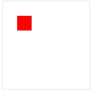
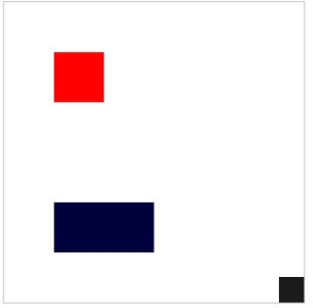
Saving and refreshing our screen should now give you a single lonely rectangle set a little inside the top left corner of your page. You may be wondering about the “Oh no!” line of our example. When our page loads, the “Oh no!” content is placed on our page. When our canvas layers are rendered, this content is then covered up. If HTML5 is not supported (or JavaScript is disabled) our canvas is not drawn, leaving the original text which we can use to tell the user something is wrong. In our fill style declaration we used a color reference as a hex value. We can also use a standard color word like red, or use a function call that takes a red, green, blue, and opacity value set to generate a color. In our fillRect declaration we defined the starting position from the left and top, as well as its width and height, respectively as fillRect(left, top, width, height). In our initial example, all values were 50. Let us add a second rectangle that is wider than it is tall, and move it much further down our page:
- <!DOCTYPE html>
- <html>
- <body>
- <canvas id="canvas" width="300" height="300" style="border: 1px solid #c3c3c3;">
- Oh no! This browser does not support HTML5 :(
- </canvas>
- <script>
- var canvas=document.getElementById("canvas");
- var canvas1=canvas.getContext("2d");
- canvas1.fillStyle="#FF0000";
- canvas1.fillRect(50, 50, 50, 50);
- canvas1.fillStyle= "rgba(0, 0, 50, 100)";
- canvas1.fillRect(50, 200, 100, 50);
- </script>
- </body>
- </html>
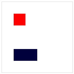 You will notice that even though we now have two blocks, we do not need to change the names we used when declaring our second rectangle from our first. This is because we are setting values, then calling a function to draw the element, and are not storing the values in our script as objects in our JavaScript code.
Keep in mind our drawings can be declared in a manner that draws them outside or extending beyond the confines of our canvas. They will technically be drawn, however the canvas will not expand to meet the needs of your drawing. To see this in action, we can add one more rectangle the same size as our first, but place it so it overdraws our canvas, so we only see a portion of it:
- <!DOCTYPE html>
- <html>
- <body>
- <canvas id="canvas" width="300" height="300" style="border: 1px solid #c3c3c3;">
- Oh no! This browser does not support HTML5 :(
- </canvas>
- <script>
- var canvas=document.getElementById("canvas");
- var canvas1=canvas.getContext("2d");
- canvas1.fillStyle="#FF0000";
- canvas1.fillRect(50, 50, 50, 50);
- canvas1.fillStyle= "rgba(0, 0, 50, 100)";
- canvas1.fillRect(50, 200, 100, 50);
- canvas1.fillStyle = "rgba(20, 20, 20, 20)";
- canvas1.fillRect(275, 275, 50, 50);
- </script>
- </body>
- </html>
Additional Notes
Keep in mind that JavaScript, which we are getting a sneak preview of, is case sensitive. This means Canvas1 is considered different than canvas1!
Even though this last rectangle is still 50 by 50, we only see the 25x25 of it that fits inside our canvas dimensions. Now that we have played with rectangles, we will replace them with triangles. We will also just give them borders without a fill color. To do this, we will define the line segments that make up our triangle, and use strokeStyle() instead of fillStroke():
Triangles
- <!DOCTYPE html>
- <html>
- <body>
- <canvas id="canvas" width="300" height="300" style="border:1px solid #c3c3c3;"> Oh no! This browser does not support HTML5 :(
- </canvas>
- <script>
- var canvas=document.getElementById("canvas");
- var canvas1=canvas.getContext("2d");
- canvas1.beginPath(); //declare the beginning of settings for our line
- canvas1.strokeStyle = "rgba(50, 0, 0, 0.5)";
- canvas1.moveTo(150,150); // set the starting point of our "pen" to the middle
- canvas1.lineTo(150,200); // move our "pen" down 50 pixels, drawing a line
- canvas1.lineTo(200,200); // move our "pen" 50 pixels to the right
- canvas1.closePath(); // Draw a direct line back to our starting point
- canvas1.stroke(); // Visually place the defined line on the page
- </script>
- </body>
- </html>
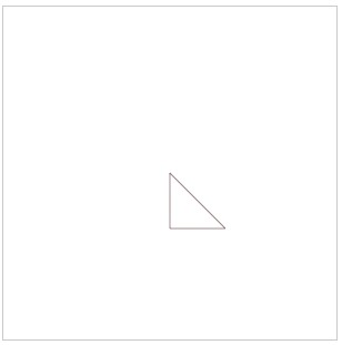
Saving and refreshing should now remove the rectangles we drew earlier and replace them with a right angle triangle positioned with the right angle in the middle of the canvas. By adjusting our X and Y values in moveTo and lineTo variables, we can move our triangle around the page. We will change just one point (our starting point) and see how different our triangle looks:
- <!DOCTYPE html>
- <html>
- <body>
- <canvas id="canvas" width="300" height="300" style="border: 1px solid #c3c3c3;"> Oh no! This browser does not support HTML5 :(
- </canvas>
- <script>
- var canvas=document.getElementById("canvas");
- var canvas1=canvas.getContext("2d");
- canvas1.beginPath(); //declare the beginning of settings for our line
- canvas1.strokeStyle = "rgba(50, 0, 0, 0.5)";
- canvas1.moveTo(75,150); // set the starting point of our "pen" to the middle
- canvas1.lineTo(150,200); // move our "pen" down 50 pixels, drawing a line
- canvas1.lineTo(200,200); // move our "pen" 50 pixels to the right
- canvas1.closePath(); // Draw a direct line back to our starting point
- canvas1.stroke(); // Visually place the defined line on the page
- </script>
- </body>
- </html>

To convert our outlined triangle to a filled, solid object we just need to convert our stroke settings back to fill:
- <html>
- <body>
- <canvas id="canvas" width="300" height="300" style="border: 1px solid #c3c3c3;"> Oh no! This browser does not support HTML5 :(
- </canvas>
- <script>
- var canvas=document.getElementById("canvas");
- var canvas1=canvas.getContext("2d");
- canvas1.beginPath(); //declare the beginning of settings for our line
- canvas1.fillStyle = "rgba(50, 0, 0, 0.5)";
- canvas1.moveTo(75,150); // set the starting point of our "pen" to the middle
- canvas1.lineTo(150,200); // move our "pen" down 50 pixels, drawing a line
- canvas1.lineTo(200,200); // move our "pen" 50 pixels to the right
- canvas1.closePath(); // Draw a direct line back to our starting point
- canvas1.fill(); // Visually place the defined line on the page
- </script>
- </body>
- </html>

We can move beyond straight lines in order to draw other shapes by using Bezier curves, quadratic curves, and arcs. Each of these allow us to define different points on our lines and to curve our line between those points. For now, we will look at Bezier as an example of how to approach multi-point curves. Bezier lines allow for two control points as opposed to the one allowed in quadratic curve, so the programmatic difference is essentially just one less point defined for a quadratic than a Bezier (limiting the shape your line can take).
Bezier Curve
- <html>
- <body>
- <canvas id="canvas" width="300" height="300" style="border: 1px solid #c3c3c3;"> Oh no! This browser does not support HTML5 :(
- </canvas>
- <script>
- context.beginPath();
- context.moveTo(10, 130);
- context.bezierCurveTo(0, 10, 290, 10, 290, 290);
- context.lineWidth = 10;
- context.strokeStyle = black;
- context.stroke();
- </script>
- </body>
- </html>
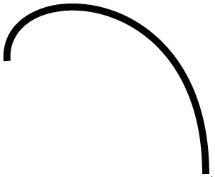
By setting a moveTo point, we are starting our curve from that point just as with a regular line. From here, our Bezier function call takes three sets of points, our two control points, and end point. As a challenge, try adjusting your Bezier points to turn this example into a drop, or marker style, symbol.
Drawn Text
We can even draw text on the screen. While this might seem redundant as we have done that since we began this section, drawing text on a canvas can help us complete logos or draw letters without specifying every line needed to create the letter itself. This means the text becomes part of the canvas and cannot be copy/pasted. To create text, we simply need to define the style, string, and starting location. Replacing our earlier examples, our new canvas1 definition turns into:
- <script>
- var canvas=document.getElementById("canvas");
- var canvas1=canvas.getContext("2d");
- </script>
The benefit of creating text as a layer on a canvas instead of styling it with CSS allows us additional mechanisms to manipulate our words.
With this set of techniques, we can now recreate icons and logos without needing actual image files, and can scale them to fit as our page size and layout changes. This also makes it more difficult for your drawn images to be “borrowed.” As there is no image file to save, it becomes more difficult (though not impossible) for anyone trying to use your creations. Let us add text to this canvas by setting up a splash of color for our text, then defining our font, text and start location:
- var gradient=ctx.createLinearGradient(0,0,c.width,0);
- gradient.addColorStop("0","red");
- gradient.addColorStop("0.5","yellow");
- gradient.addColorStop("1.0","blue");
- ctx.fillStyle=gradient;
- ctx.fillText("Let's see some color!",10,90);+
Learn more
Keywords, search terms: Canvas, css graphics
See what Canvas can do! http://net.tutsplus.com/articles/web-roundups/21-ridiculously-impressive-html5-canvas-experiments/
The full specifications http://www.w3.org/TR/2009/WD-html5-20090825/the-canvas-element.html
Chapter 16
Video
The abundance of audio and video material on the internet grew over time as bandwidth improved and storage space became cheaper and ubiquitous. Through this time, many approaches were brought forward to facilitate enjoying the material. Software, file extensions, browser add-ons and more attempted to fill the void. Now, HTML5 has added both audio and video tags to make it easier to integrate media into our pages. These tags make embedding media easier, but (so far) are limited in the number of file formats they support.
Additional Notes
You can convert video files to OGG with any supporting software just as you would convert to any other video format.
Our new video tag supports a number of features through attributes like automatically playing (autoplay), looping the file (looping), on screen controls (controls), preloading the video before it is played (preload), error handling (onerror), and even displaying an image when the file is not in use (poster) and also includes width, height, and source attributes of the file.
The video files we wish to use must be in the OGG format, which is an open source video format. We define our video very similarly to other elements we take into our page. An initial video that simply plays when the page is loaded can be completed by adding the following:
- <video src="ourfile.ogg" width="200" height="150" autoplay>
Take note that this is a pretty rude solution in many cases, as the file will start to play as soon as enough of it is ready, and the user is left with no means of control except closing the page entirely (think about the lovely ads we have all been subject to that use this type of technique). To address this, we will add some more attributes:
- <video src="ourfile.ogg" width="200" height="150" autoplay controls preload="auto" poster="videoImage.png">
 Now we see a splash screen and controls. Our other options for preload (auto lets the browser decide) are none and metadata. None will stop all preloading activity, while metadata loads information about the video like length and dimensions. Audio files are actually identical to this approach (even the use of .ogg files) with exception to the ability to define the width and height. All we need to change is our vocabulary, using the word audio instead of video in our tag.
Audio
|
|

The use of audio in a site can add a number of effects, from background music (be kind—allow the user to stop it if they want), to little noises that aid in navigation (these might interfere with screen readers) to embedded players that allow the user to select and play a particular audio file.
Like image formats, audio files can be encoded in a variety of formats that provide different levels of quality. The two formats most commonly found are .mp3 and .wav, standing for motion picture extract group (3rd set of standards) and wave, respectively. The difference lies in their method of compressing and storing the information needed to reproduce the sound. MP3 files are more compressed, meaning they are smaller and require less time and space to transmit, but contain less information and as such have a lower audio quality. Wave files, on the other hand, are typically much larger and sound better. This means they are more taxing on a website as they require more storage space and will take longer to load.
Which format you use will obviously depend on what is more important to you—speed of delivery and space, or quality of sound for the user. Some things to take into consideration are that most users report hearing little difference in quality between the formats, especially when the file is played on a mobile device or computer with basic entry-level speakers attached. If you have ever purchased a digital album or single online, you may have been presented with the option between these or other formats to accommodate the more discerning audiophiles among us.
Learn more
Keywords, search terms: Audio, video, embed(ded) audio video
Example of commercial htm5 based tools: http://flowplayer.org/
Example of flash based tools: http://www.tubesnack.com/
Chapter 17
Mobile Device Support
When you are creating your HTML pages and following the responsive design patterns that restrict tags to structural as much as possible, you have already laid the groundwork to support mobile devices.
When all of your page content is broken down into logical pieces, and those pieces have ID and/or class attributes, we will be able to show, hide, or reposition those elements using CSS. When we determine the screen dimensions the user has on their device, we can decide what or how to show content from our regular page. The key to this, of course, are the ID and class tags. Anything that you may want or need to control (move, alter, edit, etc.) as a single piece by itself should have an ID tag. Elements that will share the same changes (for example, pictures, links, paragraphs, etc.) should have the same class or classes so they can be changed at the same time.
A single element, say a paragraph in a group of paragraphs, can have both an ID and a class, and can receive style changes from CSS due to both. We will get to this in more depth in CSS, but keep it in mind as you build pages now so they are ready for you later.
If you are reading this chapter looking for examples on HTML5 support of things like Geolocation, these will be found in the JavaScript section as they require the use of a scripting language to function, and are not available through HTML markup.
Important considerations for mobile development go beyond styling changes and begin to include performance measures as well, since mobile devices often lack computing power that can match a desktop or laptop’s capacity. Skipping some of your fancier animations or large background images to trim down your loading times is another responsive-style adjustment to your site alongside other CSS changes. See the resources below for some examples of methods that may help your site improve response times.
Learn more
Keywords, search terms: Mobile optimization, mobile performance
Optimization tips and tools http://www.html5rocks.com/en/mobile/
Compatibility Charting: http://mobilehtml5.org/
Test your browser(s): http://html5test.com
Follow new developments: http://www.mobilexweb.com/
Chapter 18
Tags to Avoid
Now that we have focused on the new features of HTML5 and warned about the inefficient methods developers resorted to in the past, let us take a look at a few other tags and methods to avoid using in our code.While some of these are already deprecated, not all are, and they all take away from our goals of separating structure from style and responsive design.
<b>, <i>, <strong>
All of these place emphasis on text, and can be replaced with CSS. Using these within your code means a change to your CSS style will not necessarily determine whether or not the style of text is affected for content wrapped in these tags. It also means you have to edit style in two places, both your CSS and HTML files.
<font>
Again, we can control font (with even more control) using CSS, and hard coding your font into your page can override what you wanted in your CSS.
<br>
I know, I have (and will) use breaks in my examples. What I mean to discourage here is using breaks as a quick fix when you should be using <p> or something more appropriate. If another tag better identifies your content, but you do not want some of the automatic styling that comes with the tag, we can override those attributes in our CSS, so use the best tag for your content. We will see how to adjust it to your needs when we look at CSS later.
Chapter 19
CSS
Selectors

The selector is a good place to start with CSS. It is used to identify which item(s) the rule(s) following it will apply to, and is the first element of a rule definition. A selector can refer to an existing tag that is part of the HTML structure like unordered lists, paragraphs, inputs, or it can refer to a custom class, element’s name, or ID that we create. Selectors are followed by a set of braces { }, and the rules we enter in between the braces (the property we want to adjust, and the value we want it to have) apply to the selector we specify. We will look at some of these here (there are 40+ as of initial CSS3 components), focusing on those that are more frequently used. Take note that in CSS, we use the colon (:) instead of an equal sign (=) to assign values.
Classes
To take a look at how we can attach a “where” concept to our rules, we will attach some classes to our tags. This allows us to apply different styles to the same selector type, while adding the ability to be more specific about which occurrence we are talking about. We use classes by giving them rules in CSS and referring to them as attributes in elements that support them from our HTML document by using class=“nameOfOurClass.” When defining classes in our CSS file, we precede their name with a period to specify they are a class.
IDs
The ID attribute is used similar to how a class is used, with two differences:
- The ID is defined with a # instead of a period, e.g., #warning.
- You should use an ID only once on a page, as it should identify something unique to the document.
We already have our ID references in our HTML file anywhere we used id=“ourNameHere” attributes in our tags.
Examples
We will begin with a simple example and adjust our unordered list by disabling bullets. For now, we will put the rule in our <head> nested within <style> tags, which will allow the rule to apply anywhere on the page where the selector (in this case, ul) exists:
- <style>
- ul {
- list-style-type: none;
- }
- </style>
We could also write this rule in a more condensed form:
- <style>
- ul {list-style-type: none;}
- </style>
Since CSS rule sheets ignore white space, the line breaks only serve to make the document more readable when we interact with it. Minifying it (removing all of the extra line breaks by hand or with the use of a script) can reduce the size of larger style sheets, which can help performance (especially in mobile devices where we know this is of more concern).
By adding the rule above, we dictate the appearance of all unordered lists on our page. Rules specify the “What, Where, and When” aspects we want to define for the given selector. The “What” is the actual change we want to see—text in a certain color, an image in a specific location, and so on, just like our example above. In this case, we wanted to hide the default bullet markers. The “Where” is one or more specific locations, defined as a particular named element or when certain conditions are met, i.e. before every paragraph (p.before{}), or every link on the page (a{}). Finally, the “When” aspects allow us to control the site’s appearance based on different factors like if the display is mobile sized, or if the user clicked the print button (@media print {}).
By placing these examples in the <head> of our page, we have created an internal style sheet. This denotes that all of the style information we need to reference can be found in the page itself. We could also create external files with our rules. This allows us to have one or more CSS files in our site, and to apply those rules to one or more pages. The external file method is what we will predominantly use as it best fits responsive design, and separates the tasks our files are targeting.
Important Reminder
Using the inline method outside of JavaScript violates our responsive design and separation of duties! Another downside to this method is it would have to be applied to every paragraph we wanted it on within our page.
To connect a CSS file to our webpage, we would move all of our rules (everything inside the <style> tags) into a new document. After saving this new file with the .css extension, the browser will understand that everything contained is to be treated as if it were in our <style> tags. We can connect it to our page much like linking to another page in our server:
- <link rel="style sheet" type="text/css" href="mystyle.css">
In our <link> tag we provide a rel attribute of style sheet to identify the file’s purpose. The type attribute tells the browser how to expect the contents to be formatted (“text/css”), and href provides the location of the file. If the file was not in the same folder as the web page we are using, we would adjust the link just as we would in an <a> tag.
Past practice has been to create entirely different sites, complete with customized CSS and HTML pages, to support mobile devices. This kicked off the m.yoursite.com, or mobile.yoursite.com period where heavily modified versions of sites were maintained separate from the primary, desktop version. Now, with the use of responsive design methods and the newer features of CSS3, we can use one master CSS file for all aspects of our site.
You may wish to separate your CSS files while you are working on them, as one master file can become tedious to search through. It may also help to add multi-line or long comments in your file to delineate between organized sections of your CSS. Ultimately, by your release date, you will want to get all of your CSS back into one file. Compressing it with tools like http://www.csscompressor.com/ which remove the whitespace that makes the file readable while developing, and reduces the file size making transmission faster for the user.
Our final method of applying rules is inline. This refers to the practice of inserting the rule inside the attribute tag of the item in question. If we wanted to change the text color of a particular paragraph, we could go right to our HTML file and alter our regular <p> tag to read:
- <p style="color:red;">Our now RED paragraph!</p>
Here we do not need our selector as it is the tag itself, and we also do not need our braces, or quotes within the rules. All we include in our attribute’s value are the surrounding quotes and the rules we want to apply, still using : and ; appropriately. This is an effective means of responding to an event, or changing appearance through JavaScript.
There are a number of other things we can do with selectors in order to identify what we want to interact with. The * character can be used to apply to everything within page, or within a selector if one is specified. For example, * { color: blue} would make all text on the page blue (assuming it is the last rule applied… we will get to that) while footer * { color: blue} would make all items in our footer blue. This can be handy for development and testing to quickly adjust a number of items, but should be avoided in production as processing the rule can require examining a large number of elements, potentially increasing page load times.
We can target specific items by referring to them using their ID. To do this, we put a # in front of their ID name. As an example, we will create two divs, one with an ID of todo and another with an ID of complete, to make a quick task list:
- <div id="todo">
- <ul>
- <li>Check the mail</li>
- <li>Go to the store</li>
- <li>Take the dog to the vet </li>
- </ul>
- </div>
- <div id="completed">
- <ul>
- <li>Rent a movie</li>
- <li>Make grocery list</li>
- <li>Make vet appointment</li>
- </ul>
- </div>
|
By adding the following styles to this page, we can turn our To Do list red, and our Completed list green:
- <style>
- #todo { background-color:red; }
- #completed { background-color: green; }
- </style>
- Check the mail
- Go to the store
- Take the dog to the vet
- Rent a movie
- Make grocery list
- Make vet appointment
Important Reminder
Keep in mind we can only use an id name once on each page. If you want to apply these rules in more than one place, then you should use a class definition, coming up next!
We can use this technique on any tag that accepts an ID as an attribute (the actual rules we are allowed to use, however, differ depending on the element). To apply rules like this in multiple places, we will need to switch to a class definition. To do this, we simply change our # to a . and instead of relying on an element’s ID, we give it a class attribute with a value of the selector name we create in our style definition. We will tweak our last example to split our To Do list into “today” and “tomorrow” lists and rename our completed div to “done.” Then give both to do lists a class of todo, our done list a class of completed, and change our CSS rules to match:
- <style>
- .todo { background-color:red; }
- .completed { background-color: green; }
- </style>
- <div id="today" class="todo">
- <ul>
- <li>Check the mail</li>
- <li> Go to the store</li>
- </ul>
- </div>
- <div id="tomorrow" class="todo">
- <ul>
- <li>Take the dog to the vet </li>
- </ul>
- </div>
- <div id="done" class="completed">
- <ul>
- <li>Rent a movie</li>
- <li>Make grocery list</li>
- <li>Make vet appointment</li>
- </ul>
- </div>
- Check the mail
- Go to the store
- Take the dog to the vet
- Rent a movie
- Make grocery list
- Make vet appointment
To add even more emphasis to our completed list we can make the list inside it show text as crossed out. We could do this by applying a style to an ID we assign it, or by giving that ul a class, but we already have enough structure in place to specify what we want by using a descendant selector. This selector type is specified by saying we want elements “a” inside elements “b” to have the style applied. In our example, we want <ul>s inside a .completed crossed off, so we will add the following rule to our styles:
- .completed ul { text-decoration: line-through; }
Now, if we add any more sections with a class of completed, they will also be crossed out automatically. You can try splitting your completed <div> into two pieces, like “yesterday” and “last week” to try it out.
Additional notes
Hover works on more than links! Just about any element has a hover state as long as the cursor position can be associated with it. Note: the z-index and position of layered elements can easily interfere with things like hover.
Hyperlinks are frequently styled so they change in appearance when they are hovered over or have already been clicked. We can assign our styles to these events by creating rules for <a> tags when they are unvisited, visited, or a hover (mouse pointer is over the link) state is attached:
- a:link {
- color:blue;
- }
- a:visited {
- color:grey;
- }
- a:hover{
- color:red;
- font-weight:bold;
- }
Try adding a link to your local Veterinarian’s office to the task in your todo list, and watch how it changes when you interact with it.
Sometimes you might find it easier to change something for all occurrences of an element that are not members of another rule. Instead of adding additional classes to those elements, we can specify an exception with the not state:
- div:not(.completed){ font-size:larger; }
This rule will make text in any div (whether or not they have the .todo class) text larger. Another handy set of states are :before and :after. These selectors allow us to place and style content as a prepend or append action to our element. If we wanted to prepend a To Do: title to our .todo class elements, we could add the following rule:
- .todo:before{
- content:"To Do:";
- background-color:yellow;
- color:red;
- font-weight:bold;
- }
Important Reminder
Note: We cannot use the Content rule to add HTML to an element, only text. To achieve this, we would need to use JavaScript or another language that can manipulate the DOM.
The remainder of the selectors allow us to get even more specific, selecting the elements the appear before or after another given element, matching elements that have a particular attribute, or even matching attributes that contain a certain string as part of their value. For a full reference, I recommend the list at w3schools.com.2 Our completed example should now look like this:
- <style>
- .todo {
- background-color:red;
- }
- .completed {
- background-color: green;
- }
- .completed ul {
- text-decoration: line-through;
- }
- div:not(.completed){
- font-size:larger;
- }
- a:link {
- color:blue;
- }
- a:visited {
- color:grey;
- }
- a:hover{
- color:red;
- font-weight:bold;
- .todo:before{
- content:"To Do:";
- background-color:yellow;
- color:red;
- font-weight:bold;
- }
- </style>
- <div id="today" class="todo">
- <ul>
- <li>Check the mail</li>
- <li> Go to the store</li>
- </ul>
- </div>
- <div id="tomorrow" class="todo">
- <ul>
- <li>Take the dog to the vet </li>
- </ul>
- </div>
- <div id="yesterday" class="completed">
- <ul>
- <li>Rent a movie</li>
- </ul>
- </div>
- <div id="lastWeek" class="completed">
- <ul>
- <li>Make grocery list</li>
- <a href="http://www.dunkirkanimalclinic.com/"><li>Make vet appointment</li></a>
- </ul>
- </div>
To Do:
- Check the mail
- Go to the store
To Do:
- Take the dog to the vet
- Rent a movie
- Make grocery list
- Make vet appointment
Order of Precedence
There are some rules to our rules. There is a hierarchy to how they are applied in order to provide a semblance of order and avoid conflicts. First, we need to consider where the rule is located. In general, the “closer” the CSS file is to the line of code using it, the more likely that particular CSS file will override what is in the others. For example, rules in an external style sheet would be overridden by those in an internal style sheet. Just the same, styles in an internal style sheet would replace the previous style sheet included. Styles that are added to the page, or attributes that are inline with the element they apply to, become the “closest” to what it is targeting.
Useful Feature
JavaScript code that affects appearance will frequently apply inline modifications to apply style changes to a page, but will not affect the CSS file or other pages.
When we discuss the overriding nature, it is important to remember that this applies to the specific rule. A set of rules for an <a> tag defined in an external sheet will not necessarily be overridden by the <a> tag rules in an internal style sheet. Each rule within the definition is examined, and is still applied if that particular rules does not appear “closer” to the element. For example:
An External Sheet:
- a {
- color:blue;
- text-decoration:none;
- }
An Internal Sheet:
- a { color:red;}
- <head>
- <link rel="style sheet" type="text/css" href="mystyle.css">
- </head>
- <style>
- a { color:red;}
- </style>
Comparing the above example style sheets, we can see that the external sheet applies two rules: text color is blue, and there should not be an underline. However, our internal style sheet specifies a rule that color should be red. Since this rule is closer, our link will be red. The underline rule, however, is not defined in the internal sheet, so it will carry over and remain.
This also carries into the CSS rules themselves. Definitions can be general, like our example above that would apply to all links on our page, or they can be more specific to target a particular group or single link. The more specific we are, the greater influence our rule will have. For example:
- <style>
- a{
- color:red;
- }
- div.block a{
- color: blue;
- }
- </style>
- <body>
- <a href="">Our RED link</a>
- <div class="block">
- <a href="">Our BLUE link</a><br/>
- <a href="" style="color:green">Our GREEN link</a>
- </div>
Above, our “a” style for our links is overridden in our div, as the block style is more particular, or close, to the actual link we want affected. However, our green link overrules our block style as it is inline, and applies to that specific link. From here, only a change in this inline style caused by JavaScript, or an “over-override” from a rule marked !important can trump the inline rule. The easiest way to debug CSS issues is with web developer tools that are an add-on or included in modern browsers like Chrome, that can show you exactly what rules are applied, overridden, and even let you test (temporary) changes before making them in your real file.
Caveat: User-enforced styles (settings the client enters in their browser, or applied by an accessibility program) also fit in to our precedence list, and can override any styles we set.
 By Armchair [Public domain], via Wikimedia Commons
Learn more
Keywords, search terms: css rules, rule structure, selectors, css classes and ids
A list of all CSS properties: http://www.blooberry.com/indexdot/css/propindex/all.htm
All of the selectors: http://www.w3.org/TR/CSS2/selector.html
Some tips, tricks and more features: http://www.instantshift.com/2010/03/15/47-css-tips-tricks-to-take-your-site-to-the-next-level/
Chapter 20

Borders
To better identify where our content falls on a page, and to signify that it is different from the material around it, we can adjust the borders on our elements. Borders can be enabled or disabled by the top, bottom, left and right of the element and can also have different styles like solid, double, grooved, dotted and dashed lines, among others.
To specify a full border, we simply use border, and can apply color, width, and style:
|
|
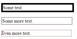
The full list of possible border styles is as follows:
|
Value |
Description |
|
none |
No border. |
|
dotted |
Dotted border. |
|
dashed |
Dashed border. |
|
solid |
Solid border. |
|
double |
Double (two lines) border. |
|
groove |
Grooved, 3d border. |
|
ridge |
Ridged, 3d border. |
|
inset |
Lowered (sunken) 3d border. |
|
outset |
Raised 3d border. |
|
inherit |
Inherits the same style as the parent element. |
Margin and Padding
These related concepts allow you to control the amount of space between your content and its container, and between the container and objects around it. Padding controls the amount of space inside your container, for instance between text and a set of paragraph tags. You can remember padding as the inside by thinking about a padded room; the padding is only effective if it is on the inside of the walls.
By adding borders to our paragraphs as we did above, we can see the outline of where the paragraph fits into our page. Now, we will see the difference when we apply padding:
|
|
You will notice that the paragraphs still have not moved relative to one another, they each simply take up more space. In order to move them further away from each other, we can add a margin:
|
|
With both examples, we can adjust our values by pixel or percent. We can also control the amount of change by each side of the object, by specifying top, bottom, left or right to our rules. To do this we need to edit our values to only pad the left side of our paragraphs, and only apply a margin to the bottom of each:
|
|
Instead of writing out multiple rules to adjust sides, we can combine them into one declaration by writing out our values clockwise, starting with top, as padding: top right bottom left or margin: top right bottom left, replacing the words with a fixed or relative value (they can be mixed) and by using zero as a place holder if we do not want the value changed from default:
|
|
Background
There is a lot we can do with the background of our pages. Colors and images can be applied to all or portions of our content, helping to highlight different elements of our site, and play a large part in the overall look and feel. We can specify colors by their name if they are a basic color like red, white, blue etc. or we can provide its hex value, or the values for its red, green, and blue values.
|
|
To use images instead of colors, we can specify the image’s location in our files, and can also dictate where we want to place it on our page, whether or not it should repeat, and whether it should move or remain in place when the user scrolls the page. By default, images will repeat to fill the space they are placed in. To prevent this, we can add a no-repeat attribute to our definitions. This time, we will use the background attribute as opposed to the background-color attribute. The benefit of this is that you can include both in a set of rules on the same object (image first, color second), allowing you to have an image on top of a background color. Take note that in these examples, you will need to select your own images in place of those used below.
- <style>
- p.one {
- border-style:solid;
- border-width:5px;
- background:url(clouds.jpg);
- }
- p.two {
- border-style:groove;
- border-width:medium;
- background:url(calendar.jpg) no-repeat;
- background-color:#ff3355;
- }
- p.three {
- border-style:dotted;
- border-width:1px;
- border-color:red;
- background:url(calendar.jpg);
- }
- p {padding:50px 30px 50px 5px;}
- p {margin:50px;}
- </style>
- <p class="one">Some text.</p>
- <p class="two">Some more text.</p>
- <p class="three">Even more text.</p>

There are two ways of achieving this affect. The first is by using advanced styling through CSS using WebKit features supported by some browsers, and then adding style rules to create the effect as close as possible in other browsers. The second is by creating a repeatable gradient image. The first approach’s reliance on WebKit provides support for Apple and Google products. For browsers that do not use WebKit, we have to add extra rules to achieve the same effect. This is a more advanced example as it requires knowledge of each browser’s needs to create:
- <style>
- #ourBackground {
- background-color: #1a82f7;
- background: url(ourFallBackImage.png);
- background-repeat: repeat-x;
- /* Safari 4-5, Chrome 1-9 */
- background: -webkit-gradient(linear, 0% 0%, 0% 100%, from(#1a82f7), to(#2F2727));
- /* Safari 5.1, Chrome 10+ */
- background: -webkit-linear-gradient(top, #2F2727, #1a82f7);
- /* Firefox 3.6+ */
- background: -moz-linear-gradient(top, #2F2727, #1a82f7);
- /* IE 10 */
- background: -ms-linear-gradient(top, #2F2727, #1a82f7);
- /* Opera 11.10+ */
- background: -o-linear-gradient(top, #2F2727, #1a82f7);
- }
- </style>
- <div id="ourBackground" width="300px" height="300px">
- <br/>
- Some <br/>
- Text <br/>
- Here <br/>
- <br/>
- </div>
This code should produce an almost identical image in every browser, depending on which rule(s) the browser is able to execute:
 The first three lines of this style script—
- background-color: #1a82f7;
- background: url(ourFallBackImage.png);
- background-repeat: repeat-x;
demonstrate how we create the gradient effect through an image. In this example, ourFallBackImage.png would be a very skinny (1 pixel) wide image as tall as we want our gradient to be. By repeating this image across the X axis (moving horizontally) the image will fill the width of the parent object. By specifying the bottom-most pixel color from our image as the background, the gradient will appear to fill the page. The balance of our rules in this example achieve the same result through CSS, but also provides more control over the gradient without needing to create additional images.
Float
Floating an object with CSS allows us to move it around within its parent object, ignoring (to some extent) the other items near it. Note that float is only for left/right values, not top/bottom, even though their movement may feel that way as windows resize.
When multiple objects in the same container have the same float style, they will line up next to each other for as many as the container can fit. While this may sound confusing, we will look at it without the terminology: If you have a big box, and that box has small boxes in it, those boxes will fit as many of themselves left-to-right in a row as they can. Any boxes that do not fit will start a new “row” underneath.
The use of float is a big help to responsive styling. Boxes of content that normally fit side by side on a larger screen will automatically create more “rows,” with less items in each, to accommodate screens with less width. Create a page with the following code, and then play around with the size of your browser window to see the resizing in action:
- <style>
- .thumbnail {
- float:left;
- width:80px;
- height:80px;
- margin:5px;
- }
- </style>
- <div>
- <img class="thumbnail" src="yourPictureHere.jpg" >
- <img class="thumbnail" src="yourPictureHere.jpg" >
- <img class="thumbnail" src="yourPictureHere.jpg" >
- <img class="thumbnail" src="yourPictureHere.jpg" >
- <img class="thumbnail" src="yourPictureHere.jpg" >
- <img class="thumbnail" src="yourPictureHere.jpg" >
- <img class="thumbnail" src="yourPictureHere.jpg" >
- <img class="thumbnail" src="yourPictureHere.jpg" >
- <img class="thumbnail" src="yourPictureHere.jpg" >
- <img class="thumbnail" src="yourPictureHere.jpg" >
- </div>
Content before and after a floated element will attempt to wrap around it. When we do not want this to happen, we can add a rule to that element’s style to clear the floating effect. To do this, we would add clear: left; clear: right; or clear:both depending which sides we are concerned with.
Useful Feature
Since relative refers to moving the position from where it would be based on all of the other elements and rules, we can use negative values to “pull” an element in that particular direction.
Positioning
We can specify, with great control, exactly where our elements are ultimately located in our window. CSS allows us to modify location to such an extent that an items position on the page can have no relation to its location in your code. Just as we have seen in many of our other rules, there are two methods to declaring position, fixed and relative. Here fixed elements specify the offset of pixels from a side or corner of the window, and relative declares that our values are moving the content from where it would have been if we had not changed it.
Here is how we might take a heading and force it to an offset from the top left corner as an absolute, meaning it will sit there no matter what else is above, underneath, or around it:
- <style>
- h2 {
- position:absolute;
- left:50px;
- top:100px;
- }
- </style>
- <h2>This is a heading with an absolute position</h2>
- <p>With absolute positioning, an element can be placed anywhere on a page. The heading below is placed 50px from the left of the page and 100px from the top of the page. As this text continues, you will see that the heading sits on top of the text as if it was not even there. As this text continues, you will see that the heading sits on top of the text as if it was not even there. As this text continues, you will see that the heading sits on top of the text as if it was not even there. As this text continues, you will see that the heading sits on top of the text as if it was not even there. As this text continues, you will see that the heading sits on top of the text as if it was not even there. As this text continues, you will see that the heading sits on top of the text as if it was not even there. As this text continues, you will see that the heading sits on top of the text as if it was not even there. As this text continues, you will see that the heading sits on top of the text as if it was not even there.</p>

If we wanted to move our heading relative to where it would normally have been positioned (just above our paragraph) we change to relative and provide the offset values that we want. Here, we will move it to the right, move it to the left, and show it as it was:
- <style>
- h2.pos_left {
- position:relative;
- left:-20px;
- }
- h2.pos_right {
- position:relative;
- left:20px;
- }
- </style>
- <h2>This is a heading with no position</h2>
- <h2 class="pos_left">This heading is moved left according to its normal position</h2>
- <h2 class="pos_right">This heading is moved right according to its normal position</h2>
- <p>This is our paragraph that has a heading with relative positioning. Unless we put a negative bottom offset on our heading large enough to cover it, it will stay above the paragraph this time. </p>

Z-index
Just when you thought we had escaped the terrors of precedence and inheritance, we have another factor in our layering to consider. The z-index of an object determines its order in the stack of elements on a page. This is how we can control which items are depicted as on “top” of another when they occupy the same portion of a page. While items are automatically layered according to their location on the page and in our code, these can be modified and overridden by a z-index to set the order we want. A larger value of a z-index forces an object “higher” on the page, or, puts it closer to the “top” of all the elements you are looking at. A page background, for example, is usually the lowest level on your page. As such, other content on your page sits on top of your background layer, and becomes the next layer in the stack. A simple way to ensure important messages are never hidden behind something else is to assign them a z-index of an extremely large like 99999. You should only use such a method for one or two critical items in a site. In our first example, we will see an image with a negative index that ensures it is behind our text. Then we will change our index value to make it higher, putting it on top of the text instead:
- <style>
- img {
- position:absolute;
- left:0px;
- top:0px;
- z-index:-1;
- }
- </style>
- <h1>Here is some text</h1>
- <img src="http://bglabs.evade.netdna-cdn.com/f...ground-824.jpg" width="100" height="100" />
- <style>
- img {
- position:absolute;
- left:0px;
- top:0px;
- z-index:-1;
- }
- </style>
- <h1>Here is some text</h1>
- <img src="http://bglabs.evade.netdna-cdn.com/f...ground-824.jpg" width="100" height="100" />
Mouse Cursor
While this is not a regular feature in most sites, it can be an important player if you intend for your website to act as if it were an application.
We can add cursor rules to our selectors in order to change the appearance of the mouse cursor when that rule is active. Much the same as working in your operating system, we can select the regular icon, wait (also called working, busy, thinking, etc.), text insert, a pointer, a question mark, and a crosshair. While most of these have little use in the average web page, they come in handy when your end product is more application focused.
I would strongly recommend judicious use of cursor changes, and be sure that your changes are reverted back as soon as it is appropriate (i.e. change your waiting/busy back as soon as an event is compete) as forgetting to reset can leave your user thinking your site (or their system) is locked up or endlessly cycling. The full list of the available cursors is as follows:
|
Value |
Description |
|
auto |
(default) let the browser choose |
|
crosshair |
Crosshair, or “plus,” symbol |
|
default |
The default cursor |
|
e-resize |
Shows resize to the right (note all resize values are compass combinations) |
|
help |
The help (question mark) icon |
|
move |
Item can be moved |
|
n-resize |
Shows resize up |
|
ne-resize |
Shows resize up and right |
|
nw-resize |
Shows resize up and left |
|
pointer |
A pointer (arrow) |
|
progress |
The busy symbol (be careful with this one!) |
|
s-resize |
Shows resize down |
|
se-resize |
Shows resize down and right |
|
sw-resize |
Shows resize down and left |
|
text |
Text line (flashing or steady “I”) |
|
w-resize |
Shows resize left |
|
wait |
Shows busy, wait (be careful with this one!) |
|
inherit |
Inherits value from parent |
Cursor styles can be applied when the element with a CSS attribute that affects the cursor is triggered. This is usually caused by hovering over the object, or when the user initiates an action, in reaction to which we apply the new style using JavaScript. Note that user triggered actions like busy icons normally need to stay “busy” until the script is done. In this case, the body tag should receive the attribute that affects the cursor so it continues to show as busy even if the user moves the mouse off of the button or other trigger that they used.
Learn more
Keywords, search terms: css layout, page formatting, positioning, css layers
LearnLayout: http://learnlayout.com/toc.html
Full layout example without tables: http://www.w3.org/2002/03/csslayout-howto
A set of basic layouts: http://blog.html.it/layoutgala/
Chapter 21
Font and Text Decoration
When we began our testing site, we started using HTML tags wherever we could to provide structure to our content with heading tags. We did this with the understanding that later we would redefine those tags so our headings looked how we wanted them to. That time has come. To start with some basics, we can use what we have already learned above by changing the color of the text and background for our heading tags:
|
|
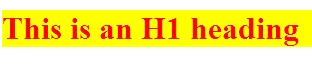
We can also adjust our font family and size. You will notice that none of these changes affect anything outside of our headings. While you may see examples using the key terms for size, ranging from “extra extra small” (xx-small) to “extra extra large” (xx-large), it is a good idea to always be as specific as possible, as key terms can be treated differently between browsers. Instead, our examples will use percentage based and fixed font sizes. To do so, we will make our h1 content italicized and bring the size down to 20px tall:
|
|
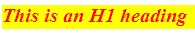
These are just a few examples of the full power of font through CSS. Some “fancier” methods include effects like capitalizing, while simultaneously shrinking, your text (small-caps):
|
|
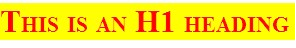
Additional notes
Order is Important! Active style rules must come after hover rules, and hover must come after link and visited! Since a link being hovered over can already have been visited, and the active link can be the one with hover on it, this ensures the correct order of application of style.
Text Styles
While our next example seems like it applies more to font than text, a good way to remember what noun you want to use in your rule is whether the affect changes the way the letters appear or not. If they do, you probably want font. If not, then you probably want text as in these next examples.
First, we might want to add the lead spaces back into our paragraph’s definition to make them appear more like a written document. We can also move our text around in our containing element by setting it to left (default), right, center, or stretch to fit with justify:
- <style>
- p {
- text-indent:15px;
- text-align:justify;
- }
- </style>
- <p>This is our paragraph for demonstrating some of the things we can do to text and font through the use of CSS. This is our paragraph for demonstrating some of the things we can do to text and font through the use of CSS. This is our paragraph for demonstrating some of the things we can do to text and font through the use of CSS. </p>
In addition to adjusting the font itself, we can decorate it with more affects like crossing it out, underlining it, or specifying that it should not be decorated, which is especially useful in eliminating the default lines under links:
- <style>
- .strikeOut{text-decoration:line-through;}
- .titles{text-decoration:underline;}
- a {text-decoration:none;}
- </style>
- <span class="strikeOut">Text we want crossed out</span><br/>
- <span class="titles">Hitchiker's Guide to the Galaxy</span><br/>
- <span><a href="">A link with no underline</span>
Anchors
Following up on our ability to remove the underline from a link, there are some other special features we can control for our page anchors using CSS. By specifying link, visited, or hover in our link selector, we can control what happens before, during and after a link has been clicked. We can think of these like applying attributes in our HTML tags, except in CSS the special features are called pseudo-classes. Since we can specify any valid CSS rule, we can have our links change colors, alter the backgrounds, change text and font properties, and everything else we will look at. To see some of the basics in action, we will change our text colors for each action, and also our background color when we are hovering. Since you will need to interact with the links to see these in action, we will forgo an image here and you can test the code yourself:
- <style>
- a:link {color:#FF0000; background-color:yellow;} /* unvisited link */
- a:visited {color:#00FF00; background-color:orange;} /* visited link */
- a:hover {color:#FF00FF; background-color:green;} /* mouse over link */
- a:active {color:#0000FF; background-color:white;} /* selected link */
- </style>
- <a href="" target="_blank">Here is our fake link!</a>
Visually Impaired Considerations
The Internet is obviously a highly visual medium, and it is good practice to keep in mind how your site will be consumed by those with differing visual needs. Here are a few techniques to be better prepared to serve a pleasant user experience.
First is text size. Modern browsers support increasing and decreasing page text on their own (by taking advantage of user style CSS properties). While this reduces the need to provide resizing style sheets for your users to select from, it does mean you should test increasing and decreasing the font size on your site from a browser (usually ctrl and +, ctrl and -). This will allow you to see how far your font size can be pushed before it interferes with your layout. You might need to adjust your style to accommodate these changes. How many levels you wish to account for is up to you, but a general rule of thumb is your page should support +3 with little disruption. You can of course offer special style sheets with links to enable them, giving you better control over the changes while still offering your users an adaptable experience.
Second is the ability to offer your users a text only version of the page. This can be done by applying custom style sheets for actions like printing or different devices that fit under our responsive design, which we will look at in more detail next.
Next is contrast. Color contrast between layered items like a link and a background color can be difficult for many users to distinguish and read. This is not to say that colors should never be layered, but that the contrast between them should be easy to distinguish. A helpful way to test this is to view your site with your brightness and contrast settings turned up and down a bit on your monitor to be sure your site is still legible.
Color combinations can also come into play, for example red and green, and green and blue. When these colors are used together, such as on a submit and cancel button that are next to each other, users with certain forms of color blindness can find them hard to read if not indistinguishable. A better approach is to use a cancel link of regular text next to a large submit button. This makes the options very visually distinct.
For example, the red/green form of colorblindness (Deuterope) makes red and green colors look more alike:
If you are counting on the color of the button to be an important indicator of function, that affect has been lost. Even worse, if you have combined text and background colors that do not lend themselves to readability for the colorblind, they may not be able to interpret the button’s function at all!
These considerations are just some examples of a much larger topic, which is accessibility. The W3C maintains a full list of items3 to be considered to improve your site for the widest variety of users, and there are a number of sites that can scan your pages to provide notes and tips that follow the W3C guide, including one from the W3C itself at http://validator.w3.org/. Sites that pass the W3C validation can add “stamps” to their pages that identify their efforts and support, and to indicate that those considerations have been made.
Responsive Styling
Our last rule concept of “When” can be applied to responsive design. It applies to rule conditions being, such as a user has a device with a mobile screen, or is trying to print our page. Since these are not within our default display, we may wish to remove elements or modify our layout to support a small screen, or remove background images and colors to make printed versions easier to read and less taxing on ink supplies.
To do this from within our style sheet, we need to specify the differences between our selectors that apply to these use cases. When we want to make style changes based on the user’s device, it is best to test for the existence of the feature in the browser, or for a specific feature or setting of a device, instead of the name and version that it identifies itself as. For example, if we consider the browser’s current width, it does not matter what the device is. A user could be on a desktop but have the browser much smaller than full screen. We also do not want to maintain a list in our code of every mobile phone size, especially when most of them fall within a limited range. By just checking the size, we can categorize the device and give it a best-guess-fit appearance.
Another argument for this approach is how the level of support for features changes both as standards change and as browsers are updated. If we only check the browser name, and a newer release than we were aware of supports the feature we want, we would lose out on the feature we want to implement. Instead, we can try and “test load” some of the features we want, or include fall back rules (like we did in our gradient example) to give ourselves the widest amount of support we can.
To test by feature or capability, we use the media queries feature of CSS. We will use screen size as an example. While not a perfect science, there are roughly 4 basic screens to consider, along with their average sizes:
- Smart phones (portrait)—320 pixels
- Tablets (portrait)—768 pixels
- Tablets (landscape), netbooks—1024 pixels
- Laptops, desktops—1024 or higher
This by no means captures every device or possible resolution. For example mini-tablets (or the trend of phablets/oversized cell phones) can fall around the 480 pixel range. Whether you want to support different layouts for these devices will determine if you need to consider more variety than the list above, but once we implement more responsive features you will see how these devices will usually receive an acceptable viewing experience. Next we will create new sections in our CSS that define what changes are necessary for those sizes. Some browsers and devices, like Apple’s Safari browser, will attempt to fit the entire page into their device screen by reporting to be a full size device. To prevent this, we can add the following meta tag to our HTML:
- <meta name="viewport" content="width=device-width; initial-scale=1.0">
This line tells the browser to report its actual device width so we can provide the proper view.
Next, we need to create a series of selectors that will test for our different scenarios. Using media queries to guide our decision:
- @media only screen and (max-width: 959px) {}
- // Smaller than desktop/laptop (tablets, netbooks)
- @media only screen and (min-width: 768px) and (max-width: 959px) {} //Portrait or landscape tablets, netbooks
- @media only screen and (max-width: 767px) {}
- // devices smaller than portrait tablets (mobile)
- @media only screen and (min-width: 480px) and (max-width: 767px) {} // mobile landscape to tablet portrait
- @media only screen and (max-width: 479px) {}
- // mobile up to landscape mode
If you already have some CSS written, you can add these selectors below your existing code. Any rules in your existing code that are not overwritten by one of these selectors will remain in use, and become your “fall back” rules. This is why we did not include a media query for full size devices (although you could, if you wanted a different set of rules to be your fall back, say to assume a smaller device instead of a full size device as your default style).
Within each of these new selectors is where we would override our “normal” style to adjust our user experience. Anywhere we used floating divs will automatically adjust (within their parent container) as the window size changes. With these selectors, we can move other pieces of content around or even turn off some items that are unwieldy on smaller devices. Larger ads may be too large in screen size and file size for easy consumption on a mobile device. To disable it, we add a rule to the media section for smaller devices that hides that content. Imagine we have the following layout:
|
Logo |
||
|
Link 1 Link 2 Link 3 |
Flash ad Content |
An ad Another ad |
|
Contact information |
||
This layout could be represented by the following HTML and CSS:
- <header><img src="ourlogo.png"></header>
- <div id="container">
- <div id="left">
- <ul>
- <li><a href="">Link 1</a></li>
- <li><a href="">Link 2</a></li>
- <li><a href="">Link 3</a></li>
- </ul>
- </div>
- <div id="main">
- <div id="splash">[flash with id "video"]</div>
- <div id="content">Our text content here</div>
- </div>
- <div id="right">
- <div class="ad">an ad here</div>
- <div class="ad">another ad </div>
- </div>
- <br style="clear: left;" />
- </div>
- <footer>Contact Information</footer>
- <style>
- div{
- border-style:dashed;
- border-width:1px;
- }
- header{
- background:url(ourlogo.png) no-repeat;
- background-size:200px 100px;
- background-position:center;
- height:100px;
- }
- #left{
- min-width:100px;
- max-width:150px;
- float:left;
- }
- #main{
- float:left;
- }
- #right{
- min-width:100px;
- max-width:150px;
- float:left;
- }
- </style>
Which, in turn, could generate something like this once we add actual content:
 Since we are using floated divs, the site will (eventually) conform to a top to bottom format that retains all content when it cannot fit across the display it is on. This is because float will place the elements in a line when the container is wide enough to hold them. When content is wider than the row, it is wrapped down to a new line. The max and min widths will help to ensure that content is not clipped, but while this helps us in some cases, the bulky flash video and large logo reduce the user’s ability to browse from a mobile device. To adapt this example for users on smaller screens, we want to preserve all of the pertinent content while also preserving a good user experience. To do this, we will hide the video, put our links at the top, and move our ads to the bottom, all by adding media queries to our CSS. We will also opt for a smaller version of our logo. Since our current design was deemed flexible enough for other devices, we will just add the CSS selector for small screens:
- <header><img src="ourlogo.png"></header>
- <div id="container">
- <div id="left">
- <ul>
- <li><a href="">Link 1</a></li>
- <li><a href="">Link 2</a></li>
- <li><a href="">Link 3</a></li>
- </ul>
- </div>
- <div id="main">
- <div id="splash">[flash width id "video"]</div>
- <div id="content">Our text content here</div>
- </div>
- <div id="right">
- <div class="ad">an ad here</div>
- <div class="ad">another ad </div>
- </div>
- <br style="clear: left;" />
- </div>
- <footer>Contact Information</footer>
- <style>
- div{
- border-style:dashed;
- border-width:1px;
- }
- header{
- background:url(ourlogo.png) no-repeat;
- background-size:200px 100px;
- background-position:center;
- height:100px;
- }
- #left{
- min-width:100px;
- max-width:150px;
- float: left;
- }
- #main{
- float:left;
- }
- #right{
- min-width:100px;
- max-width:150px;
- float:left;
- }
- @media only screen and (max-width: 479px){
- video{ display:none; }
- #left{
- width:100%;
- float:none;
- }
- #main{
- width:100%;
- float:none;
- }
- #right{
- width:100%;
- float:none;
- }
- #header{
- background:url(http://www.vectortemplates.com/raste...n-logo-big.gif) no-repeat;
- background-size:100px 60px;
- background-position:center;
- height:100px;
- }
- }
- </style>
Now, our floats and min/max rules will do the best they can until the device screen is less than 480 pixels. At that point our special style will kick in for mobile devices, putting our divs in a vertical row, hiding and resizing content, and making the divs as wide as the screen. Our site, without changing any HTML, will now look like the following:
 We can also use media queries to set styling for when a user prints our page, without requiring them to click a link to a special version (selecting print from a browser menu would trigger this style) by using @media print{}.
The full list of options for @media are as follows:
|
Name |
Description |
|
all |
All devices. |
|
aural |
Text-to-speech readers. |
|
braille |
Tactile responsive devices. |
|
embossed |
Printing to braille printers. |
|
handheld |
Small portable devices. |
|
|
Print view. |
|
projection |
Slides and presentations. |
|
screen |
Computer screens (regular size and up). |
|
tty |
Teletype terminals. |
|
tv |
TV displays. |