
4.4: Width and Height Styles
- Page ID
- 93803
\( \newcommand{\vecs}[1]{\overset { \scriptstyle \rightharpoonup} {\mathbf{#1}} } \)
\( \newcommand{\vecd}[1]{\overset{-\!-\!\rightharpoonup}{\vphantom{a}\smash {#1}}} \)
\( \newcommand{\id}{\mathrm{id}}\) \( \newcommand{\Span}{\mathrm{span}}\)
( \newcommand{\kernel}{\mathrm{null}\,}\) \( \newcommand{\range}{\mathrm{range}\,}\)
\( \newcommand{\RealPart}{\mathrm{Re}}\) \( \newcommand{\ImaginaryPart}{\mathrm{Im}}\)
\( \newcommand{\Argument}{\mathrm{Arg}}\) \( \newcommand{\norm}[1]{\| #1 \|}\)
\( \newcommand{\inner}[2]{\langle #1, #2 \rangle}\)
\( \newcommand{\Span}{\mathrm{span}}\)
\( \newcommand{\id}{\mathrm{id}}\)
\( \newcommand{\Span}{\mathrm{span}}\)
\( \newcommand{\kernel}{\mathrm{null}\,}\)
\( \newcommand{\range}{\mathrm{range}\,}\)
\( \newcommand{\RealPart}{\mathrm{Re}}\)
\( \newcommand{\ImaginaryPart}{\mathrm{Im}}\)
\( \newcommand{\Argument}{\mathrm{Arg}}\)
\( \newcommand{\norm}[1]{\| #1 \|}\)
\( \newcommand{\inner}[2]{\langle #1, #2 \rangle}\)
\( \newcommand{\Span}{\mathrm{span}}\) \( \newcommand{\AA}{\unicode[.8,0]{x212B}}\)
\( \newcommand{\vectorA}[1]{\vec{#1}} % arrow\)
\( \newcommand{\vectorAt}[1]{\vec{\text{#1}}} % arrow\)
\( \newcommand{\vectorB}[1]{\overset { \scriptstyle \rightharpoonup} {\mathbf{#1}} } \)
\( \newcommand{\vectorC}[1]{\textbf{#1}} \)
\( \newcommand{\vectorD}[1]{\overrightarrow{#1}} \)
\( \newcommand{\vectorDt}[1]{\overrightarrow{\text{#1}}} \)
\( \newcommand{\vectE}[1]{\overset{-\!-\!\rightharpoonup}{\vphantom{a}\smash{\mathbf {#1}}}} \)
\( \newcommand{\vecs}[1]{\overset { \scriptstyle \rightharpoonup} {\mathbf{#1}} } \)
\( \newcommand{\vecd}[1]{\overset{-\!-\!\rightharpoonup}{\vphantom{a}\smash {#1}}} \)
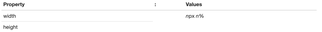
\(\newcommand{\avec}{\mathbf a}\) \(\newcommand{\bvec}{\mathbf b}\) \(\newcommand{\cvec}{\mathbf c}\) \(\newcommand{\dvec}{\mathbf d}\) \(\newcommand{\dtil}{\widetilde{\mathbf d}}\) \(\newcommand{\evec}{\mathbf e}\) \(\newcommand{\fvec}{\mathbf f}\) \(\newcommand{\nvec}{\mathbf n}\) \(\newcommand{\pvec}{\mathbf p}\) \(\newcommand{\qvec}{\mathbf q}\) \(\newcommand{\svec}{\mathbf s}\) \(\newcommand{\tvec}{\mathbf t}\) \(\newcommand{\uvec}{\mathbf u}\) \(\newcommand{\vvec}{\mathbf v}\) \(\newcommand{\wvec}{\mathbf w}\) \(\newcommand{\xvec}{\mathbf x}\) \(\newcommand{\yvec}{\mathbf y}\) \(\newcommand{\zvec}{\mathbf z}\) \(\newcommand{\rvec}{\mathbf r}\) \(\newcommand{\mvec}{\mathbf m}\) \(\newcommand{\zerovec}{\mathbf 0}\) \(\newcommand{\onevec}{\mathbf 1}\) \(\newcommand{\real}{\mathbb R}\) \(\newcommand{\twovec}[2]{\left[\begin{array}{r}#1 \\ #2 \end{array}\right]}\) \(\newcommand{\ctwovec}[2]{\left[\begin{array}{c}#1 \\ #2 \end{array}\right]}\) \(\newcommand{\threevec}[3]{\left[\begin{array}{r}#1 \\ #2 \\ #3 \end{array}\right]}\) \(\newcommand{\cthreevec}[3]{\left[\begin{array}{c}#1 \\ #2 \\ #3 \end{array}\right]}\) \(\newcommand{\fourvec}[4]{\left[\begin{array}{r}#1 \\ #2 \\ #3 \\ #4 \end{array}\right]}\) \(\newcommand{\cfourvec}[4]{\left[\begin{array}{c}#1 \\ #2 \\ #3 \\ #4 \end{array}\right]}\) \(\newcommand{\fivevec}[5]{\left[\begin{array}{r}#1 \\ #2 \\ #3 \\ #4 \\ #5 \\ \end{array}\right]}\) \(\newcommand{\cfivevec}[5]{\left[\begin{array}{c}#1 \\ #2 \\ #3 \\ #4 \\ #5 \\ \end{array}\right]}\) \(\newcommand{\mattwo}[4]{\left[\begin{array}{rr}#1 \amp #2 \\ #3 \amp #4 \\ \end{array}\right]}\) \(\newcommand{\laspan}[1]{\text{Span}\{#1\}}\) \(\newcommand{\bcal}{\cal B}\) \(\newcommand{\ccal}{\cal C}\) \(\newcommand{\scal}{\cal S}\) \(\newcommand{\wcal}{\cal W}\) \(\newcommand{\ecal}{\cal E}\) \(\newcommand{\coords}[2]{\left\{#1\right\}_{#2}}\) \(\newcommand{\gray}[1]{\color{gray}{#1}}\) \(\newcommand{\lgray}[1]{\color{lightgray}{#1}}\) \(\newcommand{\rank}{\operatorname{rank}}\) \(\newcommand{\row}{\text{Row}}\) \(\newcommand{\col}{\text{Col}}\) \(\renewcommand{\row}{\text{Row}}\) \(\newcommand{\nul}{\text{Nul}}\) \(\newcommand{\var}{\text{Var}}\) \(\newcommand{\corr}{\text{corr}}\) \(\newcommand{\len}[1]{\left|#1\right|}\) \(\newcommand{\bbar}{\overline{\bvec}}\) \(\newcommand{\bhat}{\widehat{\bvec}}\) \(\newcommand{\bperp}{\bvec^\perp}\) \(\newcommand{\xhat}{\widehat{\xvec}}\) \(\newcommand{\vhat}{\widehat{\vvec}}\) \(\newcommand{\uhat}{\widehat{\uvec}}\) \(\newcommand{\what}{\widehat{\wvec}}\) \(\newcommand{\Sighat}{\widehat{\Sigma}}\) \(\newcommand{\lt}{<}\) \(\newcommand{\gt}{>}\) \(\newcommand{\amp}{&}\) \(\definecolor{fillinmathshade}{gray}{0.9}\)There are two general width and height style properties that can be used to size any page element. The width property gives the width of an element in pixels or as a percentage of the page width. The height property sets the element's height in pixels or as a percentage of page height.
In subsequent tutorials, these properties are applied to a wide assortment of page elements. For this initial introduction, widths and heights are applied to horizontal rules and graphic images to illustrate their use.
Rule Widths and Heights
As described previously, paragraph level content can be visually and thematically separated by displaying a horizontal rule between them. This is done with the <hr> tag to draw a line across the page.
The default rule is 2 pixels in height and spans the width of the browser window. You can change these dimensions by coding width and height styles for the <hr> tag. This sizing is shown by the following in-line style sheet and browser display.
<hr style="width:75%; height:7px; text-align:center;">
When specifying widths of page elements, it is often preferable to code them as percentages. In this way, the widths always appear in correct proportion to other elements on the Web page regardless of whether the user adjusts the size of the browser window. If a horizontal rule is sized to less than the width of the browser window, then it also can be aligned with text-align:left, text-align:center, or text-align:right to position it horizontally on the line. In the previous example, the rule is 75% of the width of the page and is centered.
Normally all horizontal rules on a page will be of the same style. Therefore, it makes sense to code this styling in an embedded or linked style sheet so that it can be coded one time for application to all rules on the page or all rules on the site. The following code is an example of how horizontal rules can be standardized for a page with an embedded style sheet.
    <style>
        hr { height:1px; width:50%; text-align:center; }
    </style>
With this styling, all <hr> tags on the page produce rules that are 1 pixel in height, 50% of the width of the browser window (irrespective of the window size), and centered horizontally on the page.
Image Widths and Heights
It is often the case that graphic images are not the exact widths or heights needed to fit comfortably on your Web page. This is a recurring problem if you do not possess, or do not know how to use, imaging software to resize the image prior to placing it on the page. However, by applying width and height style properties to these images they can be resized on-the-fly when displayed in the browser.
The actual size of the image shown in Figure \(\PageIndex{2}\) is 162 x 108 pixels. When displayed on the page, its width is set to 100 pixels with an in-line style sheet.
<img src="Stonehenge.jpg" alt="Picture of Stonehenge" style="width:100px;">

When resizing images, set either the width or height property, usually not both. The browser automatically adjusts the other dimension to maintain proper proportion. Of course, you can set both properties independently if you know their correct resized dimensions or if you wish to create special visual effects with disproportionate widths and heights.
Even though an image can be automatically resized when displayed in the browser, it still retains its original file size. An extremely large image still can take up considerable disk space and can cause delays in downloading prior to its display. Ideally, you should edit a large image to reduce its actual size to the dimensions of its page display rather than using width and height styling to reduce only its display size.
An image should not normally be displayed at larger dimensions than its original size. When increasing the size of an image you risk losing resolution and producing a fuzzy "pixelated" image.
Recall from a previous tutorial that the <img> tag has deprecated width and height attributes for resizing images. These attributes should be replaced by their comparable width and height style properties for concordance with HTML5 standards. Although their names are the same, the way in which attributes and styles are applied is different.
The width and height style settings can be applied to almost any HTML5 element by default, not just to <hr> and <img> tags as in the previous examples. In subsequent tutorials, there will be recurring occasion to resize other page elements to fit them with exact dimensions on the page.