
7.3: Sizing Elements
- Page ID
- 93821
\( \newcommand{\vecs}[1]{\overset { \scriptstyle \rightharpoonup} {\mathbf{#1}} } \)
\( \newcommand{\vecd}[1]{\overset{-\!-\!\rightharpoonup}{\vphantom{a}\smash {#1}}} \)
\( \newcommand{\id}{\mathrm{id}}\) \( \newcommand{\Span}{\mathrm{span}}\)
( \newcommand{\kernel}{\mathrm{null}\,}\) \( \newcommand{\range}{\mathrm{range}\,}\)
\( \newcommand{\RealPart}{\mathrm{Re}}\) \( \newcommand{\ImaginaryPart}{\mathrm{Im}}\)
\( \newcommand{\Argument}{\mathrm{Arg}}\) \( \newcommand{\norm}[1]{\| #1 \|}\)
\( \newcommand{\inner}[2]{\langle #1, #2 \rangle}\)
\( \newcommand{\Span}{\mathrm{span}}\)
\( \newcommand{\id}{\mathrm{id}}\)
\( \newcommand{\Span}{\mathrm{span}}\)
\( \newcommand{\kernel}{\mathrm{null}\,}\)
\( \newcommand{\range}{\mathrm{range}\,}\)
\( \newcommand{\RealPart}{\mathrm{Re}}\)
\( \newcommand{\ImaginaryPart}{\mathrm{Im}}\)
\( \newcommand{\Argument}{\mathrm{Arg}}\)
\( \newcommand{\norm}[1]{\| #1 \|}\)
\( \newcommand{\inner}[2]{\langle #1, #2 \rangle}\)
\( \newcommand{\Span}{\mathrm{span}}\) \( \newcommand{\AA}{\unicode[.8,0]{x212B}}\)
\( \newcommand{\vectorA}[1]{\vec{#1}} % arrow\)
\( \newcommand{\vectorAt}[1]{\vec{\text{#1}}} % arrow\)
\( \newcommand{\vectorB}[1]{\overset { \scriptstyle \rightharpoonup} {\mathbf{#1}} } \)
\( \newcommand{\vectorC}[1]{\textbf{#1}} \)
\( \newcommand{\vectorD}[1]{\overrightarrow{#1}} \)
\( \newcommand{\vectorDt}[1]{\overrightarrow{\text{#1}}} \)
\( \newcommand{\vectE}[1]{\overset{-\!-\!\rightharpoonup}{\vphantom{a}\smash{\mathbf {#1}}}} \)
\( \newcommand{\vecs}[1]{\overset { \scriptstyle \rightharpoonup} {\mathbf{#1}} } \)
\( \newcommand{\vecd}[1]{\overset{-\!-\!\rightharpoonup}{\vphantom{a}\smash {#1}}} \)
\(\newcommand{\avec}{\mathbf a}\) \(\newcommand{\bvec}{\mathbf b}\) \(\newcommand{\cvec}{\mathbf c}\) \(\newcommand{\dvec}{\mathbf d}\) \(\newcommand{\dtil}{\widetilde{\mathbf d}}\) \(\newcommand{\evec}{\mathbf e}\) \(\newcommand{\fvec}{\mathbf f}\) \(\newcommand{\nvec}{\mathbf n}\) \(\newcommand{\pvec}{\mathbf p}\) \(\newcommand{\qvec}{\mathbf q}\) \(\newcommand{\svec}{\mathbf s}\) \(\newcommand{\tvec}{\mathbf t}\) \(\newcommand{\uvec}{\mathbf u}\) \(\newcommand{\vvec}{\mathbf v}\) \(\newcommand{\wvec}{\mathbf w}\) \(\newcommand{\xvec}{\mathbf x}\) \(\newcommand{\yvec}{\mathbf y}\) \(\newcommand{\zvec}{\mathbf z}\) \(\newcommand{\rvec}{\mathbf r}\) \(\newcommand{\mvec}{\mathbf m}\) \(\newcommand{\zerovec}{\mathbf 0}\) \(\newcommand{\onevec}{\mathbf 1}\) \(\newcommand{\real}{\mathbb R}\) \(\newcommand{\twovec}[2]{\left[\begin{array}{r}#1 \\ #2 \end{array}\right]}\) \(\newcommand{\ctwovec}[2]{\left[\begin{array}{c}#1 \\ #2 \end{array}\right]}\) \(\newcommand{\threevec}[3]{\left[\begin{array}{r}#1 \\ #2 \\ #3 \end{array}\right]}\) \(\newcommand{\cthreevec}[3]{\left[\begin{array}{c}#1 \\ #2 \\ #3 \end{array}\right]}\) \(\newcommand{\fourvec}[4]{\left[\begin{array}{r}#1 \\ #2 \\ #3 \\ #4 \end{array}\right]}\) \(\newcommand{\cfourvec}[4]{\left[\begin{array}{c}#1 \\ #2 \\ #3 \\ #4 \end{array}\right]}\) \(\newcommand{\fivevec}[5]{\left[\begin{array}{r}#1 \\ #2 \\ #3 \\ #4 \\ #5 \\ \end{array}\right]}\) \(\newcommand{\cfivevec}[5]{\left[\begin{array}{c}#1 \\ #2 \\ #3 \\ #4 \\ #5 \\ \end{array}\right]}\) \(\newcommand{\mattwo}[4]{\left[\begin{array}{rr}#1 \amp #2 \\ #3 \amp #4 \\ \end{array}\right]}\) \(\newcommand{\laspan}[1]{\text{Span}\{#1\}}\) \(\newcommand{\bcal}{\cal B}\) \(\newcommand{\ccal}{\cal C}\) \(\newcommand{\scal}{\cal S}\) \(\newcommand{\wcal}{\cal W}\) \(\newcommand{\ecal}{\cal E}\) \(\newcommand{\coords}[2]{\left\{#1\right\}_{#2}}\) \(\newcommand{\gray}[1]{\color{gray}{#1}}\) \(\newcommand{\lgray}[1]{\color{lightgray}{#1}}\) \(\newcommand{\rank}{\operatorname{rank}}\) \(\newcommand{\row}{\text{Row}}\) \(\newcommand{\col}{\text{Col}}\) \(\renewcommand{\row}{\text{Row}}\) \(\newcommand{\nul}{\text{Nul}}\) \(\newcommand{\var}{\text{Var}}\) \(\newcommand{\corr}{\text{corr}}\) \(\newcommand{\len}[1]{\left|#1\right|}\) \(\newcommand{\bbar}{\overline{\bvec}}\) \(\newcommand{\bhat}{\widehat{\bvec}}\) \(\newcommand{\bperp}{\bvec^\perp}\) \(\newcommand{\xhat}{\widehat{\xvec}}\) \(\newcommand{\vhat}{\widehat{\vvec}}\) \(\newcommand{\uhat}{\widehat{\uvec}}\) \(\newcommand{\what}{\widehat{\wvec}}\) \(\newcommand{\Sighat}{\widehat{\Sigma}}\) \(\newcommand{\lt}{<}\) \(\newcommand{\gt}{>}\) \(\newcommand{\amp}{&}\) \(\definecolor{fillinmathshade}{gray}{0.9}\)Unless they are styled otherwise, text containers such as <div>, <p>, and <span> tags are sized to fit the contents they contain. It is often the case that you wish to have more control over the sizes of container tags, and you can with the style settings shown in Figure 6-24. You were introduced to the height and width properties in a previous tutorial. Here they are combined with the overflow property to control the size and visual appearance of text containers.
| Property | Value |
|---|---|
| height | n px n % auto |
| width | n px n % auto |
| overflow | visible hidden scroll auto |
Figure \(\PageIndex{1}\): Element size style properties.
Container Widths and Heights
In previous tutorials, height and width settings are applied to images and horizontal rules to give them specific sizes. The same can be done with virtually any XHTML tag, including text containers. For instance, the following paragraph is sized at 50% of the width of the browser window rather than expanding by default to the entire page width. A border is added to visualize the effect, and padding is used to keep the border from closing in around the text. This paragraph is displayed in the browser as shown in Figure \(\PageIndex{3}\).
<style type="text/css">p#Sized {width:50%; border:solid 1px; padding:10px}</style><p id="Sized">This is a paragraph with its width set to 50% of the width of the browser window. Still, the text wraps within these boundaries. Since its width is set as a percentage, the paragraph resizes to remain at 50% of the page width when resizing the browser window.</p>
This is a paragraph with its width set to 50% of the width of the browser window.
Still, the text wraps within these boundaries. Since its width is set as a percentage,
the paragraph resizes to remain at 50% of the page width when resizing the,
browser window.
The width of the paragraph always remains at 50%. Since no height styling is applied, the height of the paragraph expands to encompass the amount of text contained within it.
Container Overflows
By default, the height of a container always expands to display its contained text, irrespective of its specified height setting. In order to set the exact height of a container, you must also indicate how to handle text "overflow," where the container is not sized large enough to display all of its content. You must supply an overflow property to deal with potential "hidden" text beyond the boundaries of the container.
There are four possible values for the overflow property, the results of which are shown in the following examples of paragraph styling.
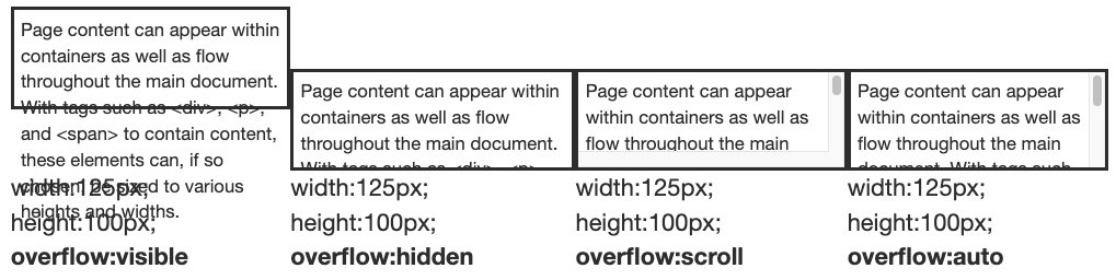
A setting of overflow:visible displays all content irrespective of the specified height of the container (the default setting); overflow:hidden applies the specified height setting even if part of the text remains hidden; overflow:scroll displays horizontal and vertical scroll bars whether needed or not to view hidden text; overflow:auto displays a vertical scroll bar if needed to view hidden text.
The overflow:auto style is the most generally useful and visibly pleasing for displaying potential scrolling text within a container of a specified width and height. Coding for the above <p> tag with overflow:auto is shown below.
<style type="text/css">p#OFLOW {overflow:auto;width:125px; height:100px; padding:5px;border:solid 1px}</style><p id="OFLOW">Page content can appear within elements as well as flow throughout the main document. With tags such as <div>, <p>, and <span> to contain content, these elements can, if so chosen, be sized to various heights and widths.</p>
This particular paragraph has id="OFLOW" to differentiate it from the other three paragraphs which have their own id values. The paragraph has width and height settings that do not permit full display of the entire paragraph. Therefore, it is also given an overflow:auto style so that a vertical scroll bar appears for accessing the hidden text.
Floating Containers
This is a division with its width set to 250 pixels and its height set to 200 pixels. It has a ridge border 5 pixels in width, padding of 10 pixels, and a background color of gray. The division floats to the right of the page. Its left margin is set at 20 pixels for separation from the text on the page.
Since all of the text cannot display within the specified height and width, the division is given a style setting of overflow:auto to create a vertical scroll bar.
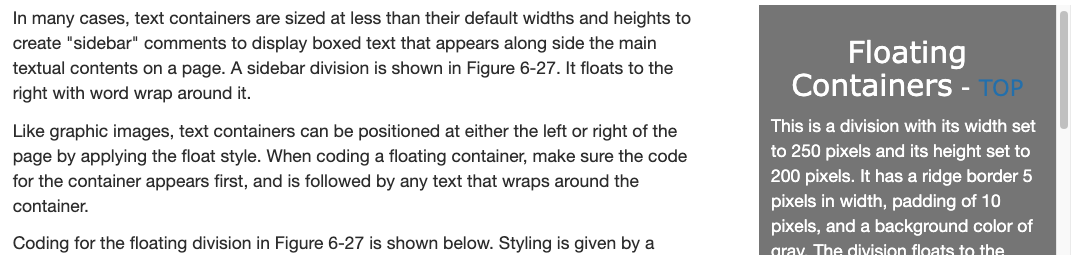
In many cases, text containers are sized at less than their default widths and heights to create "sidebar" comments to display boxed text that appears along side the main textual contents on a page. A sidebar division is shown in Figure \(\PageIndex{6}\). It floats to the right with word wrap around it.
Like graphic images, text containers can be positioned at either the left or right of the page by applying the float style. When coding a floating container, make sure the code for the container appears first, and is followed by any text that wraps around the container.
Coding for the floating division in Figure \(\PageIndex{6}\) is shown below. Styling is given by a class selector within an embedded style sheet. Division code appears immediately before the text that wraps around the container.
<style type="text/css">.FLOAT {float:right; width:250px; height:200px; overflow:auto; color:white;background-color:gray; margin-left:20px; padding:10px; border:ridge 5}h3 {text-align:center}</style><div class="FLOAT"><h3>Floating Containers</h3><p>This is a division with its width set to 250 pixels and its height set to 200 pixels. It has a ridge border 5 pixels in width, padding of 10 pixels, and a background color of gray. The division floats to the right of the page. Its left margin is set at 20 pixels for separation from the text on the page.</p><p>Since all of the text cannot display within the specified height and width, the division is given a style setting of overflow:auto to create a vertical scroll bar.</p></div>... wrapped text ...
Notice that only about half of the content is visible within the division's width and height settings. Therefore, the overflow:auto property is added to the division's style sheet to display a vertical scroll bar for accessing all text. A border is added for visibility.
The above code is a good illustration of using the block-level <div> tag to enclose and style other text blocks as a single unit of page content. In this case, the <div> tag encapsulates a heading and two paragraphs. Its purpose is to identify this collection of content to receive styling in the form of a floated, bordered container inside of which the content can scroll.