
9.3: Statistical Plots
- Page ID
- 83704

\( \newcommand{\vecs}[1]{\overset { \scriptstyle \rightharpoonup} {\mathbf{#1}} } \)
\( \newcommand{\vecd}[1]{\overset{-\!-\!\rightharpoonup}{\vphantom{a}\smash {#1}}} \)
\( \newcommand{\id}{\mathrm{id}}\) \( \newcommand{\Span}{\mathrm{span}}\)
( \newcommand{\kernel}{\mathrm{null}\,}\) \( \newcommand{\range}{\mathrm{range}\,}\)
\( \newcommand{\RealPart}{\mathrm{Re}}\) \( \newcommand{\ImaginaryPart}{\mathrm{Im}}\)
\( \newcommand{\Argument}{\mathrm{Arg}}\) \( \newcommand{\norm}[1]{\| #1 \|}\)
\( \newcommand{\inner}[2]{\langle #1, #2 \rangle}\)
\( \newcommand{\Span}{\mathrm{span}}\)
\( \newcommand{\id}{\mathrm{id}}\)
\( \newcommand{\Span}{\mathrm{span}}\)
\( \newcommand{\kernel}{\mathrm{null}\,}\)
\( \newcommand{\range}{\mathrm{range}\,}\)
\( \newcommand{\RealPart}{\mathrm{Re}}\)
\( \newcommand{\ImaginaryPart}{\mathrm{Im}}\)
\( \newcommand{\Argument}{\mathrm{Arg}}\)
\( \newcommand{\norm}[1]{\| #1 \|}\)
\( \newcommand{\inner}[2]{\langle #1, #2 \rangle}\)
\( \newcommand{\Span}{\mathrm{span}}\) \( \newcommand{\AA}{\unicode[.8,0]{x212B}}\)
\( \newcommand{\vectorA}[1]{\vec{#1}} % arrow\)
\( \newcommand{\vectorAt}[1]{\vec{\text{#1}}} % arrow\)
\( \newcommand{\vectorB}[1]{\overset { \scriptstyle \rightharpoonup} {\mathbf{#1}} } \)
\( \newcommand{\vectorC}[1]{\textbf{#1}} \)
\( \newcommand{\vectorD}[1]{\overrightarrow{#1}} \)
\( \newcommand{\vectorDt}[1]{\overrightarrow{\text{#1}}} \)
\( \newcommand{\vectE}[1]{\overset{-\!-\!\rightharpoonup}{\vphantom{a}\smash{\mathbf {#1}}}} \)
\( \newcommand{\vecs}[1]{\overset { \scriptstyle \rightharpoonup} {\mathbf{#1}} } \)
\( \newcommand{\vecd}[1]{\overset{-\!-\!\rightharpoonup}{\vphantom{a}\smash {#1}}} \)
\(\newcommand{\avec}{\mathbf a}\) \(\newcommand{\bvec}{\mathbf b}\) \(\newcommand{\cvec}{\mathbf c}\) \(\newcommand{\dvec}{\mathbf d}\) \(\newcommand{\dtil}{\widetilde{\mathbf d}}\) \(\newcommand{\evec}{\mathbf e}\) \(\newcommand{\fvec}{\mathbf f}\) \(\newcommand{\nvec}{\mathbf n}\) \(\newcommand{\pvec}{\mathbf p}\) \(\newcommand{\qvec}{\mathbf q}\) \(\newcommand{\svec}{\mathbf s}\) \(\newcommand{\tvec}{\mathbf t}\) \(\newcommand{\uvec}{\mathbf u}\) \(\newcommand{\vvec}{\mathbf v}\) \(\newcommand{\wvec}{\mathbf w}\) \(\newcommand{\xvec}{\mathbf x}\) \(\newcommand{\yvec}{\mathbf y}\) \(\newcommand{\zvec}{\mathbf z}\) \(\newcommand{\rvec}{\mathbf r}\) \(\newcommand{\mvec}{\mathbf m}\) \(\newcommand{\zerovec}{\mathbf 0}\) \(\newcommand{\onevec}{\mathbf 1}\) \(\newcommand{\real}{\mathbb R}\) \(\newcommand{\twovec}[2]{\left[\begin{array}{r}#1 \\ #2 \end{array}\right]}\) \(\newcommand{\ctwovec}[2]{\left[\begin{array}{c}#1 \\ #2 \end{array}\right]}\) \(\newcommand{\threevec}[3]{\left[\begin{array}{r}#1 \\ #2 \\ #3 \end{array}\right]}\) \(\newcommand{\cthreevec}[3]{\left[\begin{array}{c}#1 \\ #2 \\ #3 \end{array}\right]}\) \(\newcommand{\fourvec}[4]{\left[\begin{array}{r}#1 \\ #2 \\ #3 \\ #4 \end{array}\right]}\) \(\newcommand{\cfourvec}[4]{\left[\begin{array}{c}#1 \\ #2 \\ #3 \\ #4 \end{array}\right]}\) \(\newcommand{\fivevec}[5]{\left[\begin{array}{r}#1 \\ #2 \\ #3 \\ #4 \\ #5 \\ \end{array}\right]}\) \(\newcommand{\cfivevec}[5]{\left[\begin{array}{c}#1 \\ #2 \\ #3 \\ #4 \\ #5 \\ \end{array}\right]}\) \(\newcommand{\mattwo}[4]{\left[\begin{array}{rr}#1 \amp #2 \\ #3 \amp #4 \\ \end{array}\right]}\) \(\newcommand{\laspan}[1]{\text{Span}\{#1\}}\) \(\newcommand{\bcal}{\cal B}\) \(\newcommand{\ccal}{\cal C}\) \(\newcommand{\scal}{\cal S}\) \(\newcommand{\wcal}{\cal W}\) \(\newcommand{\ecal}{\cal E}\) \(\newcommand{\coords}[2]{\left\{#1\right\}_{#2}}\) \(\newcommand{\gray}[1]{\color{gray}{#1}}\) \(\newcommand{\lgray}[1]{\color{lightgray}{#1}}\) \(\newcommand{\rank}{\operatorname{rank}}\) \(\newcommand{\row}{\text{Row}}\) \(\newcommand{\col}{\text{Col}}\) \(\renewcommand{\row}{\text{Row}}\) \(\newcommand{\nul}{\text{Nul}}\) \(\newcommand{\var}{\text{Var}}\) \(\newcommand{\corr}{\text{corr}}\) \(\newcommand{\len}[1]{\left|#1\right|}\) \(\newcommand{\bbar}{\overline{\bvec}}\) \(\newcommand{\bhat}{\widehat{\bvec}}\) \(\newcommand{\bperp}{\bvec^\perp}\) \(\newcommand{\xhat}{\widehat{\xvec}}\) \(\newcommand{\vhat}{\widehat{\vvec}}\) \(\newcommand{\uhat}{\widehat{\uvec}}\) \(\newcommand{\what}{\widehat{\wvec}}\) \(\newcommand{\Sighat}{\widehat{\Sigma}}\) \(\newcommand{\lt}{<}\) \(\newcommand{\gt}{>}\) \(\newcommand{\amp}{&}\) \(\definecolor{fillinmathshade}{gray}{0.9}\)By Carey A. Smith
Two types of plots to visualize statistical data are the histogram and the boxchart. To illustrate how to create these, we generate a vector of normally distributed random data with a nominal mean of 50 and a nominal standard deviation of 8.
This example is only for MATLAB.
The next example is the version for Octave
%% A Histogram is useful for showing the spread of a data set and the frequencies of possible values.
% Examples are ages, blood pressure, home prices, incomes, etc.
% We begin by creating a vector, v4, of random values with a nominal mean and standard deviation:
v4_mean0 = 50;
v4_std0 = 8;
v4 = v4_mean0 + v4_std0*randn(1,100);
% Next we compute the actual mean and standard deviation of the created data vector:
v4_mean1 = mean(v4)
v4_std1 = std(v4)
figure
histogram(v4)
grid on;
% Display the mean and standard deviation in the title with 3 significant figures
title(['Histogram: mean= ',num2str(v4_mean1,3),', std.dev.= ',num2str(v4_std1,3)])
% The histogram's bin edges can be set to any custom values you want.
% This code creates a a set of bin edges from -4 standard deviations to +4 standard deviations, in increments of 1 standard deviation.
h_edges = v4_std0*(-4:4) + v4_mean0
figure
histogram(v4, h_edges)
grid on;
title(['Histogram of v4 with custom bin edges, mean= ',num2str(v4_mean1,3),', std.dev.= ',num2str(v4_std1,3)])
% Displays the mean and standard deviation with 3 significant figures.
Solution
Add example text here.
.
This example is only for Octave.
%% For Octave, you need to load a graphics tool kit and use the older function hist(x):
graphics_toolkit("fltk") % Needed for Octave 7.2

v4_mean0 = 50;

v4_std0 = 8;

v4 = v4_mean0 + v4_std0*randn(1,100);

% Next we compute the actual mean and standard deviation of the created data vector:

v4_mean1 = mean(v4)

v4_std1 = std(v4)

%% For Octave use the older function hist():

figure

hist(v4)

grid on
% Display the mean and standard deviation in the title with 3 significant figures

title(['hist(): mean= ',num2str(v4_mean1,3),', std.dev.= ',num2str(v4_std1,3)])
%% The histogram's bin centers can be set to any custom values you want.

% This code creates a a set of bin centers from -3.5 standard deviations to +3.5 standard deviations, in increments of 1 standard deviation.

h_centers = v4_std0*(-3.5:3.5) + v4_mean0

figure

hist(v4, h_centers)

grid on;

title(['hist() with custom bin centers, mean= ',num2str(v4_mean1,3),', std.dev.= ',num2str(v4_std1,3)])

% Displays the mean and standard deviation with 3 significant figures.
Solution
Add example text here.
.
Mimic 100 dice rolls
Assignment histogram: Mimic 100 dice rolls, plot a histogram, compute the mean and standard deviation
(a) Create a vector with 100 uniform random integers between 1 and 6 with this command:
dice = randi(6, 1, 100); % randi generates random integers
(b) Set the bin edges to be
bin_edges= 0.5 : 1 : 6.5;
Plot a histogram of the data using this bin_edges vector.
(c) Compute mdice = the mean of the vector dice
Compute sdice = the standard deviation of the vector dice
Write the mean and standard deviation in the title using this line of code:
title(['100 Dice Rolls, Mean= ' , num2str(mdice) , ' , Std. Dev.= ' , num2str(sdice)]);
You may want to repeat this a few times, to see how it varies as the random number vector is regenerated.
Answer
-
One iteration looks like this:
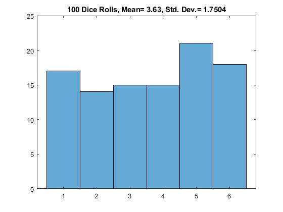
Figure \(\PageIndex{1}\): Historgram Example: Mimic 100 dice rolls
Boxchart (a.k.a. boxplot)
%% A boxchart is another plot of the data.
% It is often used for data that is not normally distributed. It shows the following:
- minimum
- 25th-percentile (1st quartile or Q1)
- median (50th-percentile)
- 75th-percentile (3rd quartile or Q3)
- maximum
This example code shows you how to create a MATLAB boxplot.
load patients % This is a built-in sample file with various data

n = length(Age) % Number of patients

figure('Name','boxchart() Example')

boxchart(Age)

title('Patient''s Ages')

ylabel('Age (years)')

xlabel([num2str(n),' Patients'])

ylim([20,60])

Age_min = min(Age)

Age_median = median(Age)

Age_max = max(Age)

text(1,(Age_min+1), ['min= ',num2str(Age_min)])

text(1,(Age_median+1),['median= ',num2str(Age_median)])

text(1,(Age_max+1), ['max= ',num2str(Age_max)])
Solution
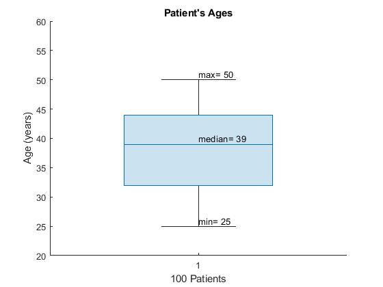
Figure \(\PageIndex{2}\): Boxchart example of patients' ages
Note: Matlab creates vertical boxplots. Books and other software typically create horizontal boxplots. The same information is shown in both types.